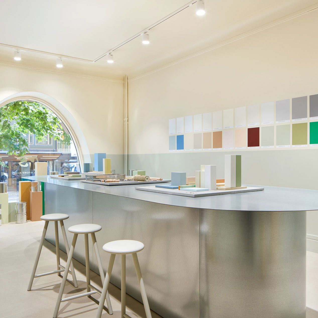
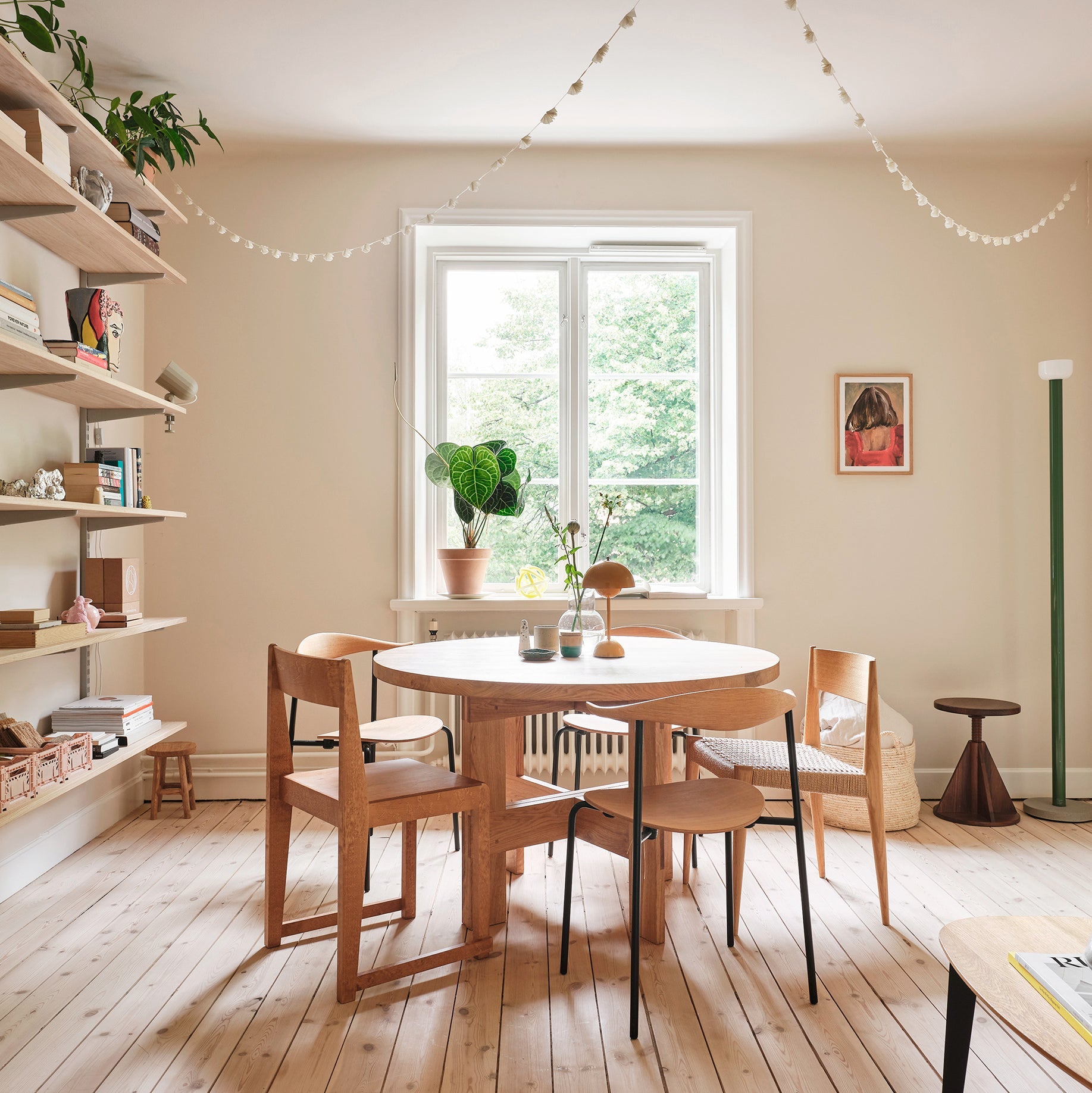
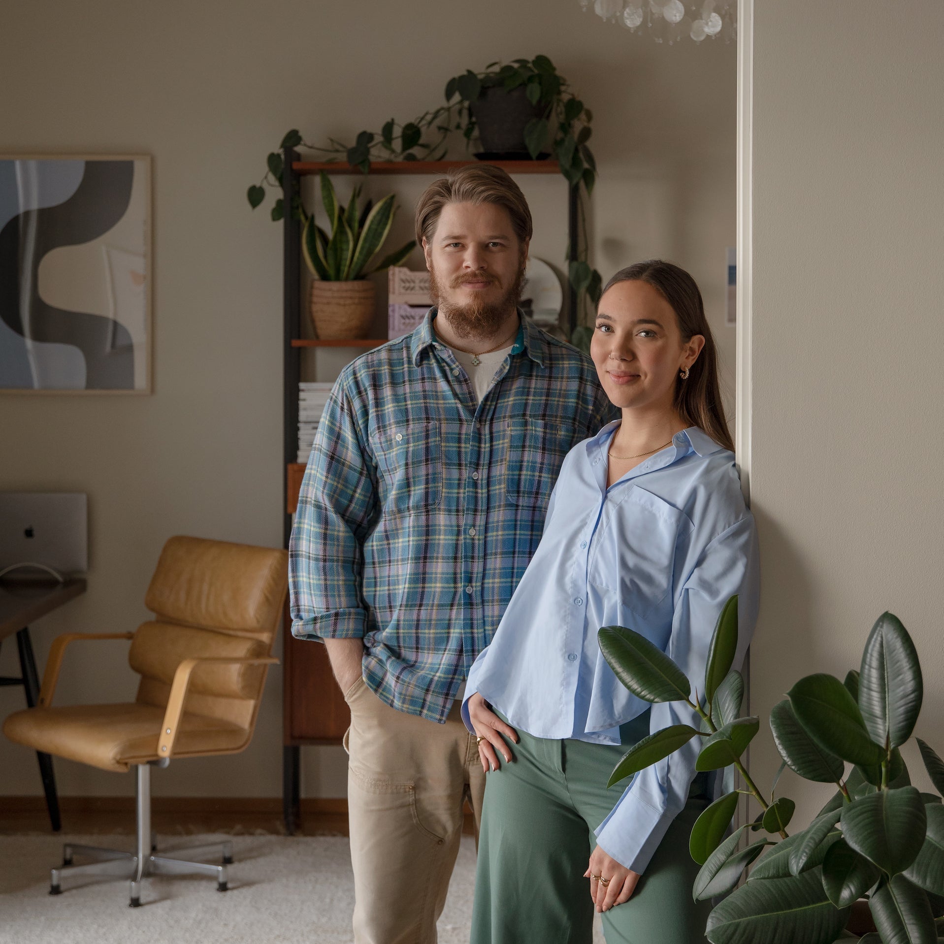
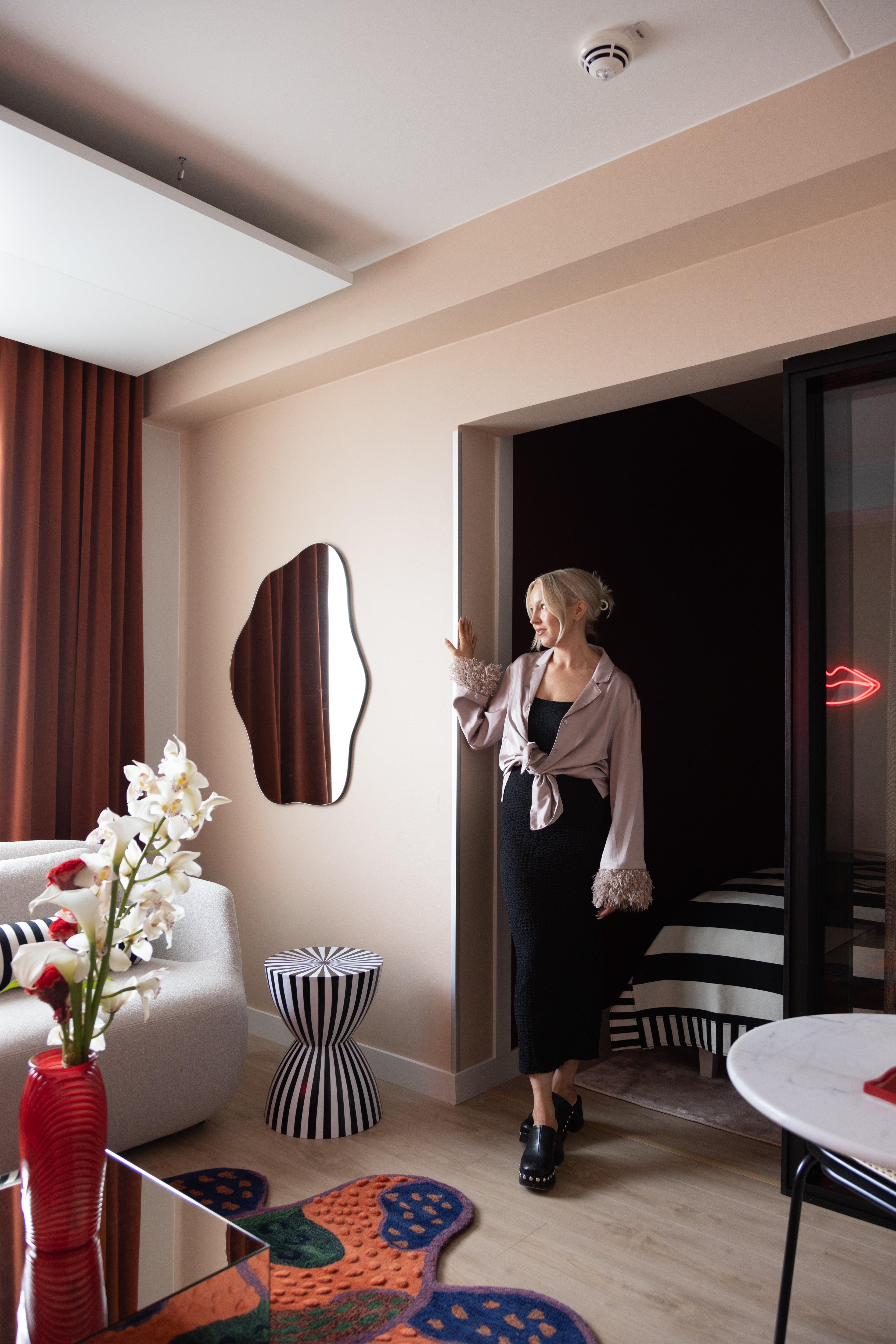
Interior designer Laura Seppänen designed a new, more spacious studio for her business, combining workspace, showroom, meeting room, and kitchen. The new studio was found nearby, literally on the other side of the wall. Before the move, a comprehensive renovation was carried out in the studio space, drawing inspiration from Italy. Join us in exploring Laura's office, where colors evoke different emotional experiences.

Where did you draw inspiration for your studio?
"I have visited Italy many times for both leisure and work, drawing influences consciously and unconsciously. I gave my studio renovation the project name Riposo, which means an Italian siesta — a moment to enjoy a longer lunch and take a break from a hectic work routine", Laura explains.
The interior design process for the new studio coincided with Milan Design Week, the largest design event in Italy, and several Italian-inspired companies were included in the project.
"I wanted to create a space for my work that can calm when needed but also add energy in certain moments, both of which are essential in a designer's job", Laura continues.


The structures of the space were modified based on Laura's design needs and customer experiences. A separate meeting room was created, and the kitchen was opened from a closed space into the showroom. Thanks to the changes, the showroom now functions as a larger display area and an open office.
"I always approach interior design by first outlining permanent elements that create the foundation for an impression. The right sequence is crucial for space design. Materials are part of this core, while colors, for me, are more like carefully chosen tools, surface, and part of the decor", Laura explains.
"As for surfaces, I typically start with the choice of flooring material, as the floor is usually the largest horizontal surface and a relatively immovable element. I dress the ceiling and walls with carefully chosen paint shades, which, when combined with other materials, create different views and experiences", Laura adds.


How did you choose the paint shades used in the studio?
"When planning the color scheme for the office, I consciously chose colors to balance the abundance of materials I encounter in my work", Laura explains.
Laura has a particular interest in color theory and symbolism and has studied colors from a psychological perspective. Her understanding of colors comes from the knowledge that individuals perceive colors differently.
“Colors aren't just what we see; they also shape our emotional experience but with good color design, you can influence mood, emotions, alertness, or even mindfulness — we humans react differently to colors but we all react", Laura notes.

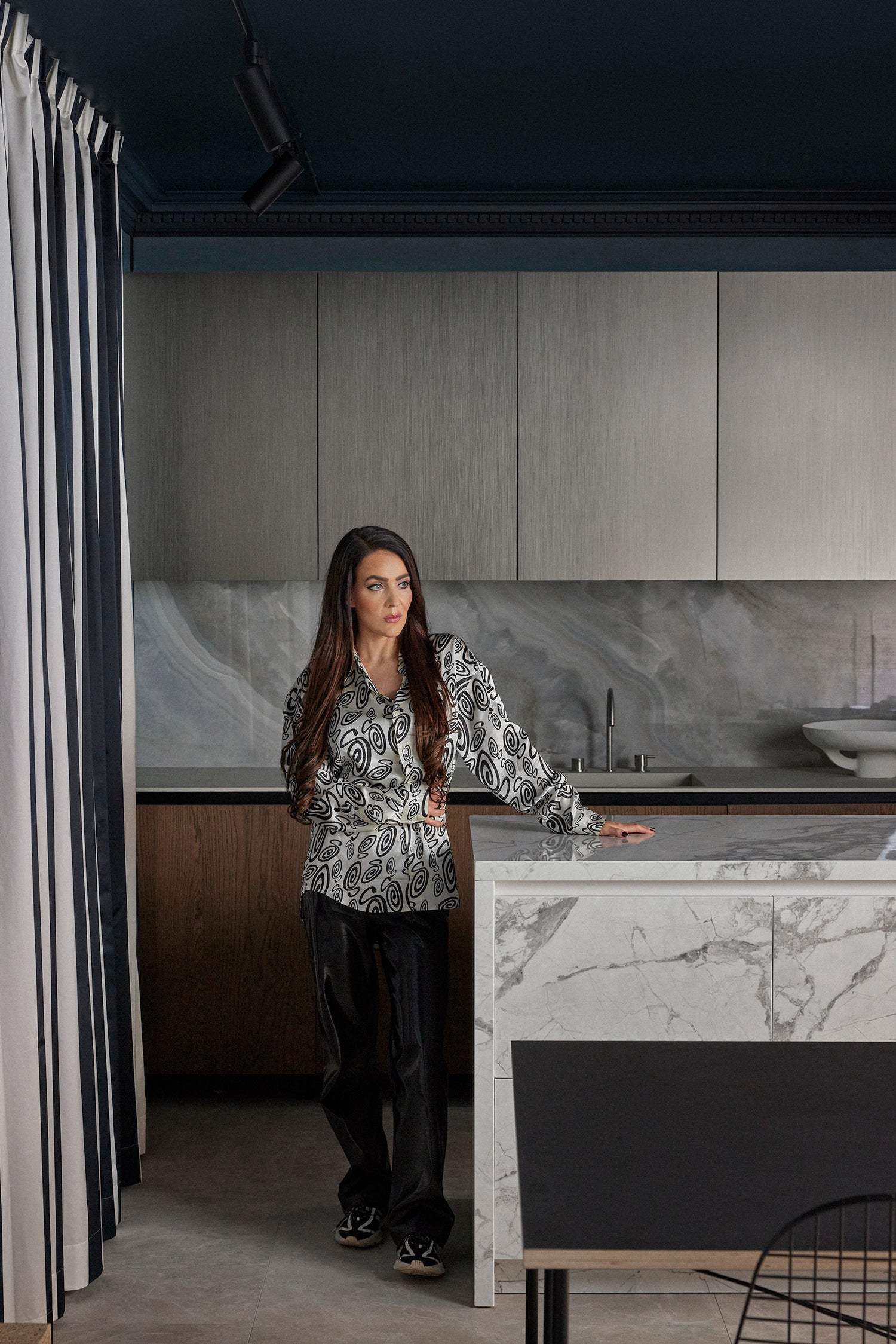
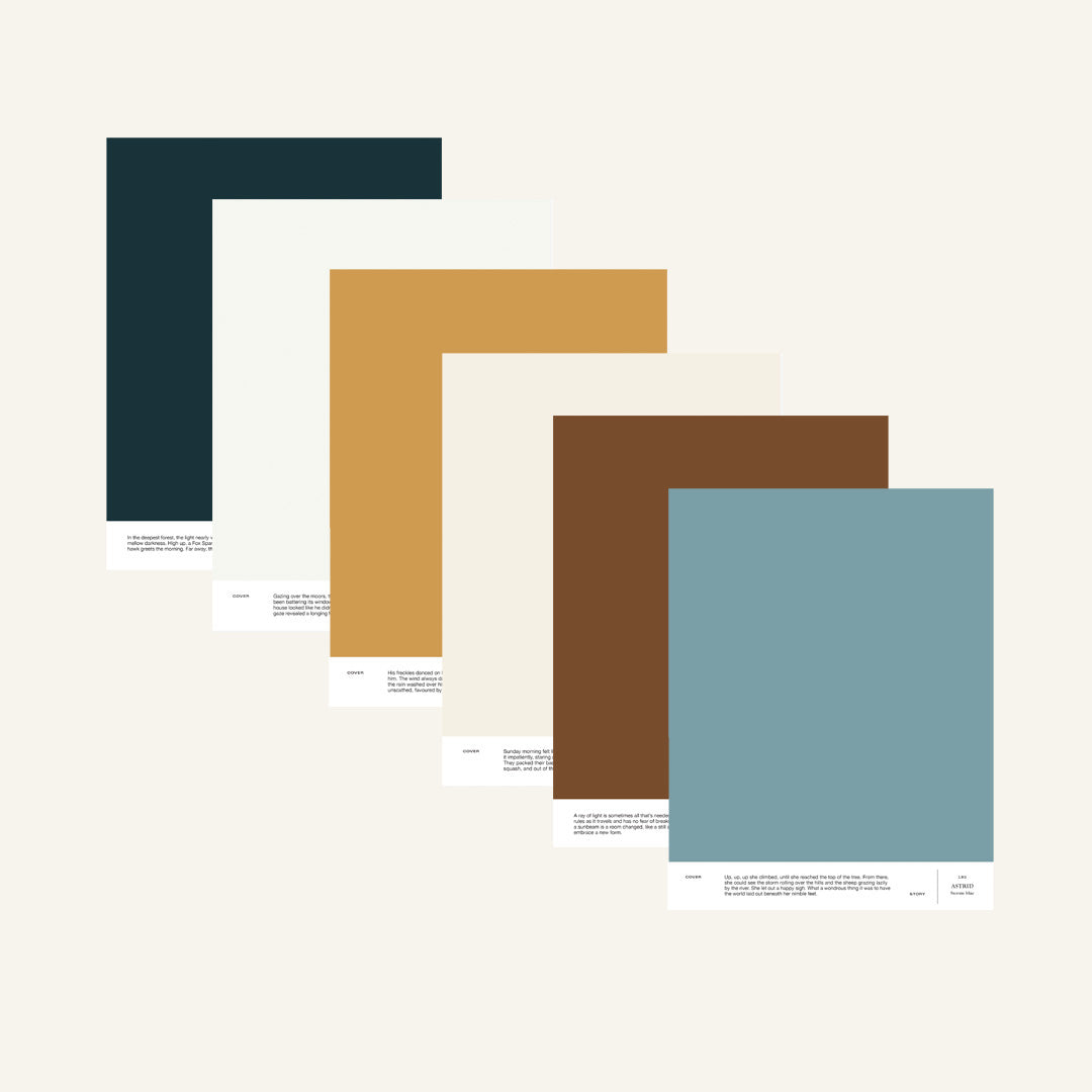
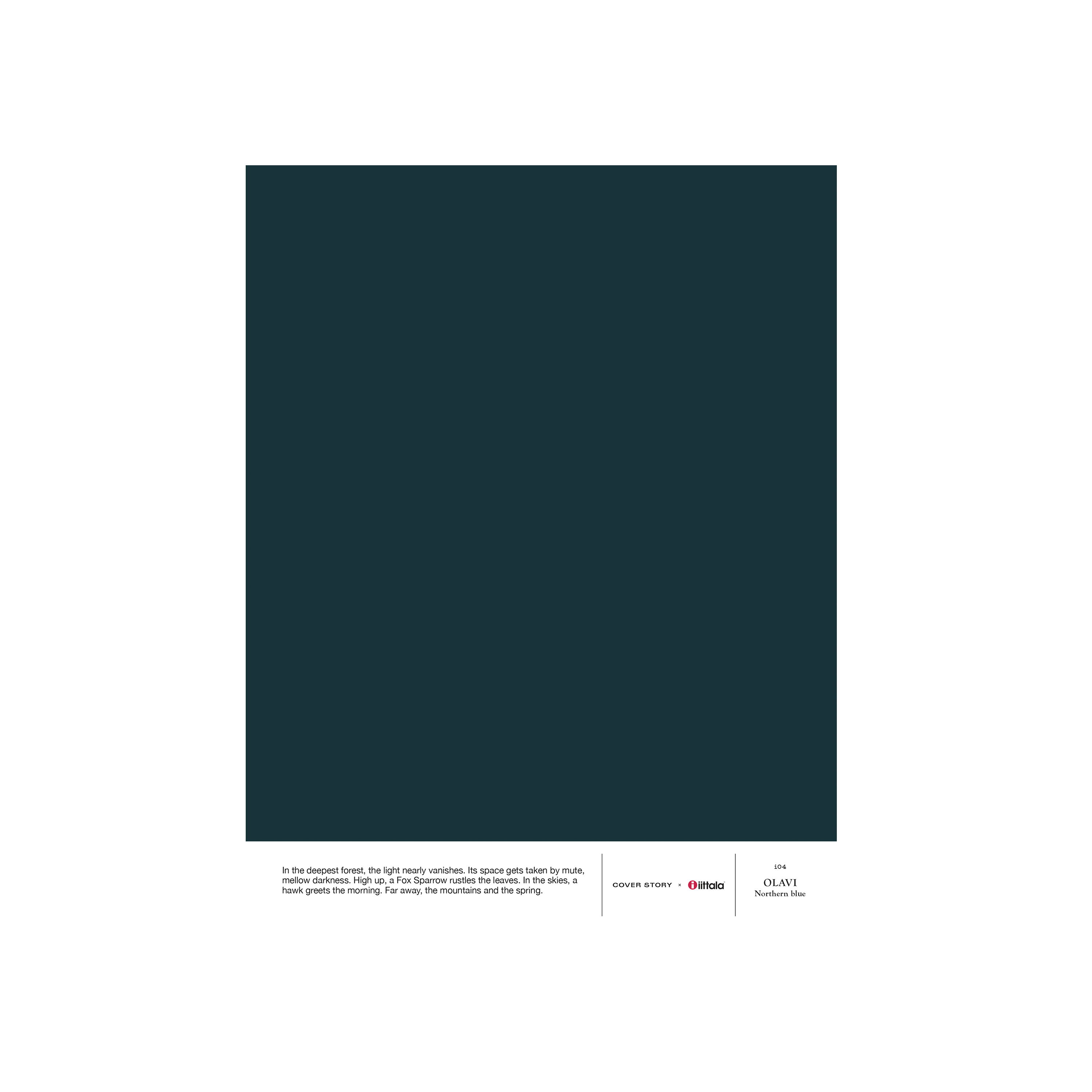
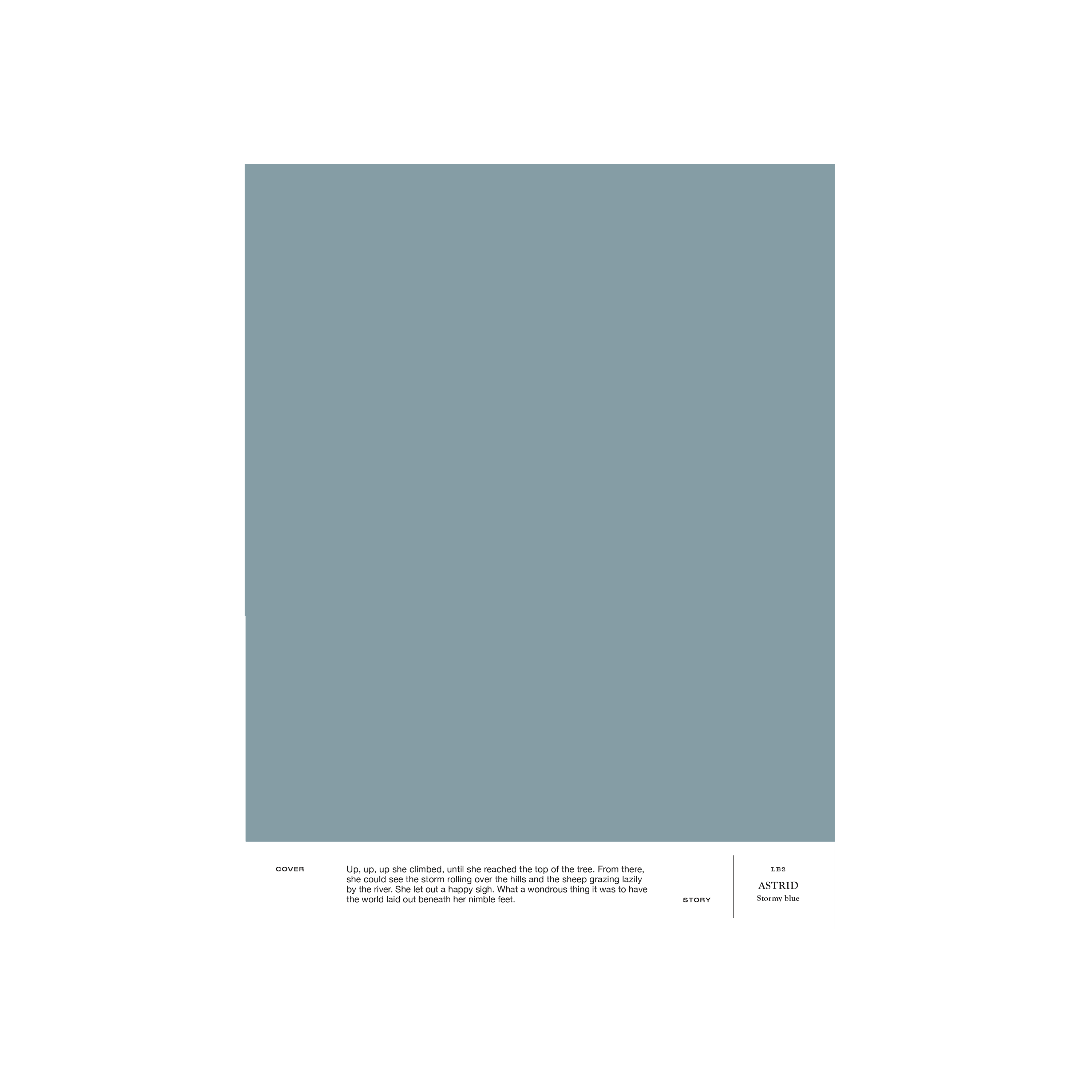
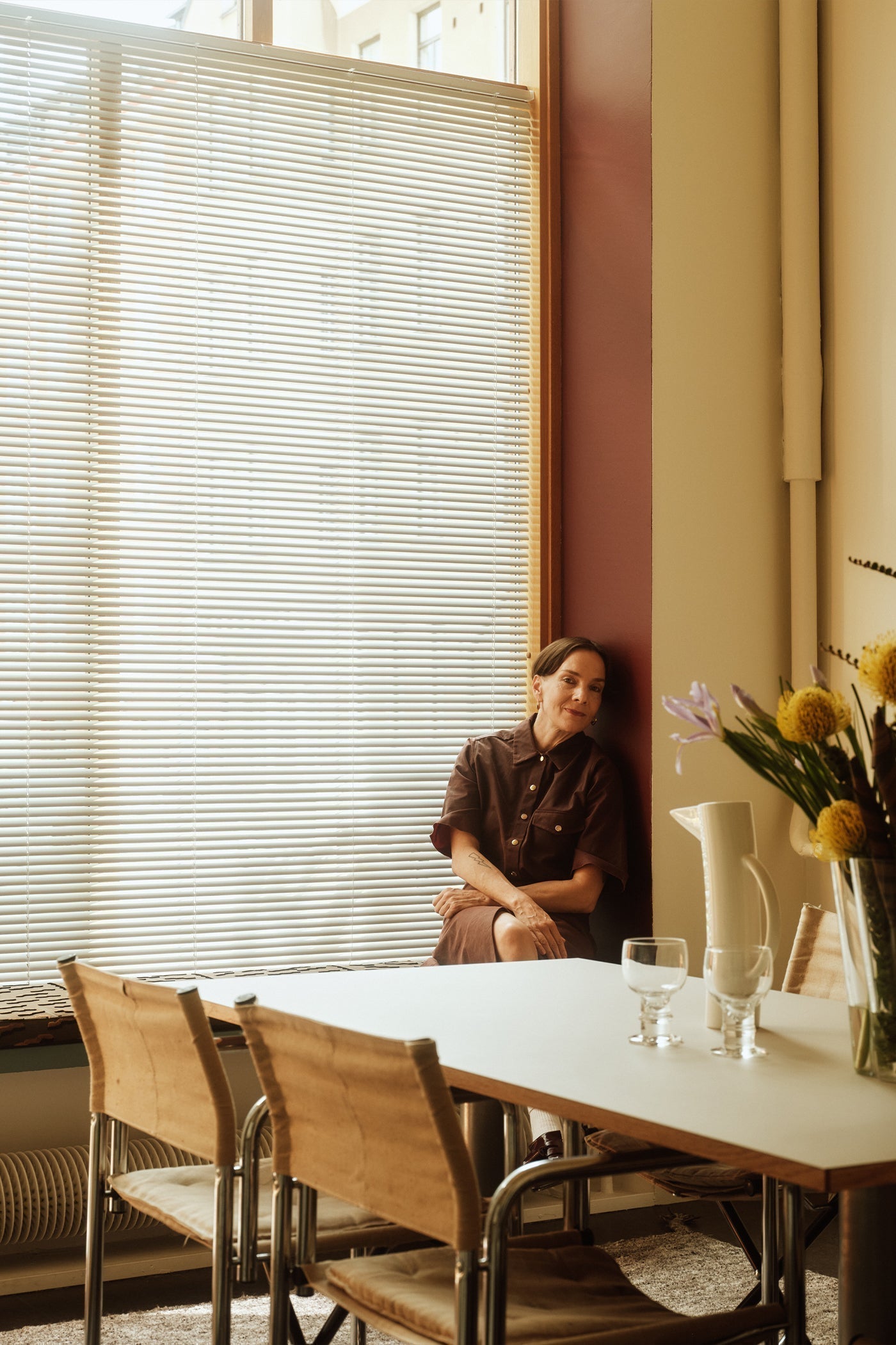
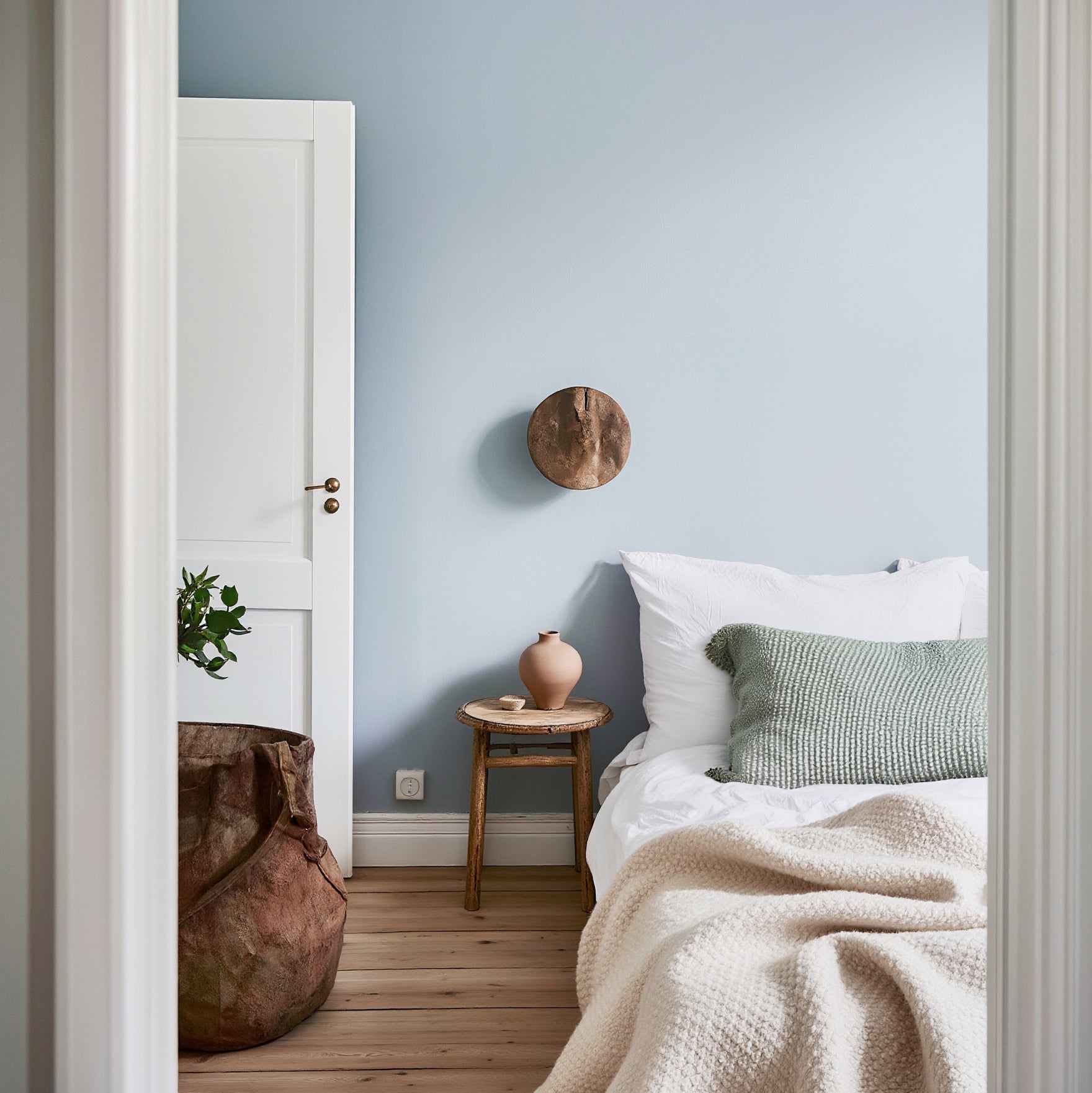
For the showroom, the ceiling was selected in a dark blue i04 OLAVI, and the walls in a light blue LB2 ASTRID, creating a harmonious atmosphere symbolizing her favorite element – the sea. With blue tones, she aims to bring intimacy to the open space, influence her work energy, and calm the general area without unnecessarily stimulating her or clients.

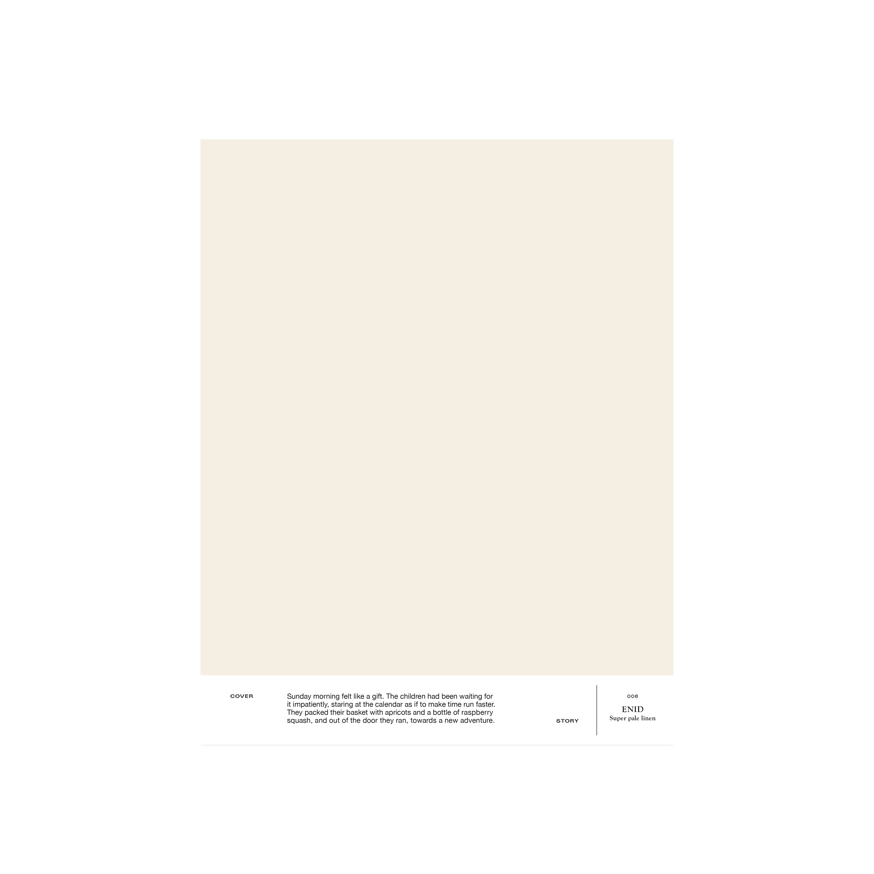
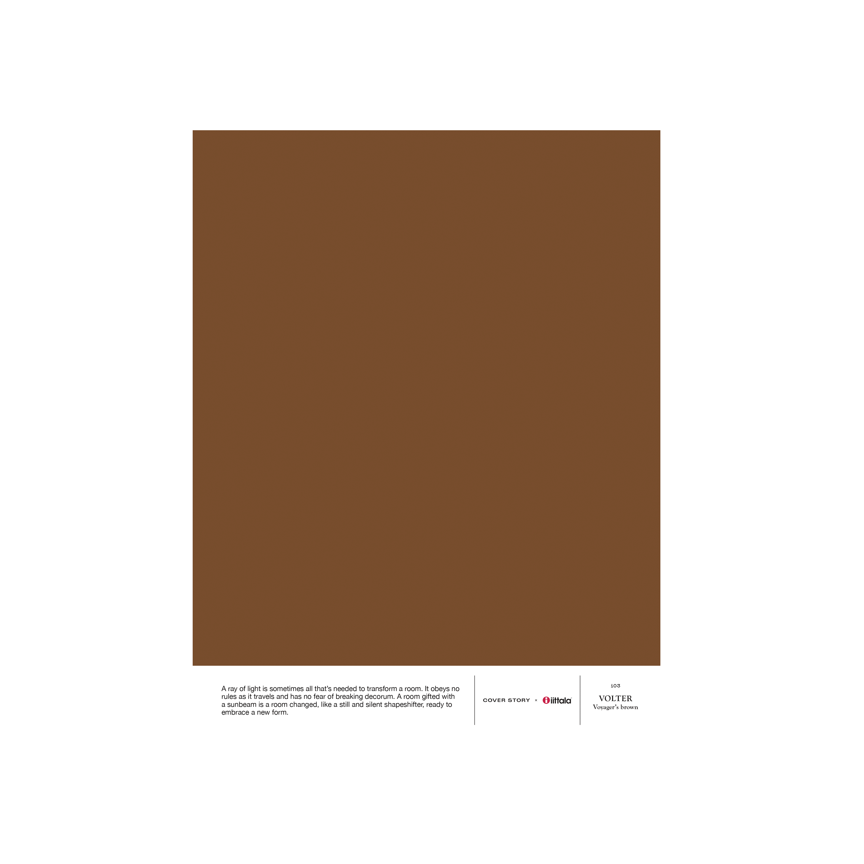
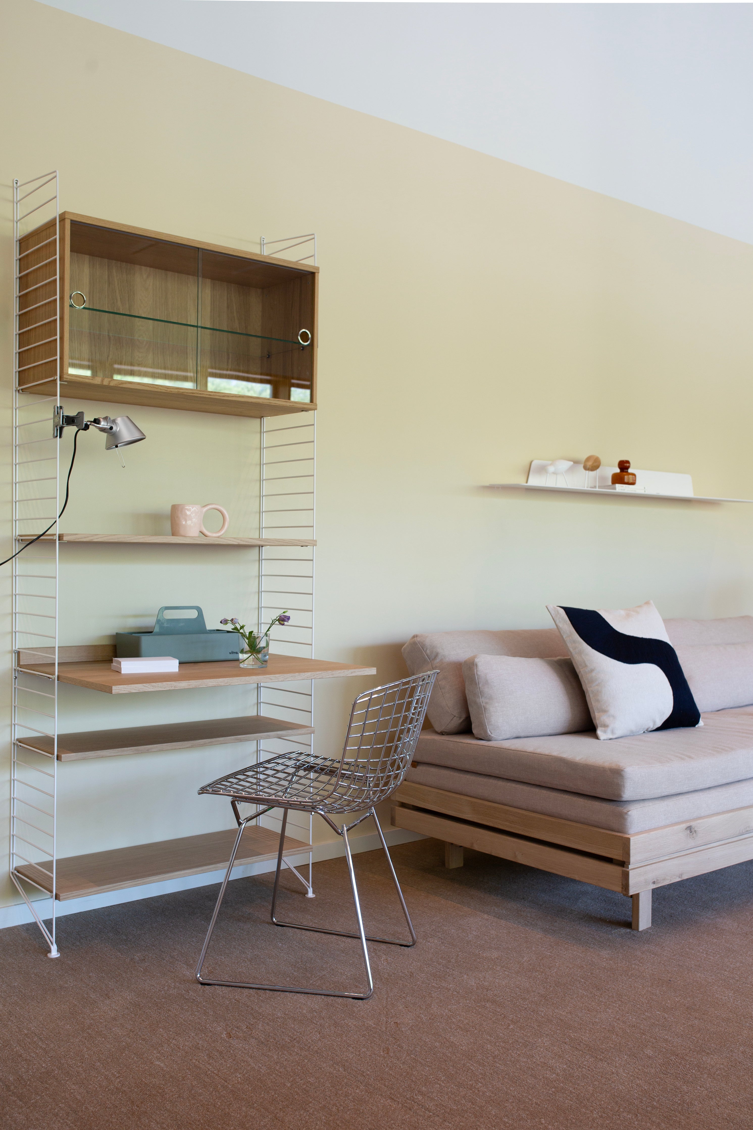
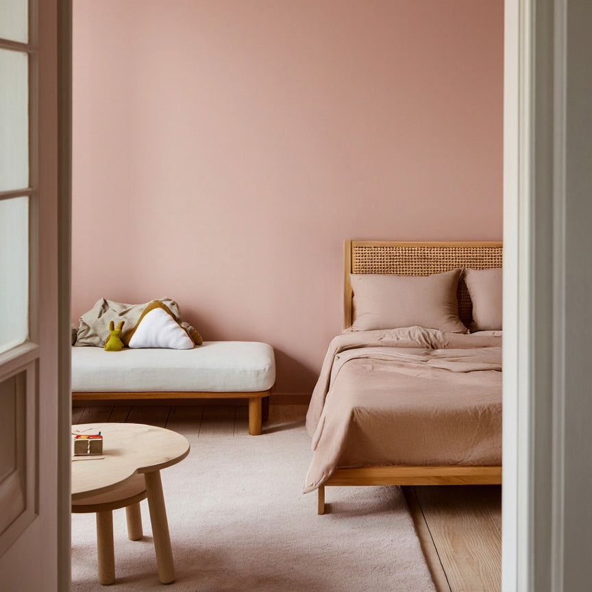
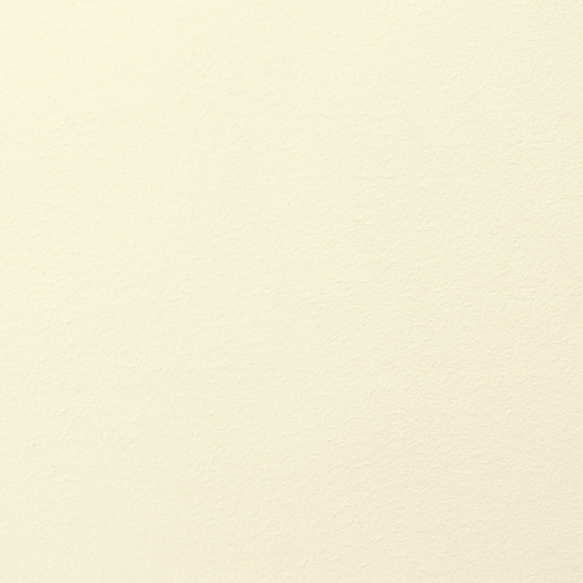
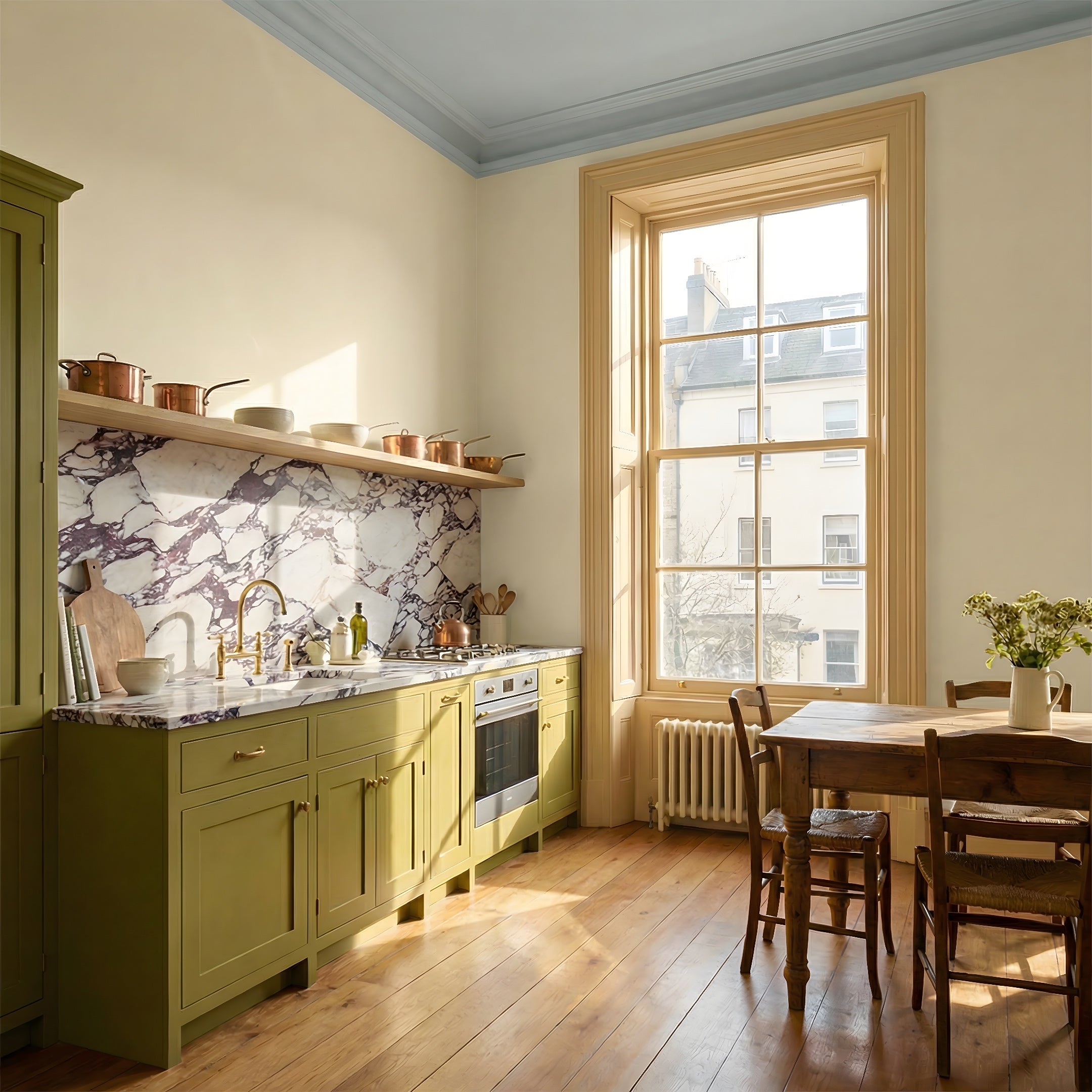
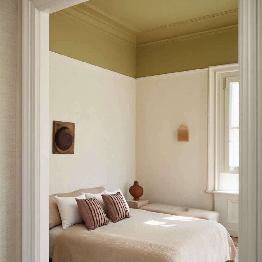
The color palette for the meeting room, on the other hand, aimed to consciously raise energy levels, as Laura's workdays involve many negotiation situations with changes and decision-making present. The walls were chosen in yellow linen 006 ENID and a muted orange-brown LB3 MIO. The ceiling was painted with a dark and moody i03 VOLTER, balancing the light overall appearance of the space and creating the desired contrast, emphasizing the structure of the room.
"The meeting room is a compact space in relatively small square footage, so I wanted to stick to brighter and lighter shades, aiming to enhance the sense of space. Yellow and orange tones are popular in the advertising world. They symbolize optimism, courage, and raise the alertness of some individuals. Shades leaning towards yellow bring the necessary warmth and gentleness, supporting important decision-making", Laura explains.


Laura's four tips for choosing color:
Perspective:
Generally, I feel that as humans, we tend to overthink. Mixing colors is exciting and interesting, and there's no need to follow any unwritten or written rules. I approach spaces through perspectives. Instead of focusing on the overall color palette, I would concentrate on individual perspectives; how tones harmonize at different structures' intersections in each space or view"
Explore colors:
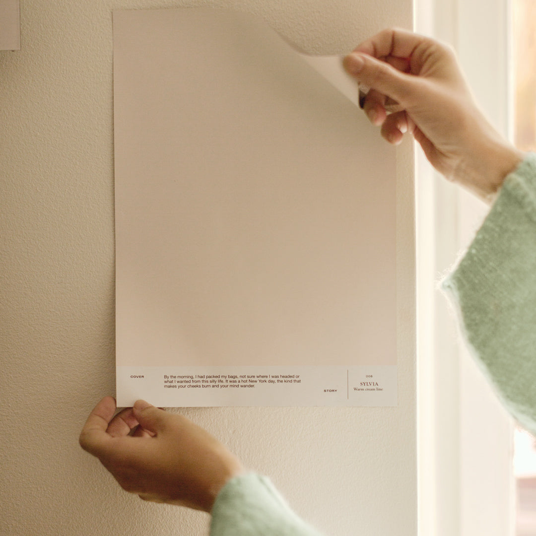
"Explore tones at different times of the day by placing color samples in areas with natural and artificial light. Notice how the shade varies under different lighting. The intensity of color changes with the amount of light"

Quality:
"There are differences in paints from different manufacturers, and this is something that may not come to mind for many initially. The tangible result of a painted surface is rarely visible while shopping for paint, so the choice is often made based on color alone. I particularly appreciate the beautiful matte finish and intensity of tone in Cover Story's paints. Additionally, the odorlessness of the paints is a definite plus, allowing life to continue in the space immediately after painting. Cover Story's paints have excellent adhesion and significantly speed up the progress of the project, as the second coat can be applied in just two hours"
Choosing white:
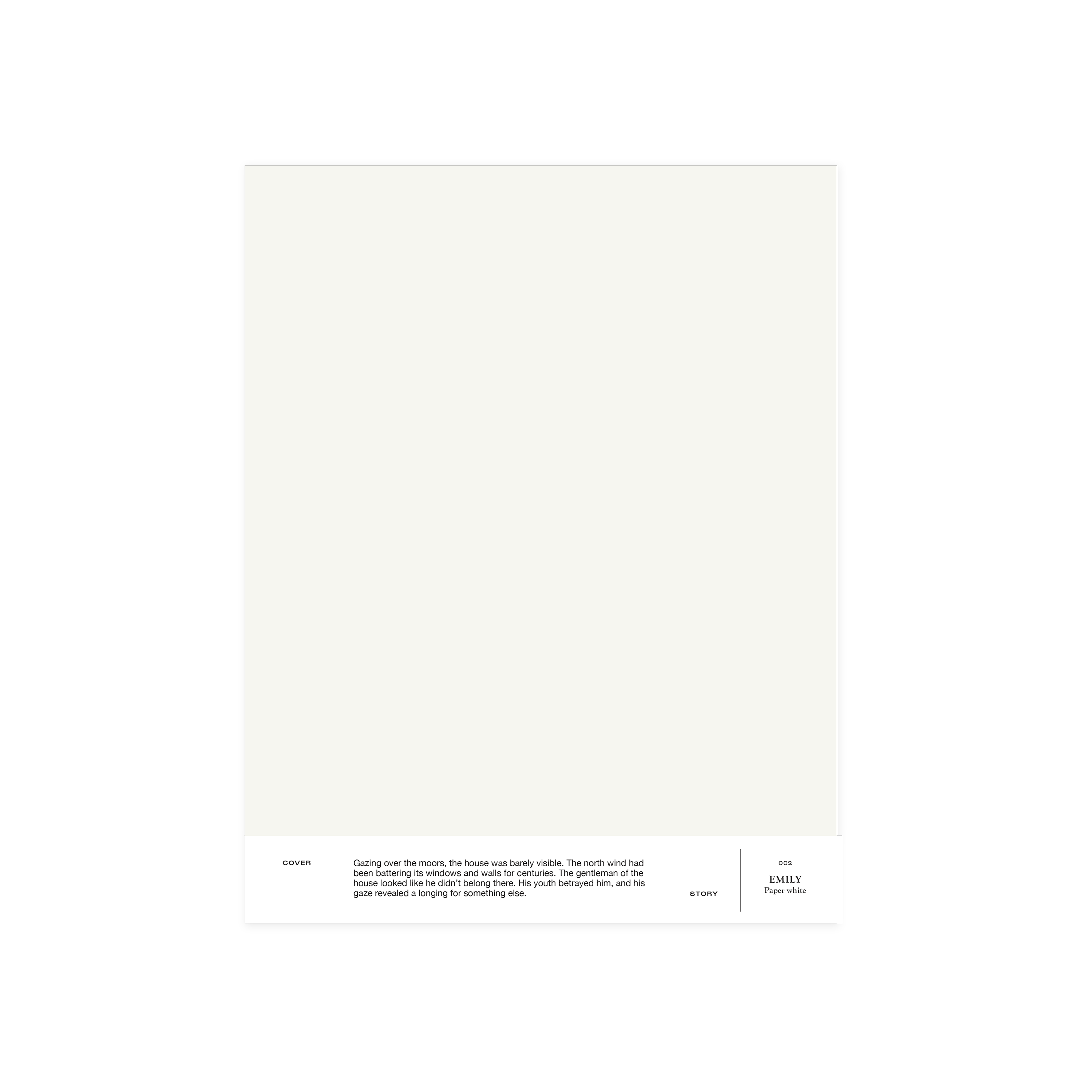
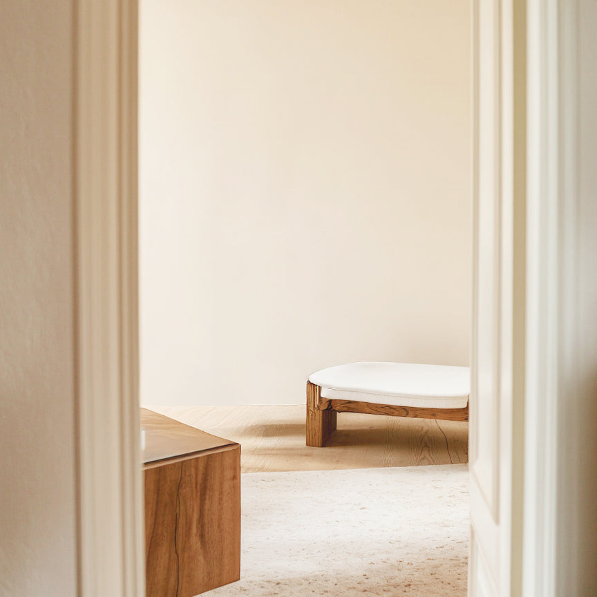
"Finding the right shade of white is an eternal question, especially if it's not a new construction. In renovation projects, the painted white wall surfaces should harmonize with existing white elements if you don't want to redo everything. For the studio, we chose 002 EMILY for this reason, which is an excellent all-around white. Emily does not clash with white trims, doors, radiators, or porcelain sinks and serves as an excellent backdrop for, for example, a reflection wall"
Laura's choices:
LB2 ASTRID, i03 VOLTER, 006 ENID, LB3 MIO, i04 OLAVI, 002 EMILY, 035 UMBERTO
Author: Pinja Kuitunen
Photographer: Katri Kapanen


