Couleur – Color Design From Oslo

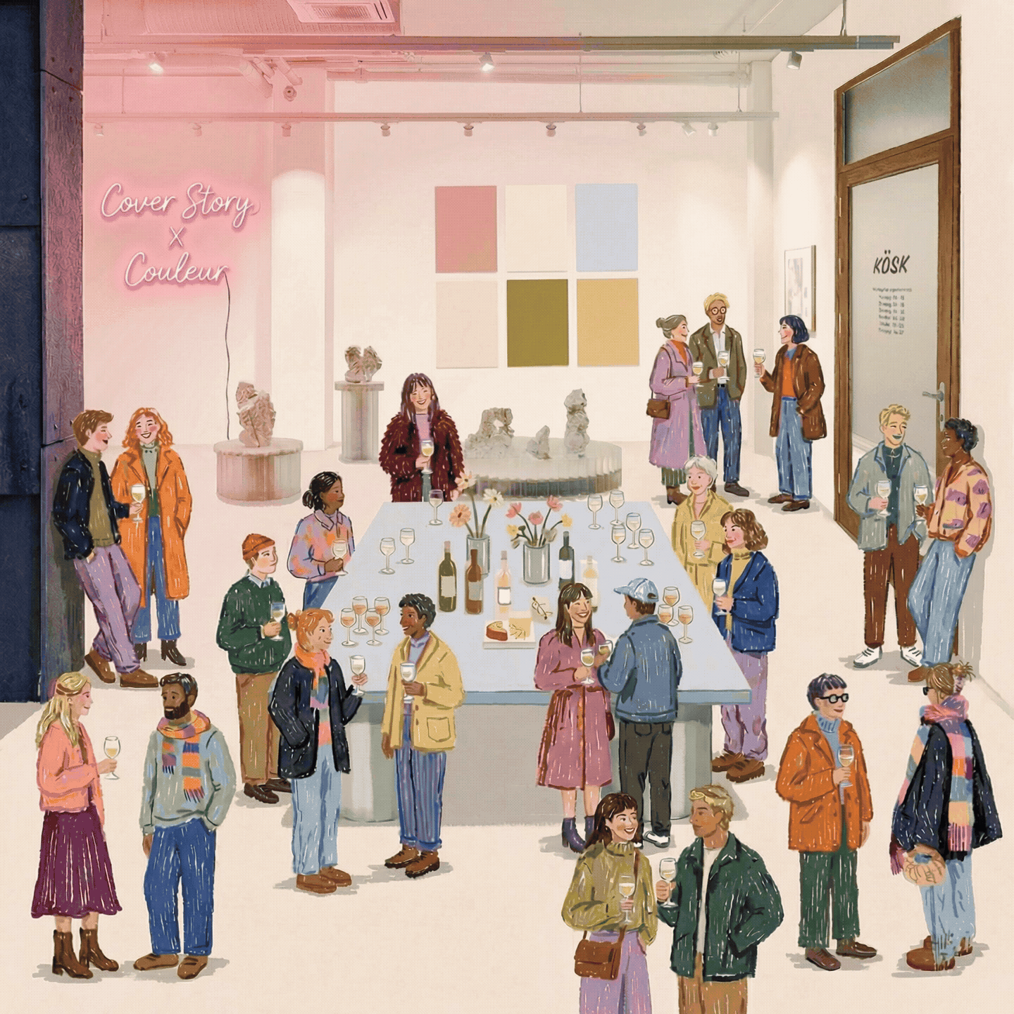
The Cover Story x Couleur interior paint collection brought together two studios united by a strong vision for color, quality, and responsible design. We spoke with Couleur’s founder, Thea Amundsen, and interior architect Anniken Larssen about the unique light of the North and their approach to using color in interiors.
So that our community can get to know you better, could you first tell us a little about Couleur — who you are and what you do?
Couleur is an interior design studio that explores how color can shape our experience of space. The studio was founded in 2020 with the aim of creating meaningful experiences within physical environments. We design thoughtful color palettes and color concepts for interiors — shades that are both subtle and expressive.
Our work is always rooted in the architecture of the space and the quality of light, but it also carries an emotional dimension: above all, we think about the people who live in and use these spaces. Our goal is to create living, harmonious environments where a sense of humanity is allowed to shine through.
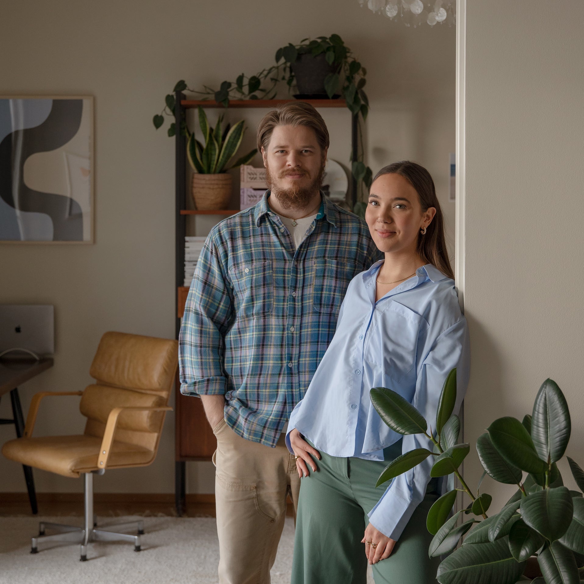
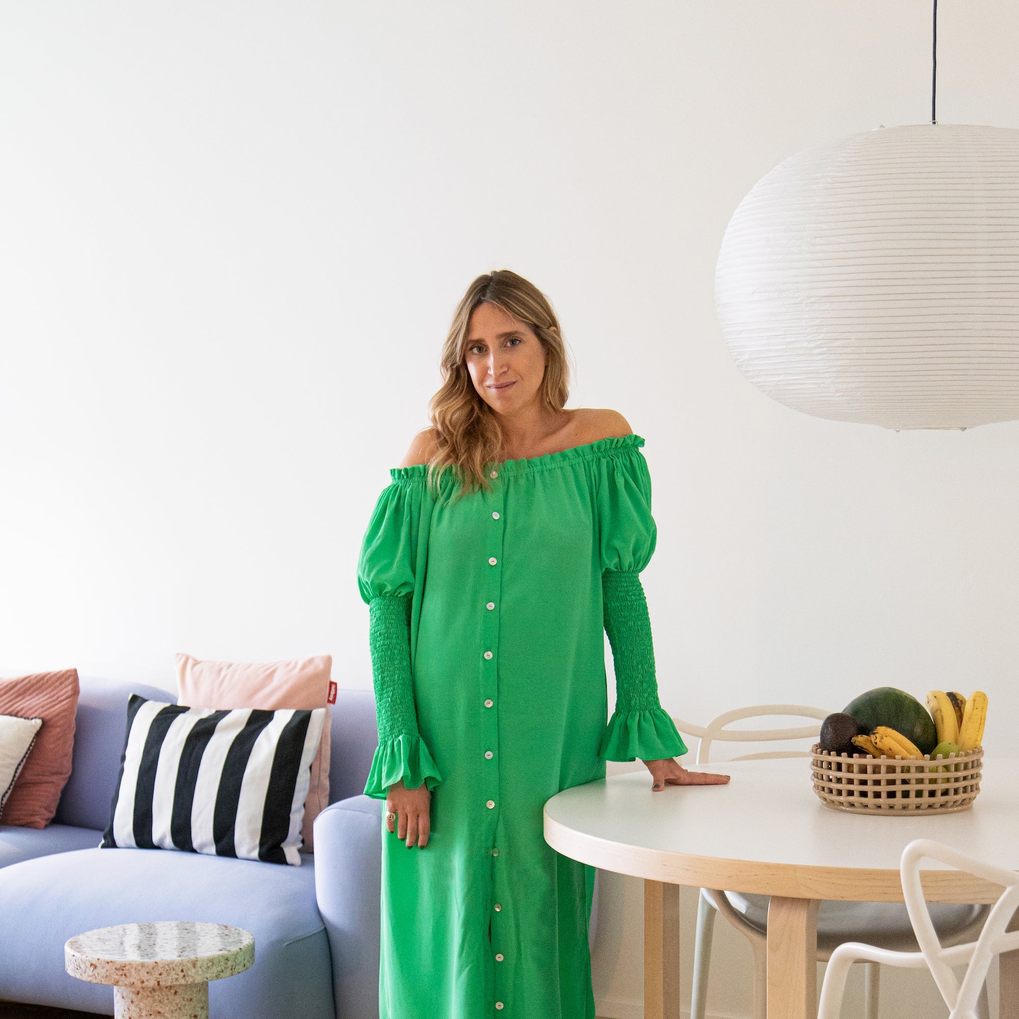
Couleur’s founder, Thea Fremo Amundsen, has over ten years of experience in the interior design field and wanted to establish a studio where color and spatial design could be approached in a new way. In 2024, the team expanded when interior architect Anniken Ore Larssen joined, bringing additional expertise and perspectives to the studio’s work. Today Couleur is a team of three, as designer Louise Korntved Ruud joined the studio in 2025.
In your own words, how did our collaboration first come about?
The collaboration began when Anniken visited Cover Story’s flagship store in Helsinki. There, she met Cover Story founder Anssi and immediately connected over a shared passion for color and material quality. He spoke about Cover Story’s refined approach to color and their strong commitment to sustainability — something that resonated deeply with Couleur.
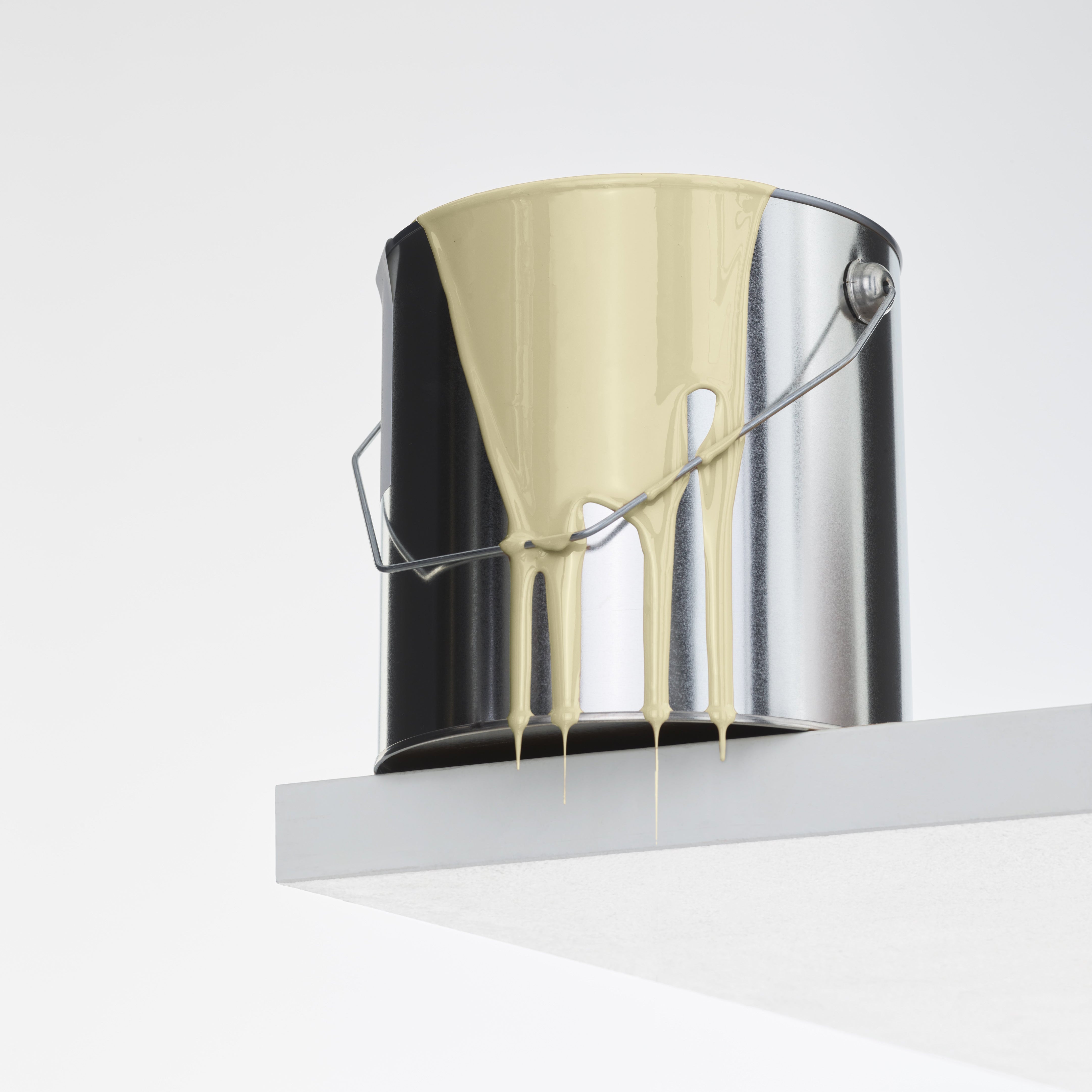
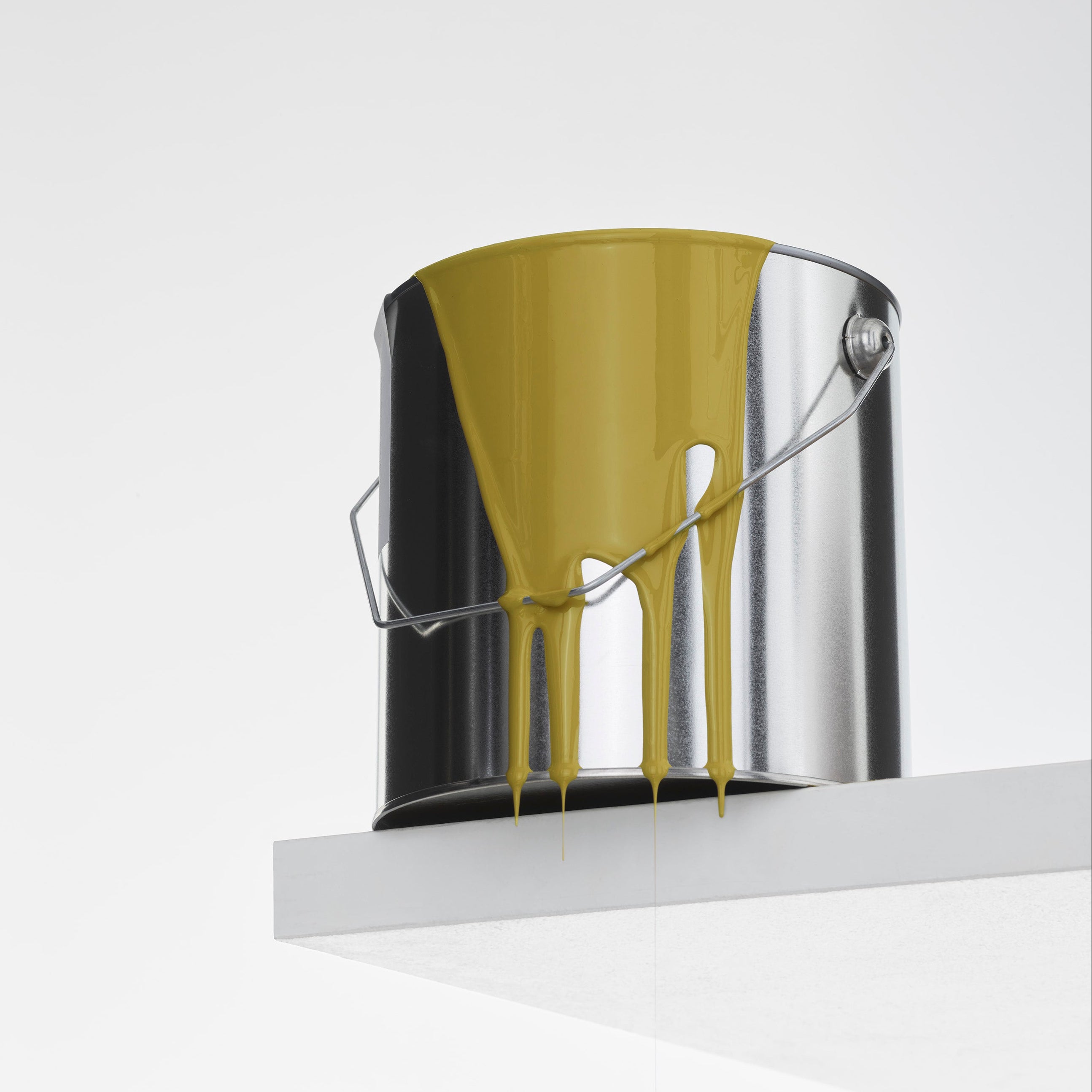
We were especially drawn to the fact that Cover Story offers durable plastic-free paint that’s also easy to apply, made with high-quality pigments, and can even be used on previously treated surfaces — a rare combination in the world of sustainable paint. This innovation was exactly what we were missing in the Norwegian market and made us eager to collaborate with Cover Story.
It felt like a natural match: two studios equally passionate about how color can transform and elevate a space, without compromising on quality or the environment. We both see color as the most important element of the interior, with the power to shape atmosphere, mood, and presence.
How did the design process for the new paint shades start, and what was it like for you?
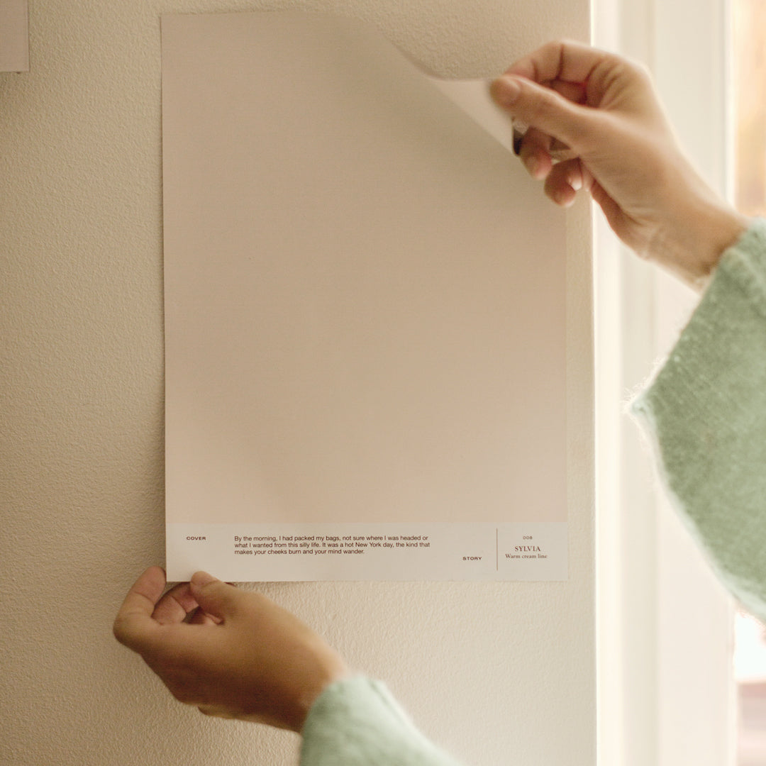
We began by exploring how light behaves in our part of the world and change with the seasons — how the crisp northern winter daylight and warm summer afternoons influence our perception of color and atmosphere. From here, we developed color hues that could shift beautifully throughout the day, revealing new dimensions as the light changes. Could we capture the feeling of light at a given moment?
The color collection we have developed for Cover Story consists of our all-time favorites that have been tried and tested over time as a part of our studio work. These colors have then been adjusted to perfection, forming the colors we have missed over the years.
When we work with color we are always looking for that quiet complexity that keeps a space interesting without being overpowering.
"Could we capture the feeling of light at a given moment?"
How would you describe the colour palette of your collection? What kind of spaces and uses are the shades designed for?
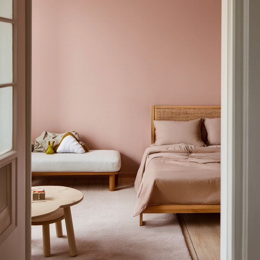
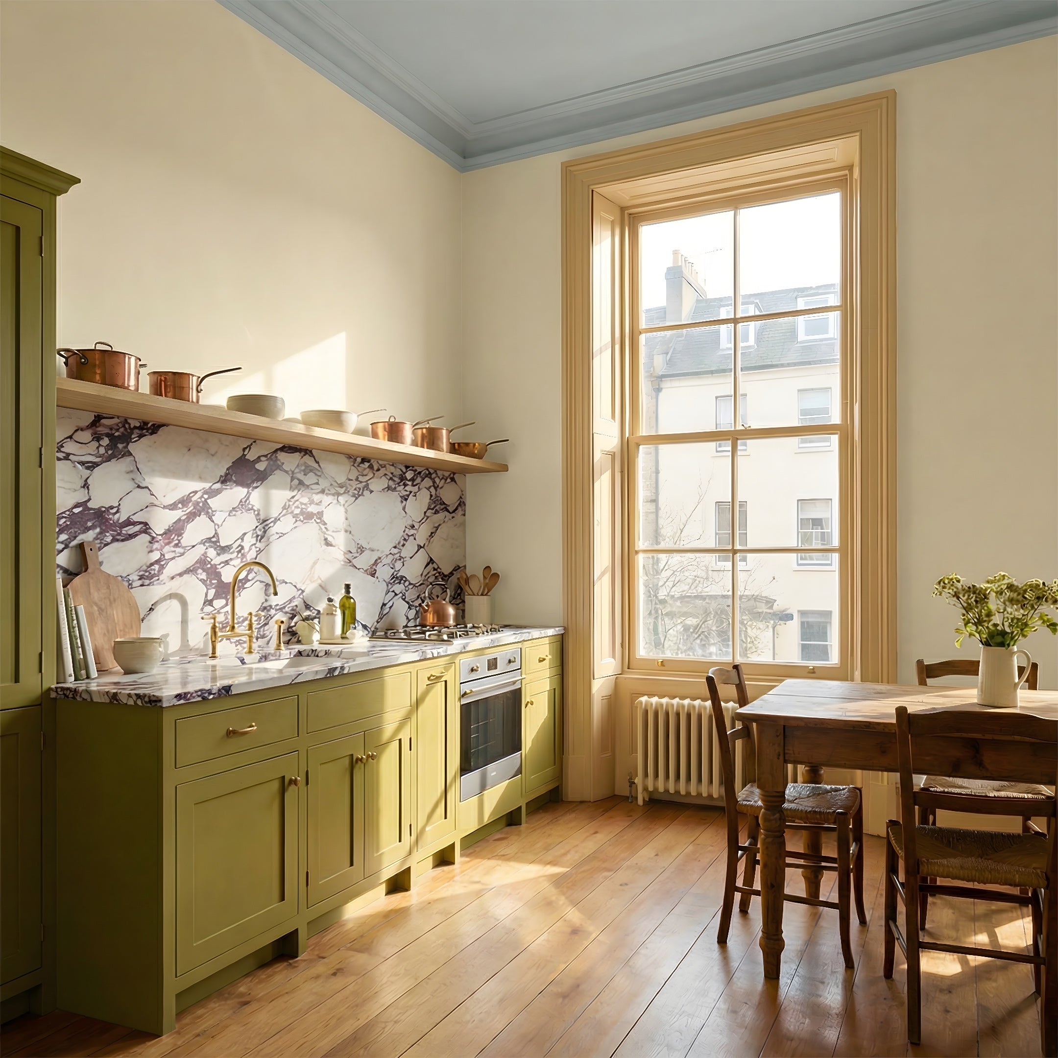
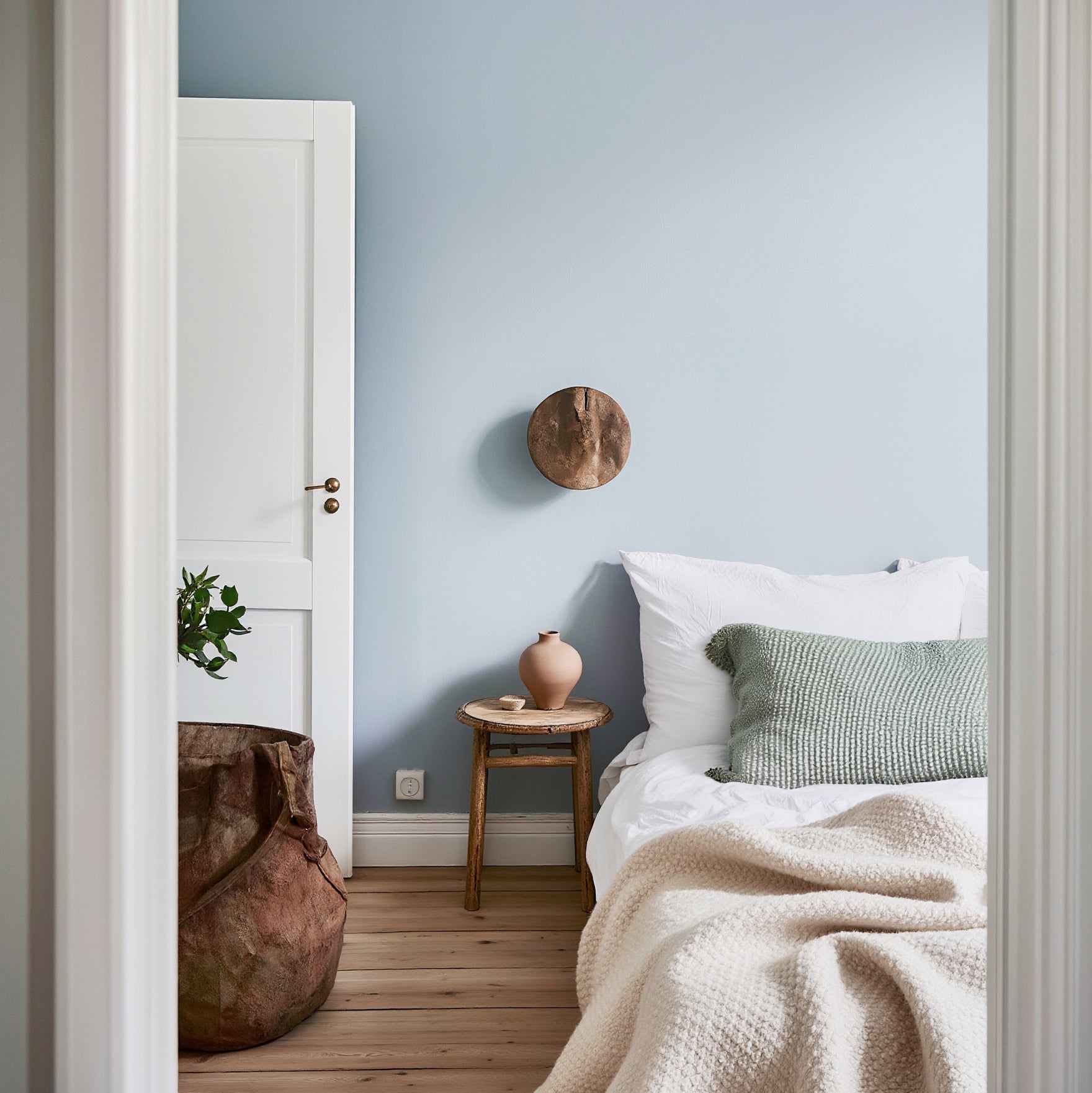
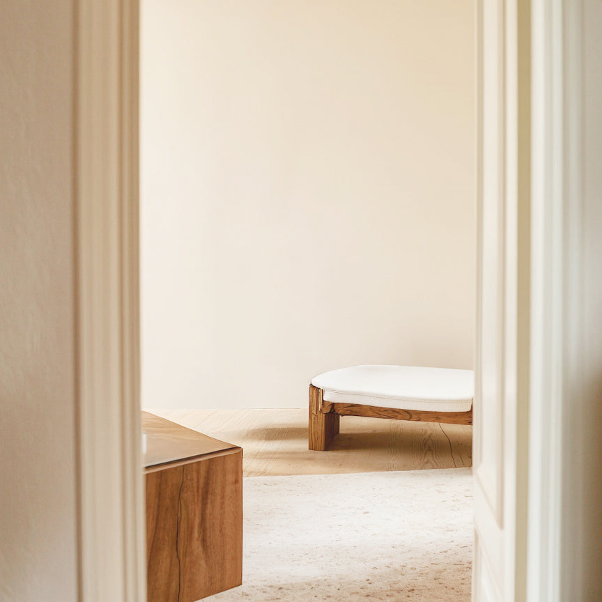
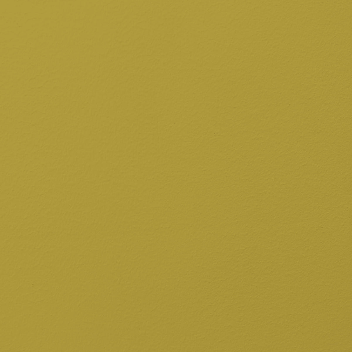
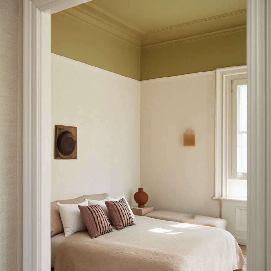
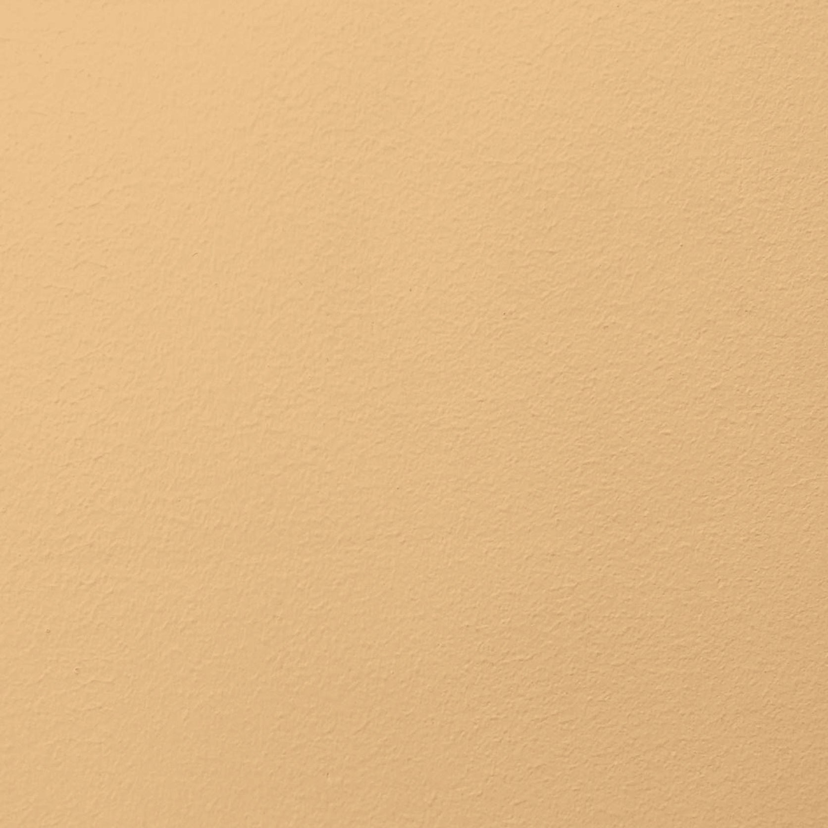
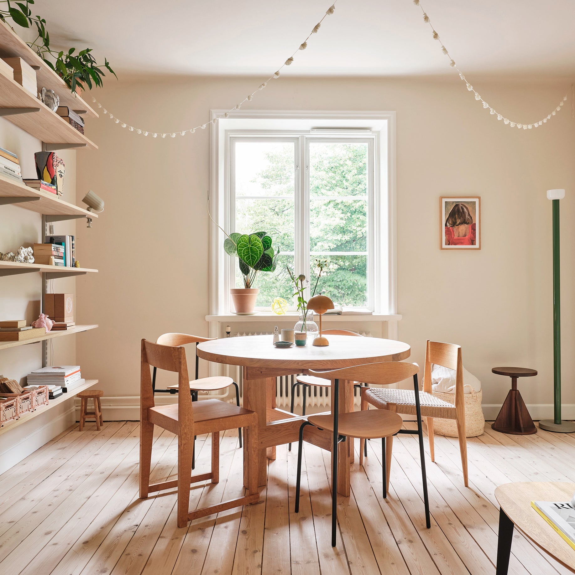
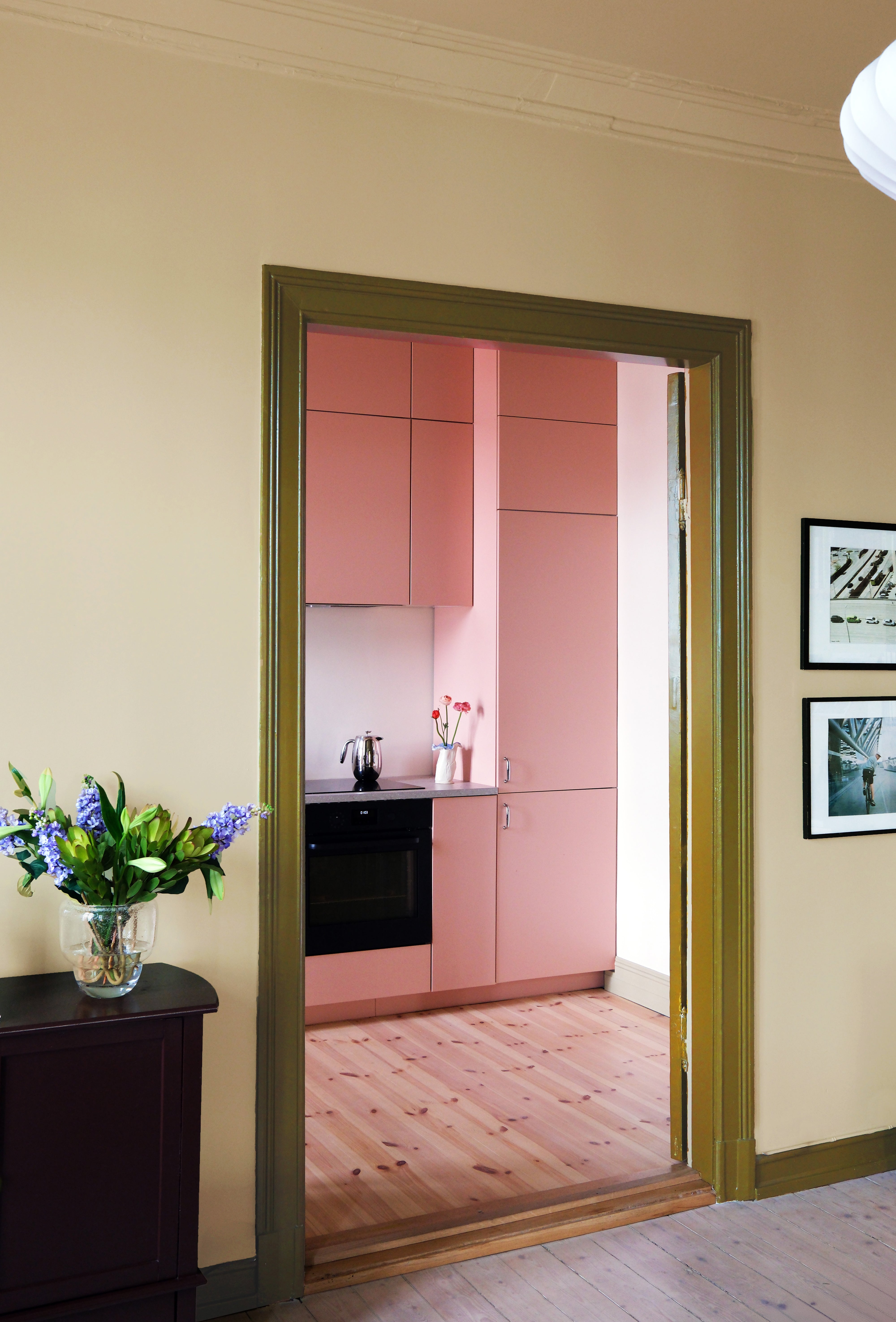
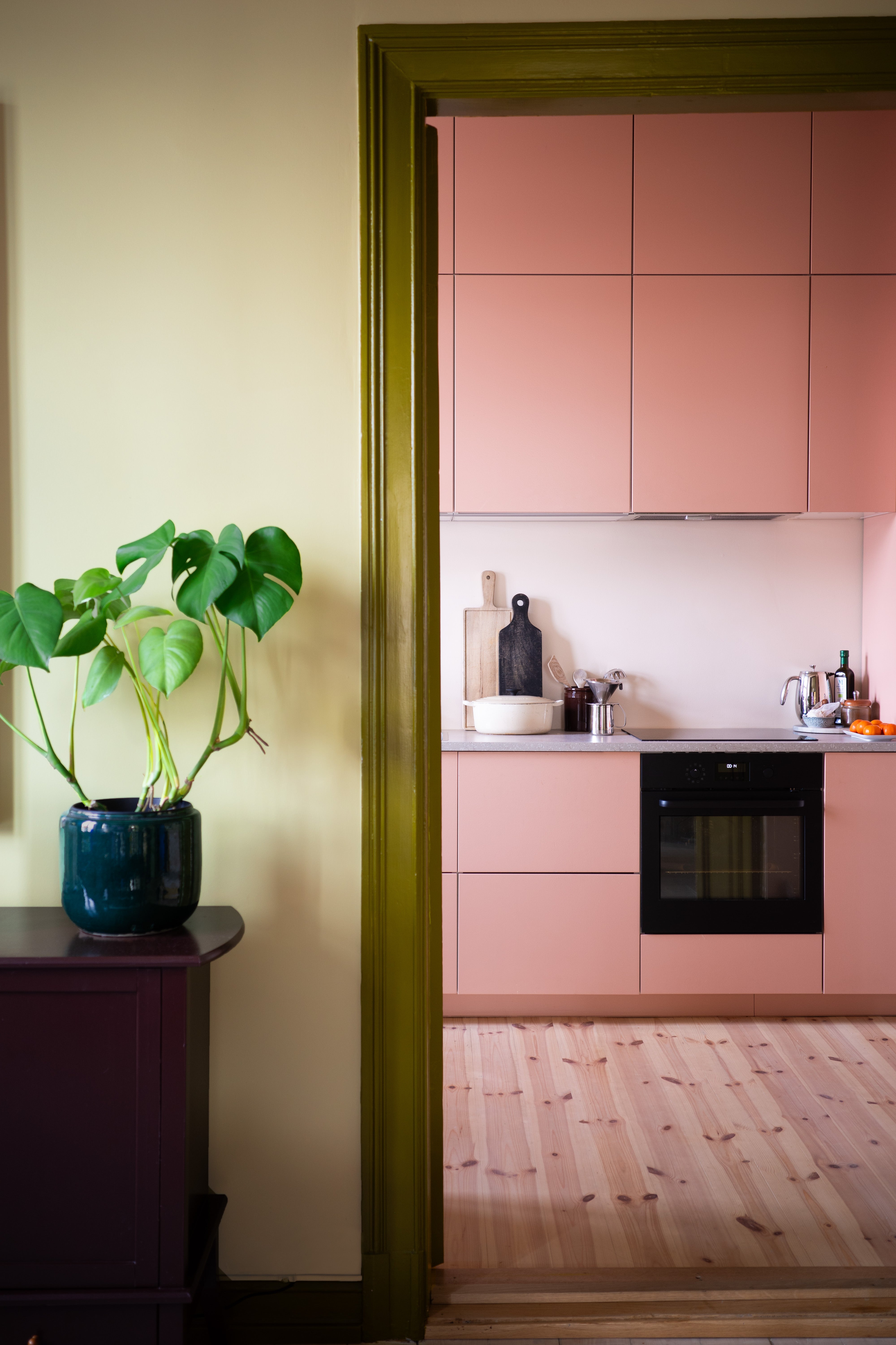
The palette consists of soft base colors that capture the light and stronger accent colors for complexity. The tones are meant to be mixed and layered across all surfaces: walls, ceilings, doors, staircases and kitchen cabinets.
Our selected colors combine great with each other, and also complement Cover Story’s existing library of colors. Whether used tone-on-tone or in contrast, the colors are meant to support the spaces and make them feel lived in — tactile, personal, and quietly expressive.
We love when colors interact in ways that let the eye wander and discover subtle shifts in nuances and contrasts. Colors bring energy into the room.
What kinds of materials or interiors would you combine the new colours with?
The most important thing for us is that you combine the colors with your personal style and belongings, to create a home that’s meant to last. In our projects we always seek to tailor the color combinations to the people that are going to live there, fitting into the narrative of their lives.
What would be your dream project or space to see these shades in?
We imagine these colors alongside rich, tactile materials such as burl, warm woods, glossy tiles, shiny metals, and patterned fabrics. They pair beautifully with vintage furniture and objects with a sense of history. But they also hold their own in more minimal, modern spaces — adding warmth and dimension without overwhelming the purity of the design. The palette is meant to invite layering, texture, and personal expression. So, yeah… we want to see them in all kinds of heartwarming homes. As the core of well-beeing.
Could you also share a bit about Oslo’s lifestyle and culture? How are things there? What do people in Oslo value in interior design?
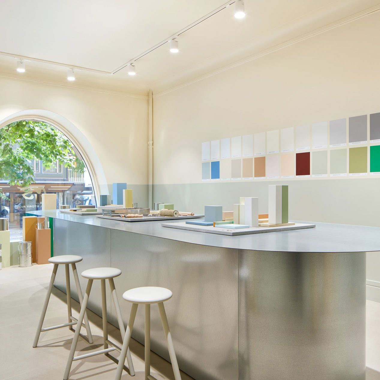
Oslo is a city that embraces both nature and city life. We have just moved into a new showroom and office space on street level that allows us to part-take and connect better with our community.
We see a growing appreciation for quality, craftsmanship, and designing spaces that feel personal, tactile, and connected to their surroundings. Combining natural materials and thoughtful color palettes play a big role. Designing a home is about creating spaces that feel balanced, grounded, and real.
Cover Story x Couleur