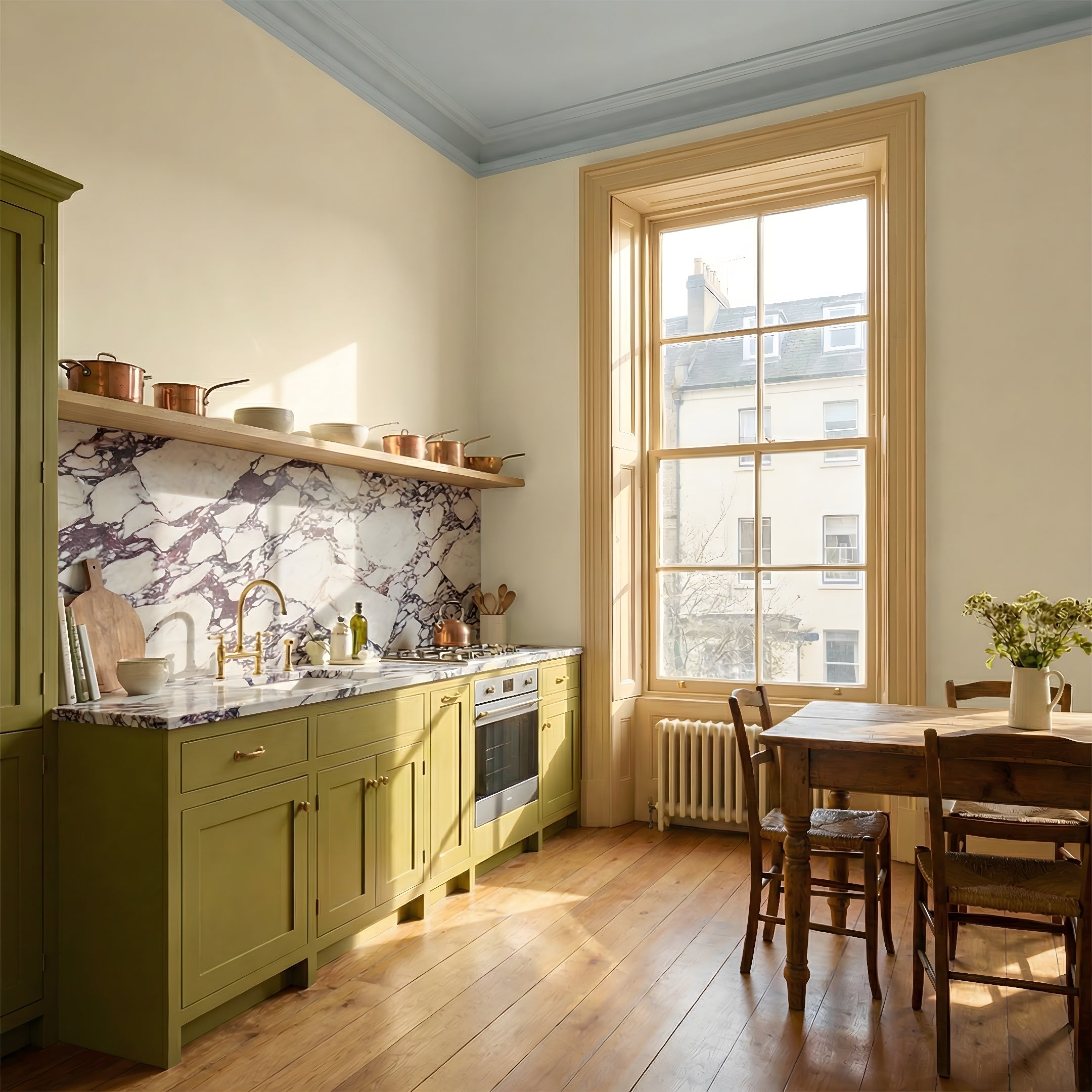
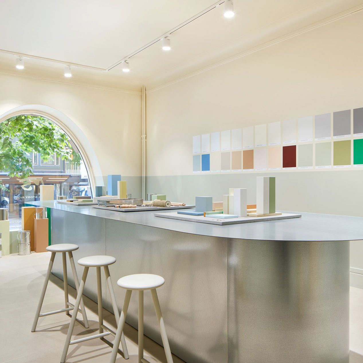
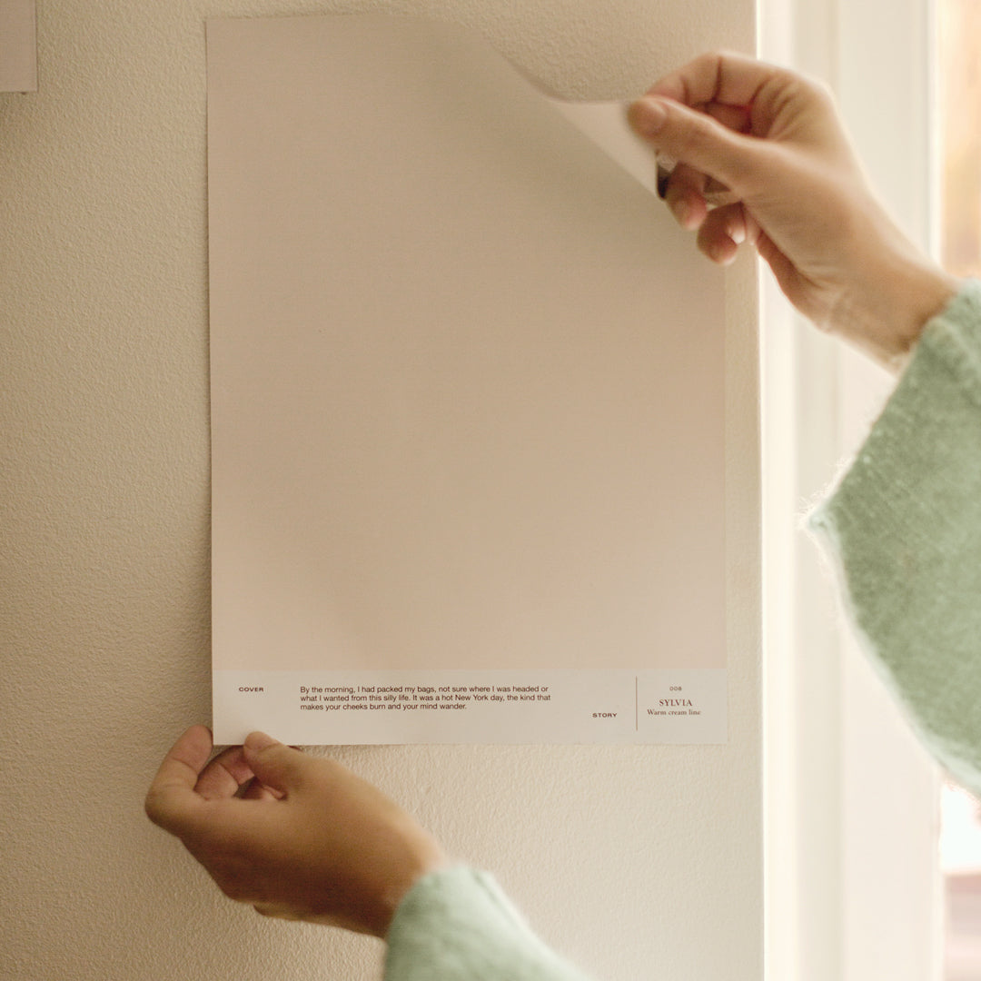
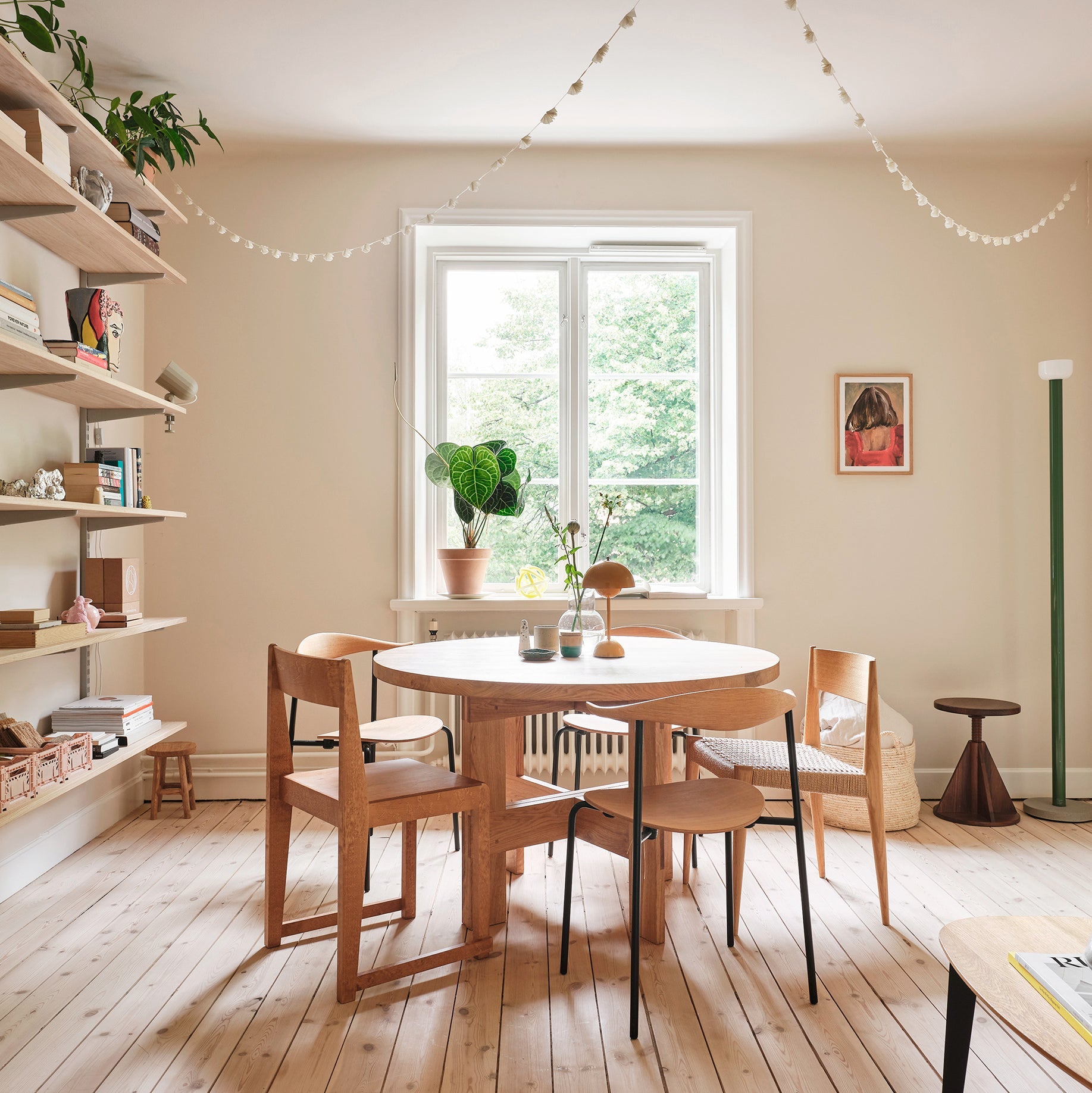
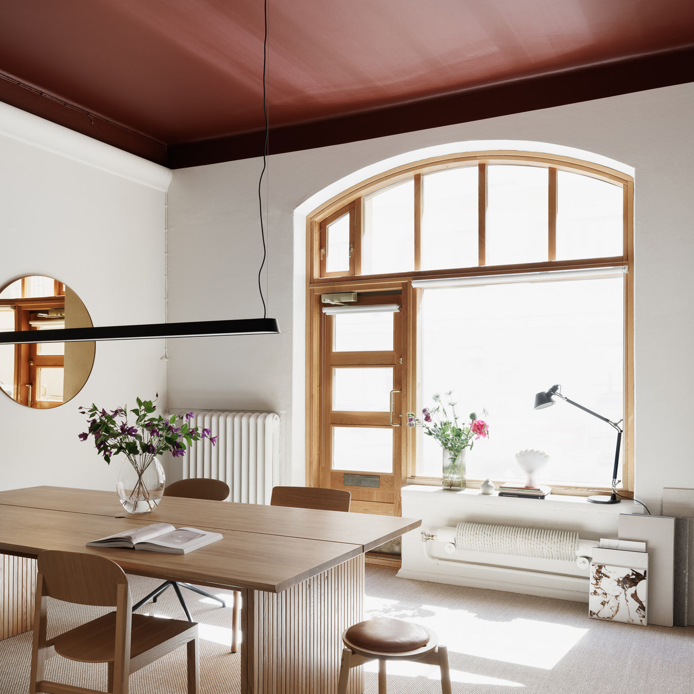
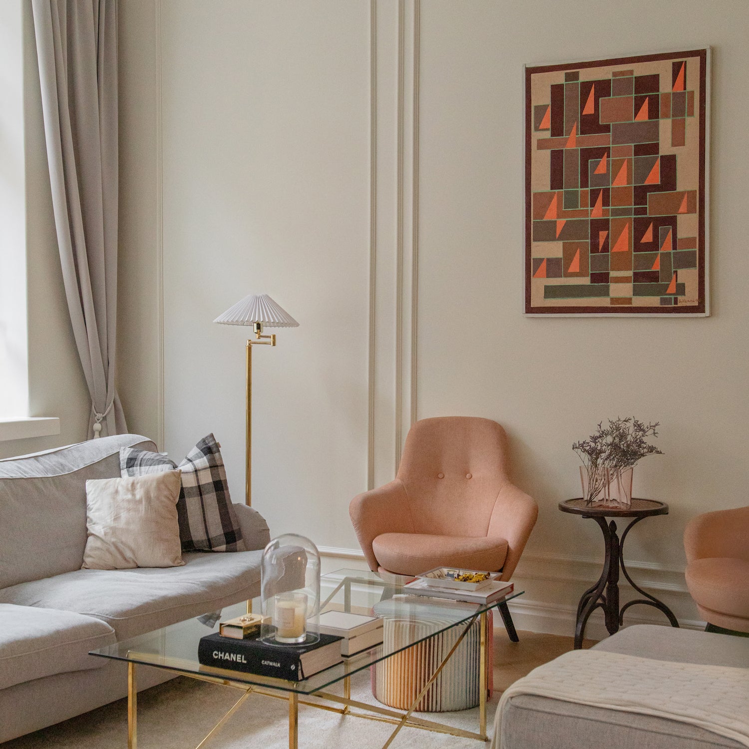
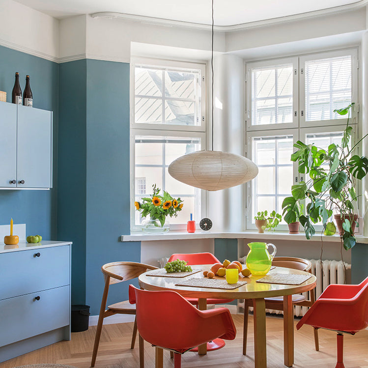
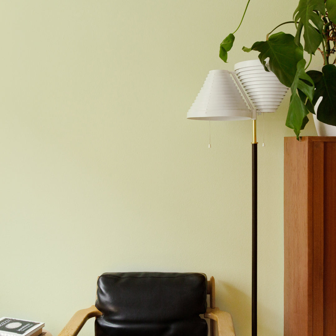
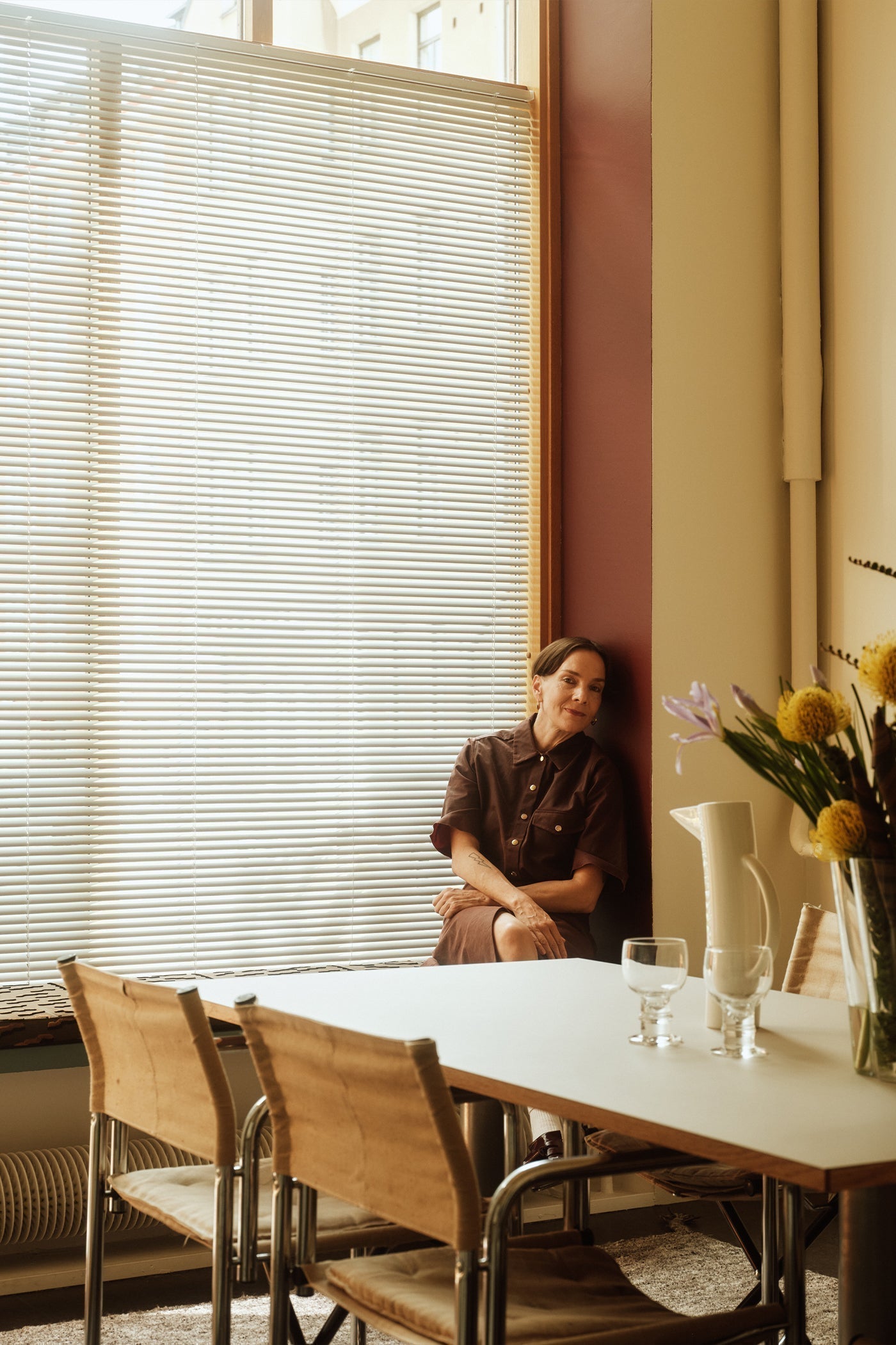
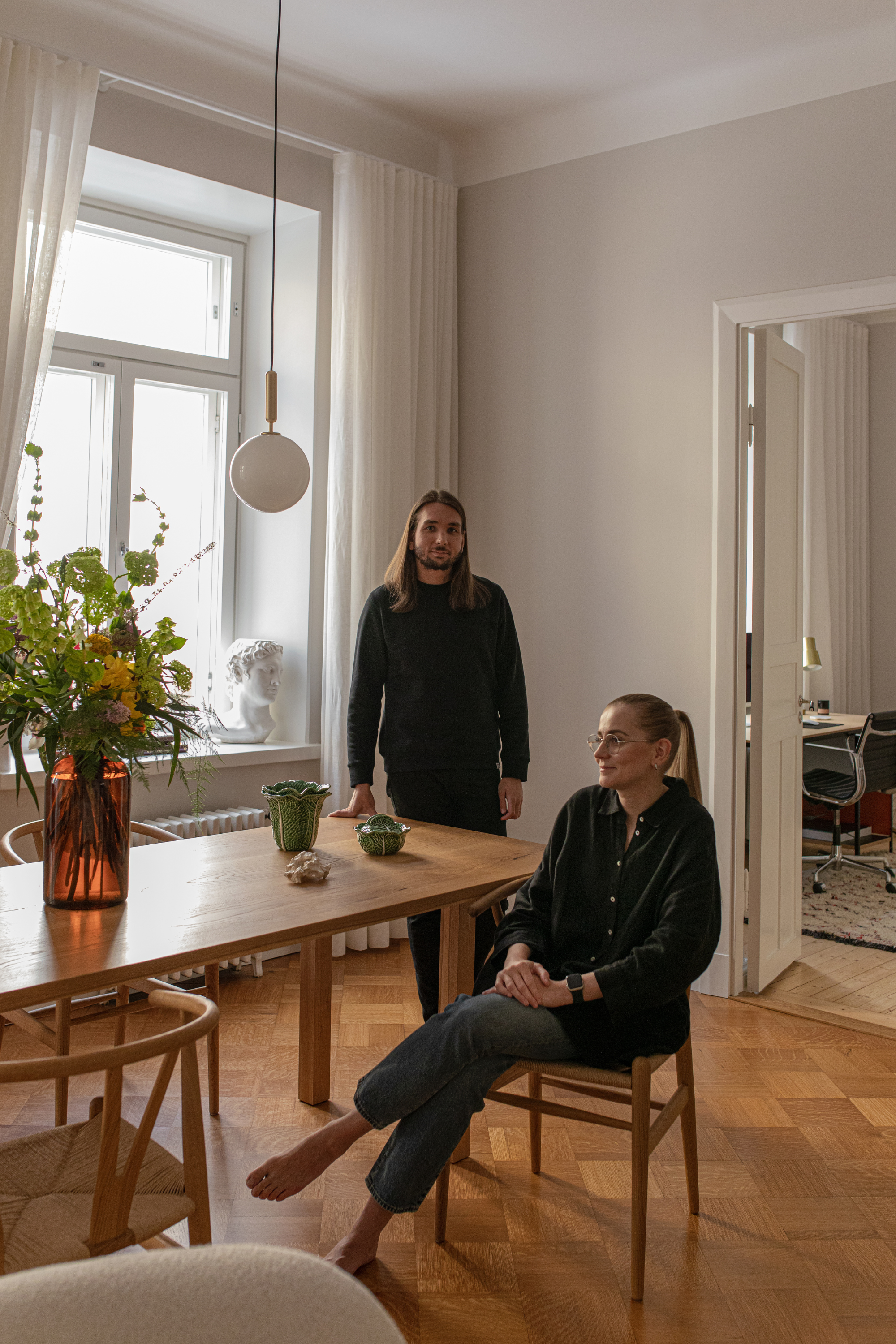
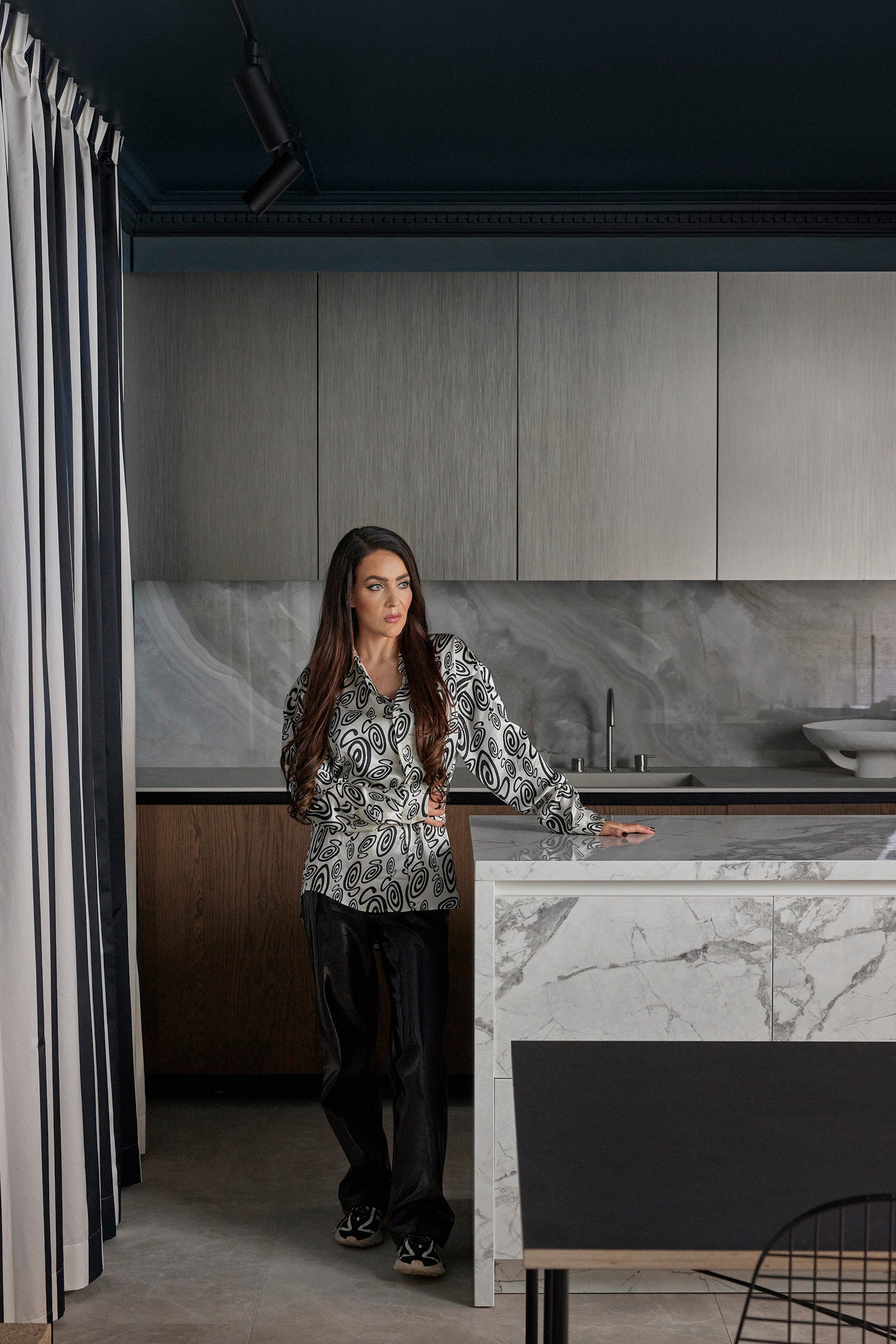
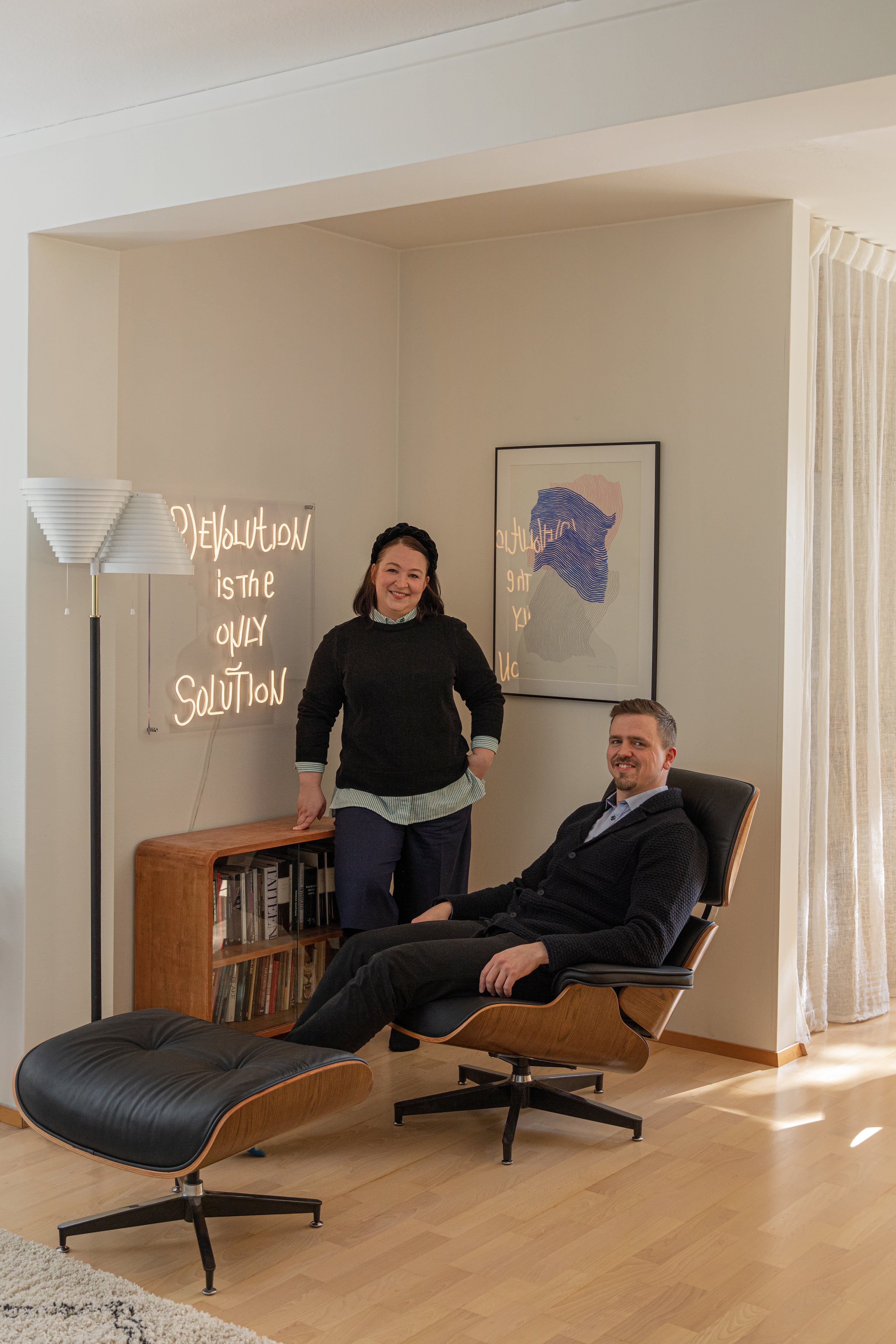
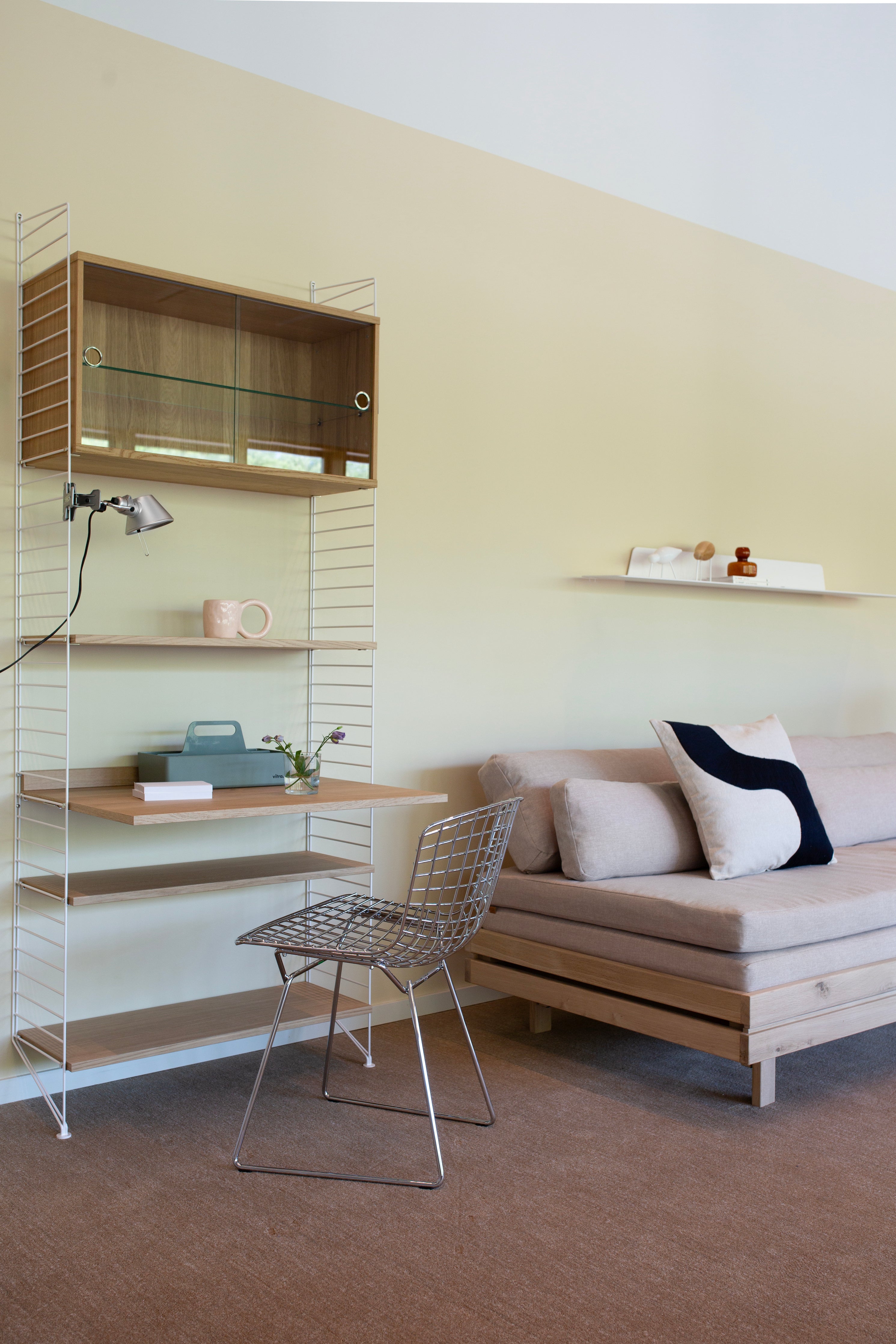
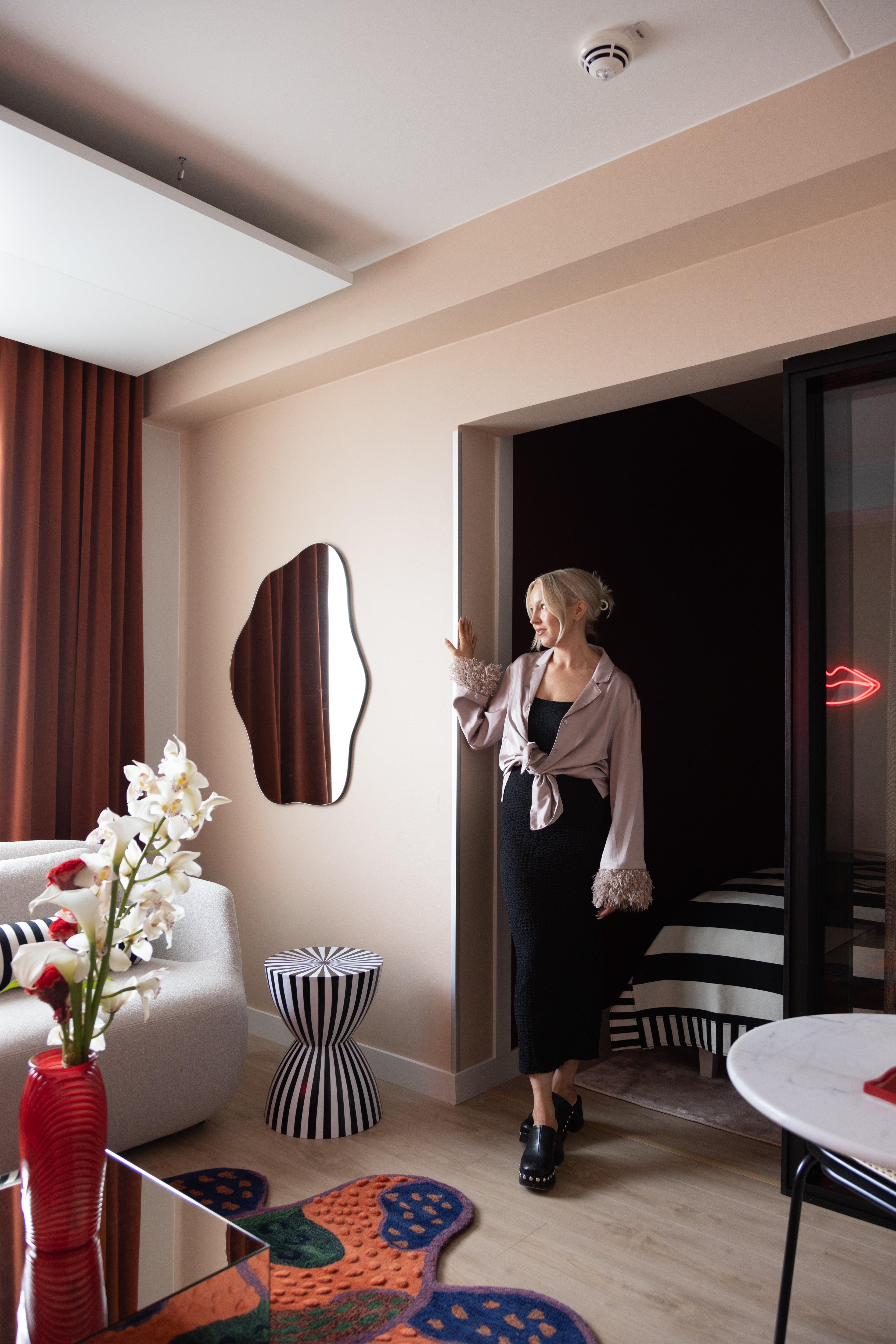
 I compare the initial process of designing this home to collecting a bag of loose candy. I gathered wonderful colors, objects, furniture and atmospheres into my bag, closed it, then started picking out elements one by one for specific areas and ensembles. I tested how they worked together, and explored what else was needed to keep the balance, the elements all spinning in a big three-dimensional puzzle.
 We tend to be cautious with colors and use them sparingly, but that risks the whole package falling short. In this apartment, I challenged myself as a color user and wanted to ponder what makes the good kind of colorful atmosphere, a kind of cozy, soft, yet rich spectrum of materials and textures.
 I did over 30 different color definitions for this home, using a palette of different shades and materials.
The colorfulness I created is not just colorfulness in individual pieces of furniture or wall surfaces, but it is colorfulness together and across. The different pieces fall into place, creating balance and harmony. I did over 30 different color definitions for this home, using a palette of different shades and materials. In my own color studies, I find it essential to find the balance of the whole. In this home, a long walnut wall softens the colors – it forms the backbone of the totality and provides a strong counterpoint to the colored surfaces. Looking at the room from different angles, new color partners and material pairings emerge. The same objects come to life in different ensembles – seen from one direction they can be accentuated, from another they can be softened.
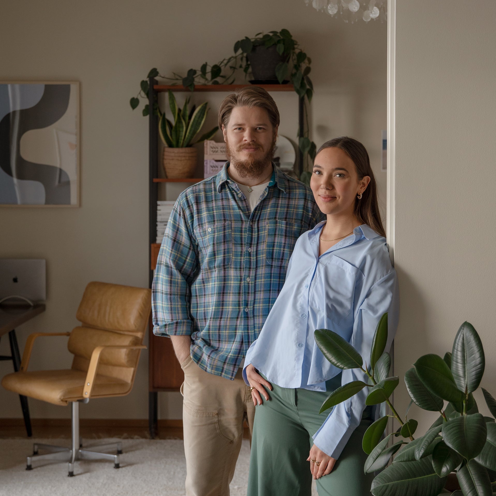
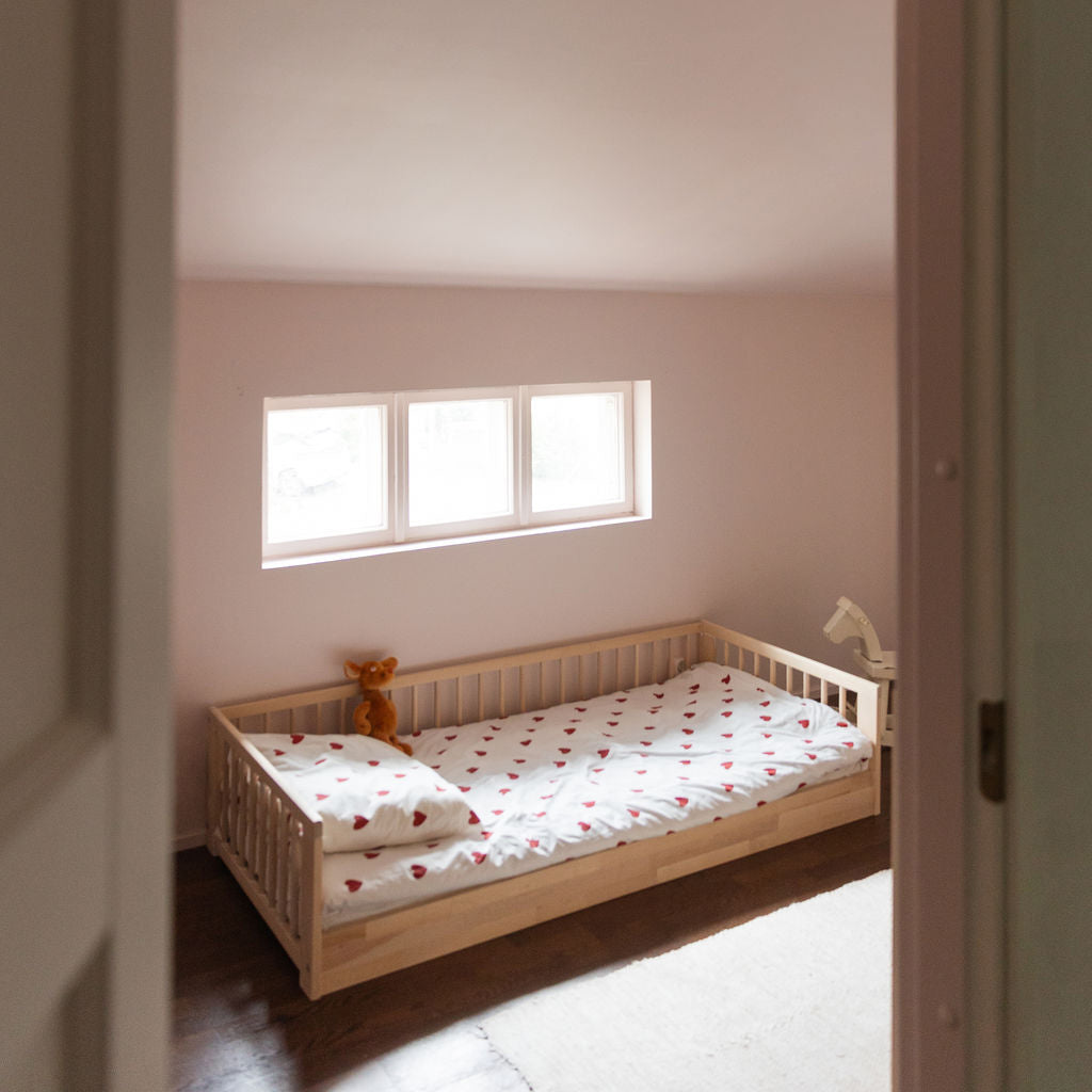
 I imagined a young family living here, with one child and maybe another on the way. This is a popular suburb for families with children. It's important to me that the character of the area and the house speak the same language.
I believe a cozy atmosphere can be created using all the elements. It's all about how you use them, what you juxtapose them with, what shades of gloss and matte you play with, how you perceive the space. For example, in this house I wanted to keep the bathrooms intimate and, conversely, open up the space towards the big windows. It's a kind of reciprocity.
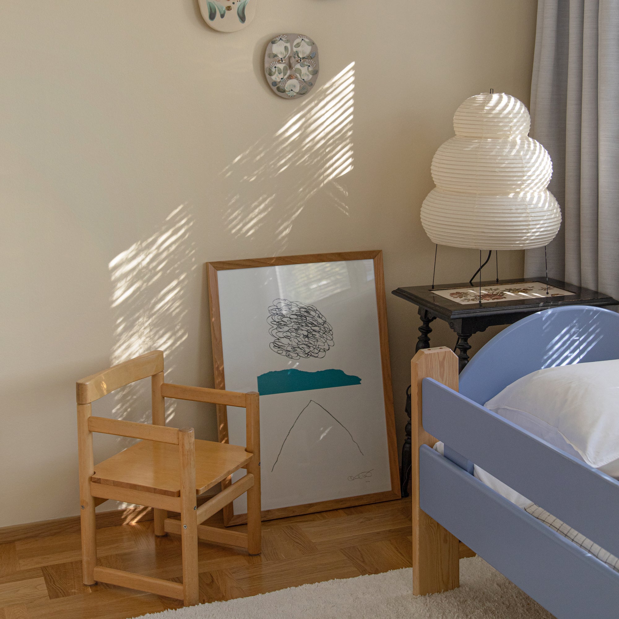
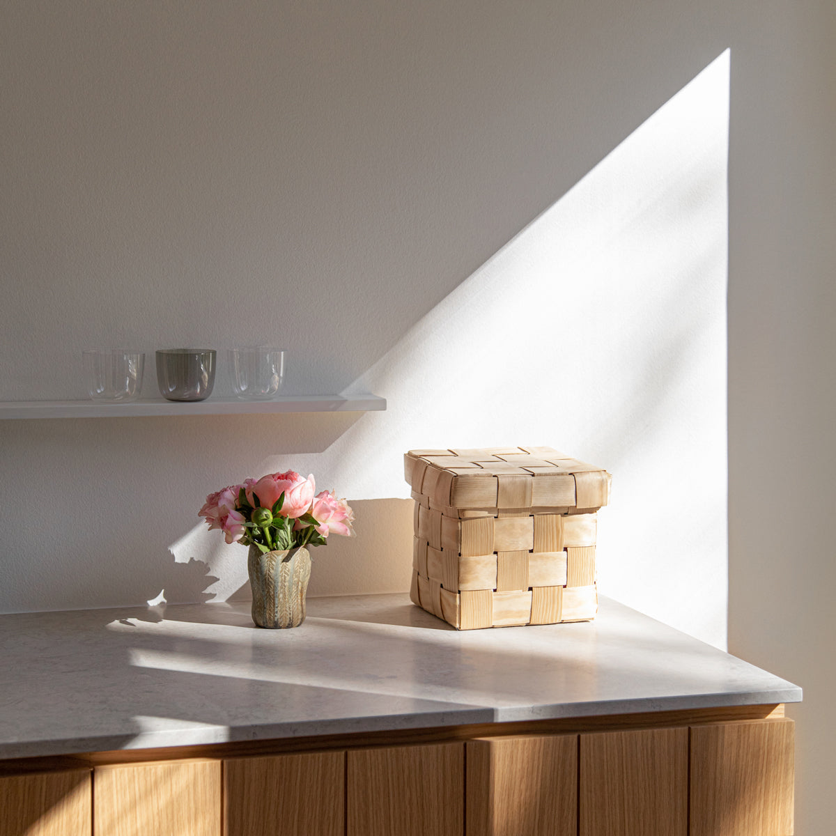
I often choose one overall shade for each space. Here it's a light, neutral beige. It creates a very subtle transition towards a strong wood finish. The lightness sort of softens the clash of tones.  Admittedly, caution with color is also part of the experiment. You have to test the colors and get to know how they work. Becoming a skilled color user doesn't happen overnight. I do a lot of research into fascinating places and spaces that speak to me, breaking them down and exploring what elements, materials and colors they are made of. I'm often surprised by what I find. I learn new things from this exploration and it gives me inspiration for my own interior design work. The buildings of Bauhaus, Le Corbusier and Aalto have given me a lot to explore, as have paintings and art. I have seen how the same elements are put into place elsewhere.
 Colors live spatially. They are never still, but move constantly according to the season, the day and the things around them. It's fascinating. We live in darkness, rain and sunshine. So spatially, it's very important that the ensemble works. A home is not truly at its best if it is only so in a certain light.
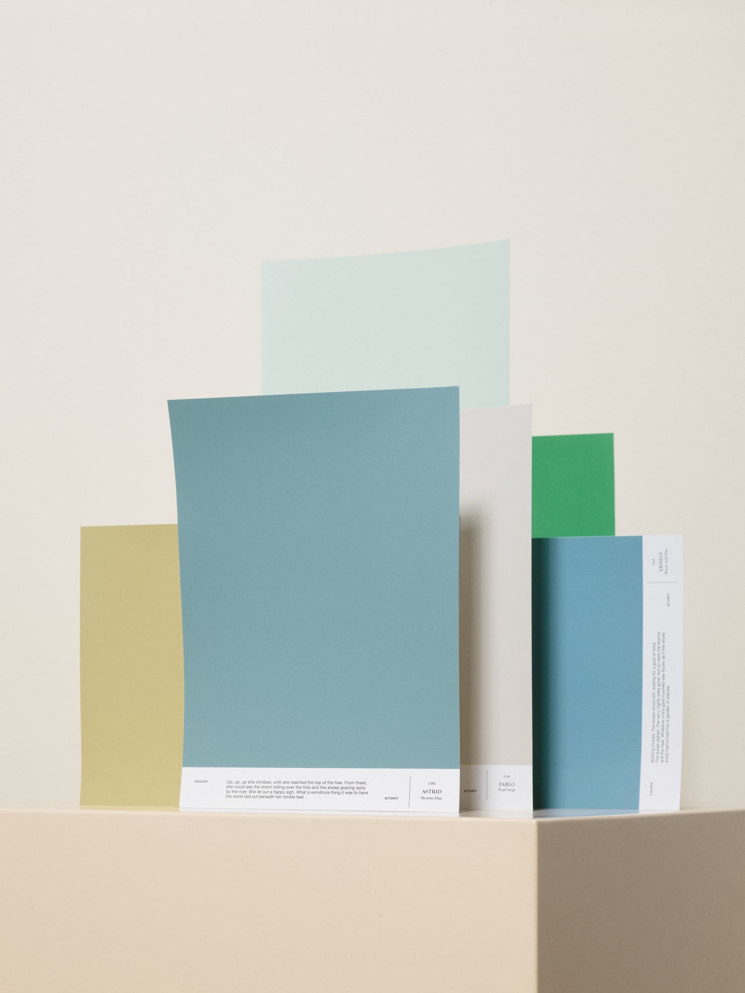
Ulla Koskinen Color palette for one home:

009 PABLO, 018 ERNEST, 029 JACK

030 VIRGINIA, LB1 AUGUST, LB2 ASTRID
Shop the Ulla Koskinen color palette here.

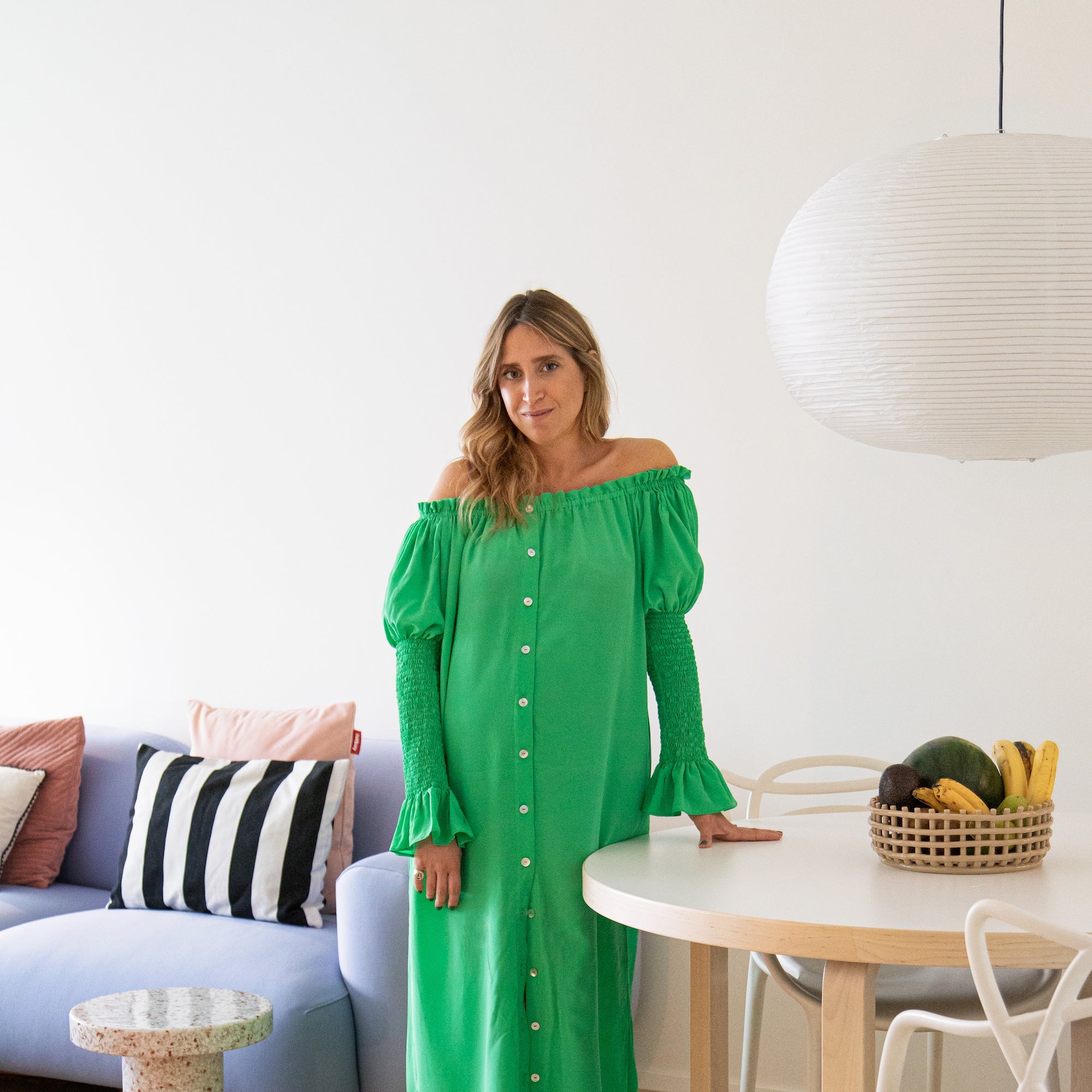
Ulla Koskinen is a interior designer and Editor in Chief of
Asun magazine.


