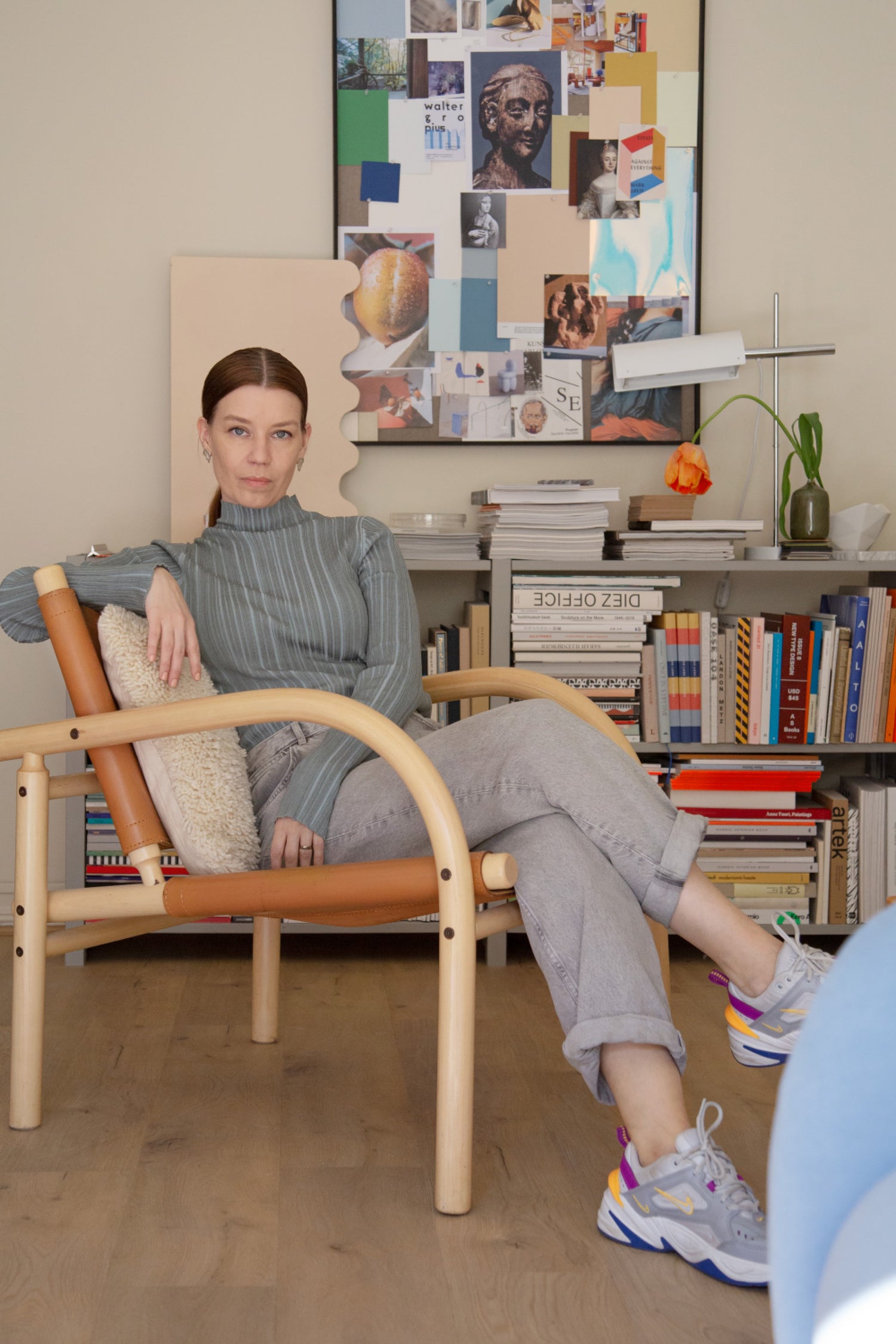

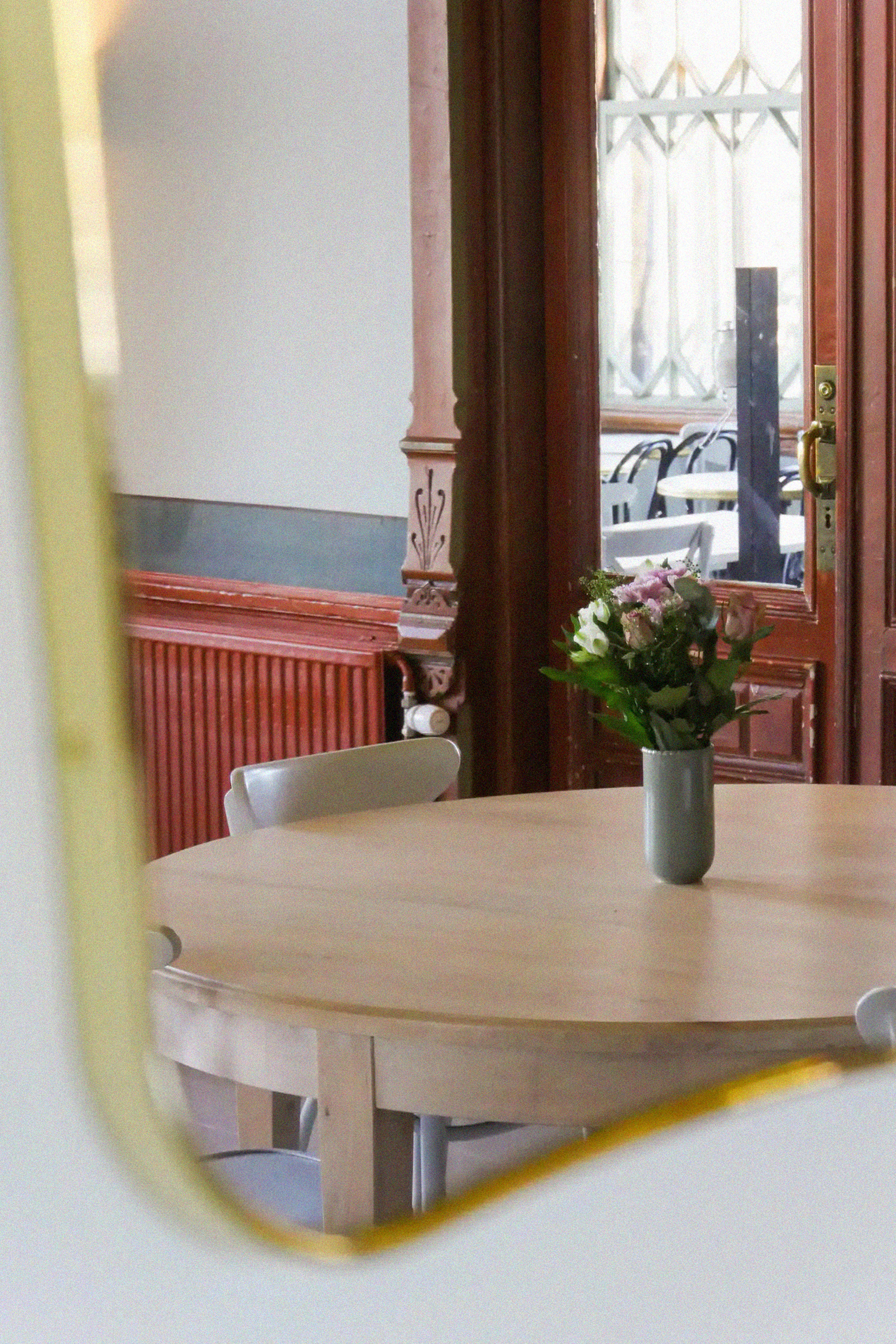
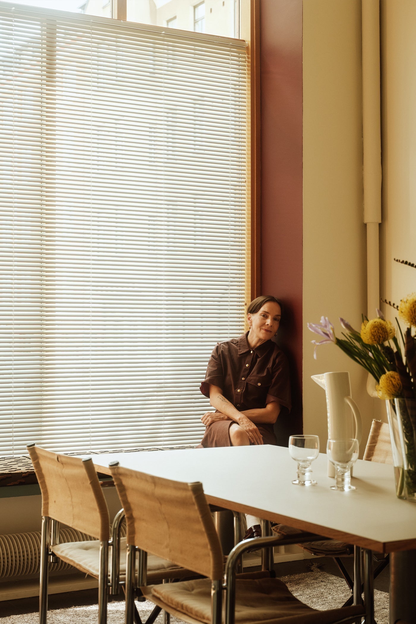
The office of Cover Story's Design Director feels peaceful as she observes the bright afternoon sun traversing along a beige wall. Päivi Häikiö knows that the atmosphere of a space is the sum of its parts. Shaded by decades old maples, with colorful details complementing its stone floor, somehow this Punavuori office space feels just right.
What does this space mean to you?
This space is my studio, a space for creative work. It's really important to me that the space I work in is my own – I'm quite a tormenting aesthete (at least to others). It's also important to move from one space to another, from home to work, because during that trip you get things sorted out in your head.
What’s the trick to it feeling so atmospheric?
The feeling of this space is largely created by the fact that it's on the ground floor – the window is big and it brings life and atmosphere inside. I particularly like the trees in front of the window, they come alive with the seasons, and the light filters beautifully through the sparse branches. The space also comes alive with the seasons, as does the warm beige shade of the walls.
Where have you bought your furniture?
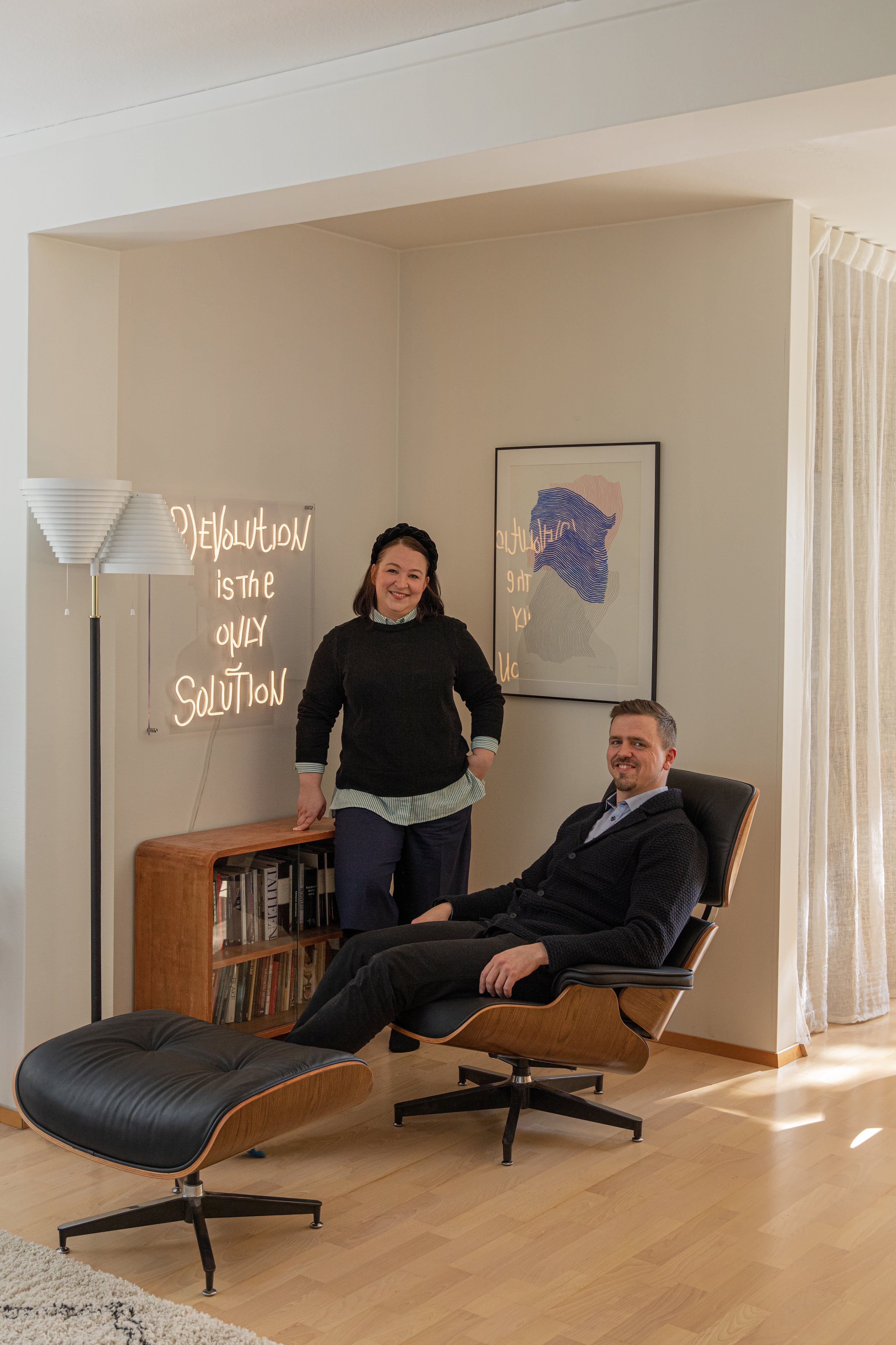
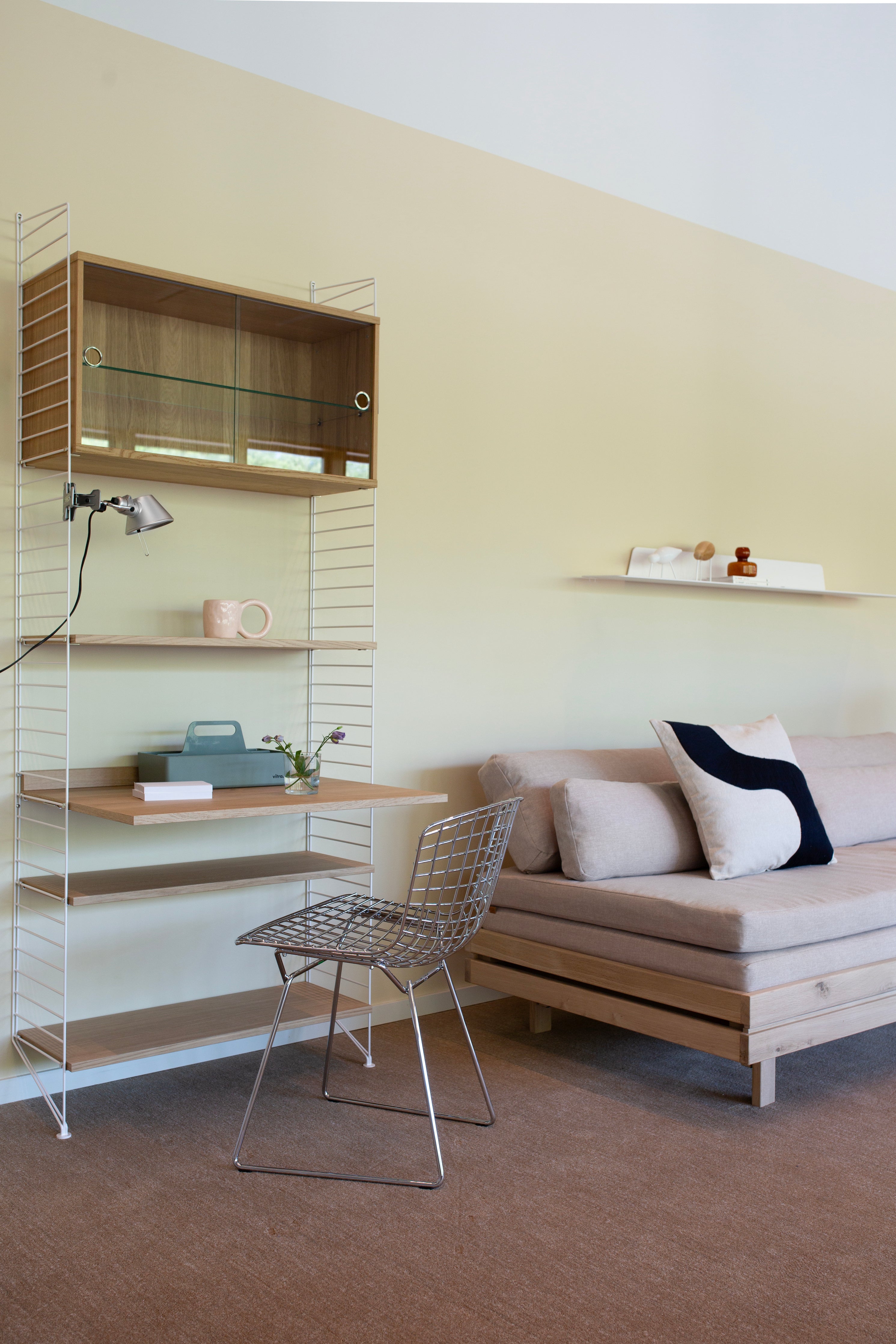
Most of the furniture is vintage; old Artek, Kukkapuro, Lundia and Fritz Hansen, that I’ve found at auction. Some are related to projects I’ve loved, like a desk from Nikari or a shelf from Lundia. And some are just my favorite things, like the Toio lamp by Flos, which gives fantastic light, or the Ben af Schulten lamp, which has a beautiful form.

You have a lot of great objects, pictures and books here. Tell us about them.
I love books, and I work with them a lot. Books are also a big source of inspiration for me. I'm a very environmentally conscious consumer, but books, in particular, I sometimes buy recklessly. Everyone must have their vice! On the walls I have works by artists I like: Ville Anderson, Ville Varumo, Carl Bergman, Kuutti Lavonen and Tuomas von Boehme. On the noticeboard, I collect inspiring things related to the projects I'm working on at the moment.

You work a lot on interior design and styling. What kind of decorator are you?
I'm not a trendsetter by any means, although of course, I follow the industry closely and it interests me. My home has been shaped over the years by considered purchases and finds from antique shops and auctions, including my family archives. Art was important in my childhood home, and from there I’ve inherited the habit of seeing art as integral to the atmosphere of a space. Atmosphere is created by the sum of its parts – creating it is an ongoing process, not a one-off calculation.
How do spaces affect your mood?
A lot. I'm very sensitive to spaces. I can't concentrate at all in, say, a co-working space, as the visual restlessness of the space is distracting. I tend to relax in classical or minimalist spaces. When our home was being renovated, I used to go to Ateneum (the National Gallery of Finland) every few days to relax. Even as a child I arranged everything in color order, and I'm disturbed, for example, by furniture placed diagonally in a room. I think I have a kind of innate graph system in my head.
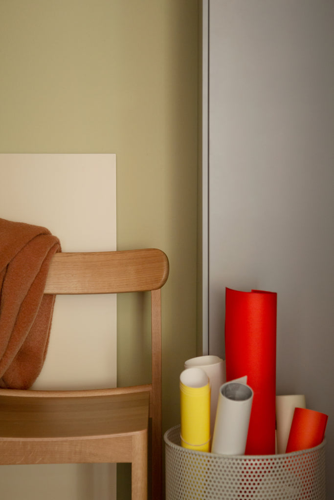
 What is your relationship with color?
I am a color palette user. I have a keen and discerning eye for colors, and I'm happy when I find things in my environment that match. I’m also always curious to observe the interplay between light and color. As Goethe put it, colors arise from light and shadow and are never really fixed. It's fascinating, and an endless source of intangible inspiration.
Historical stories and different eras inspire you. If Päivi Häikiö were an era, which would she be?
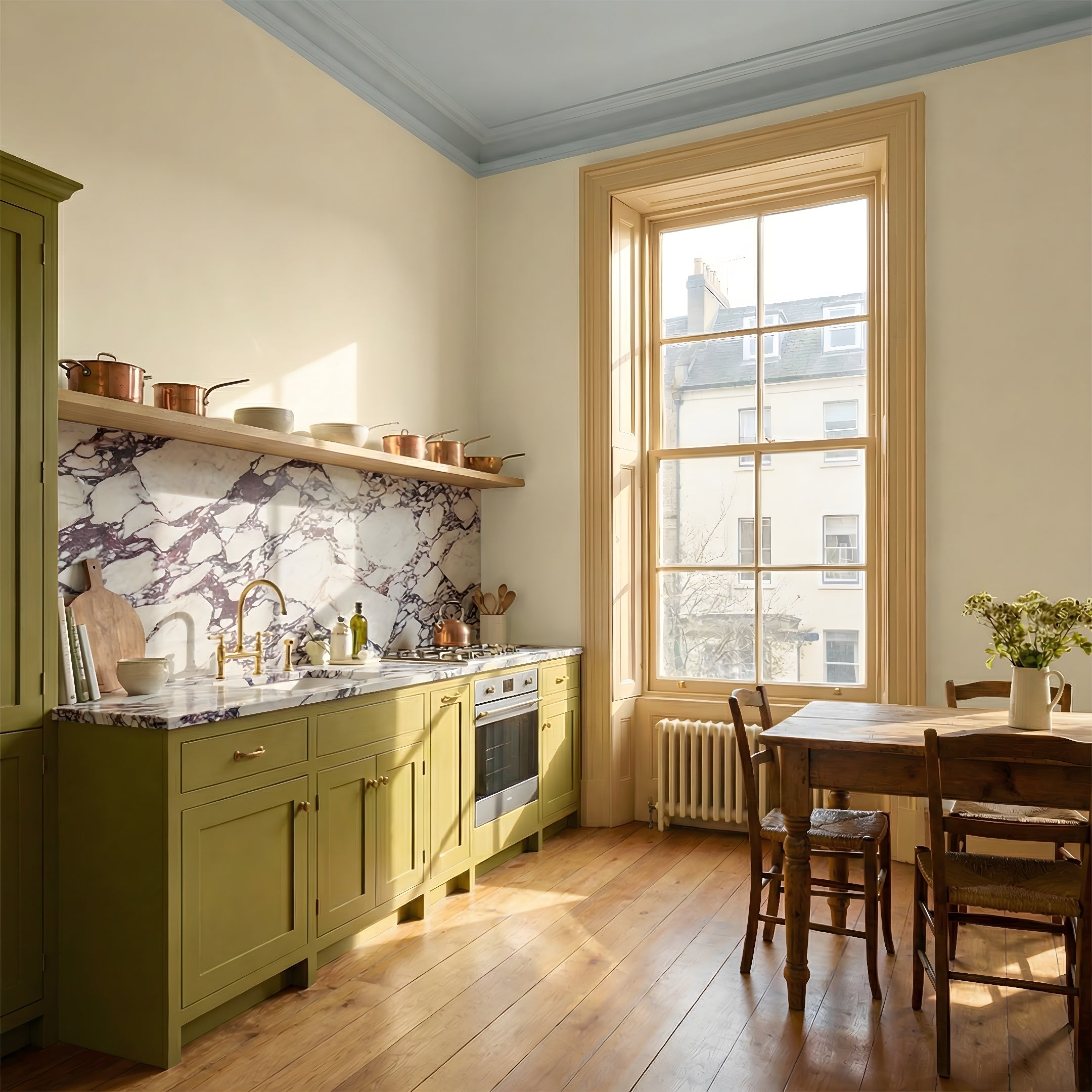
I travel through time in my imagination and study history with passion, but to be honest, I wouldn't venture too far – history is full of battles of good and evil and high drama. But if I think about it in terms of color, perhaps I sit most naturally in the classical "Gustavian" color palette. Lately, though, perhaps as a reaction to all the harmony that prevails in the world of interior design, I've visually adventured into the rich, bright color palettes of the Renaissance. For example, pairing bright Renaissance-painting green with Gustavian lime green inspires me at the moment.