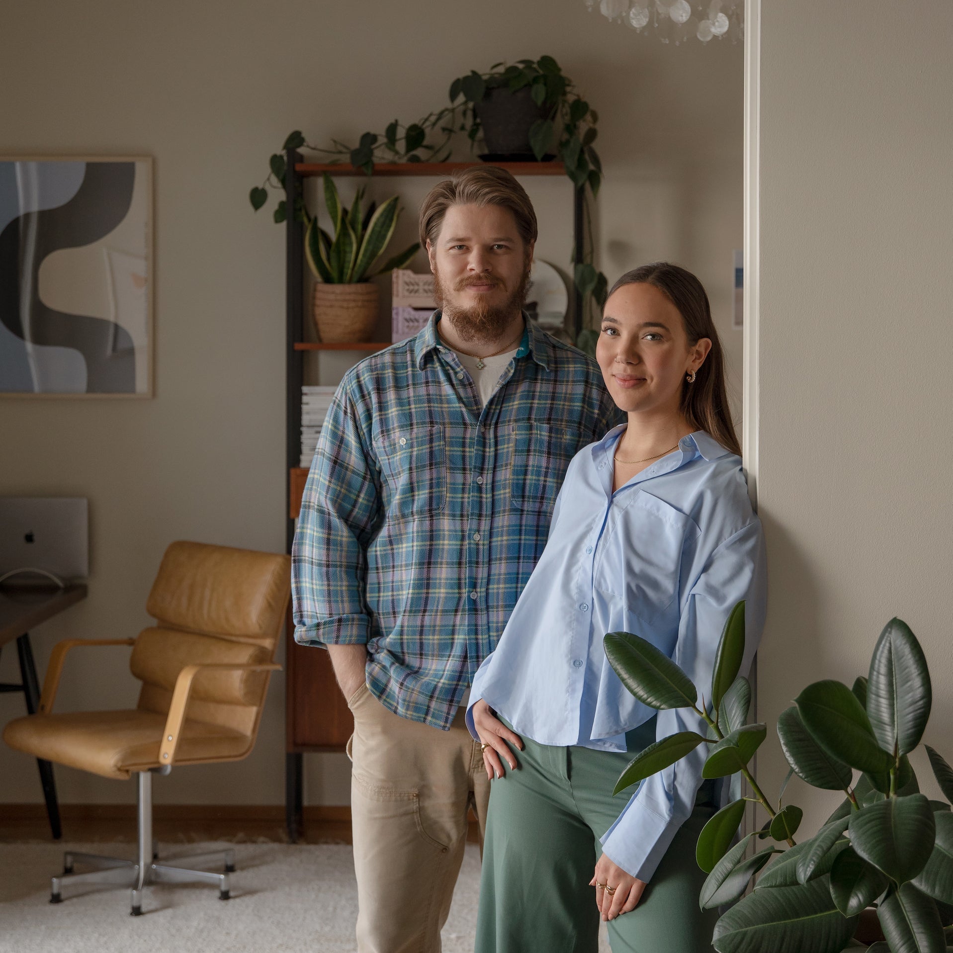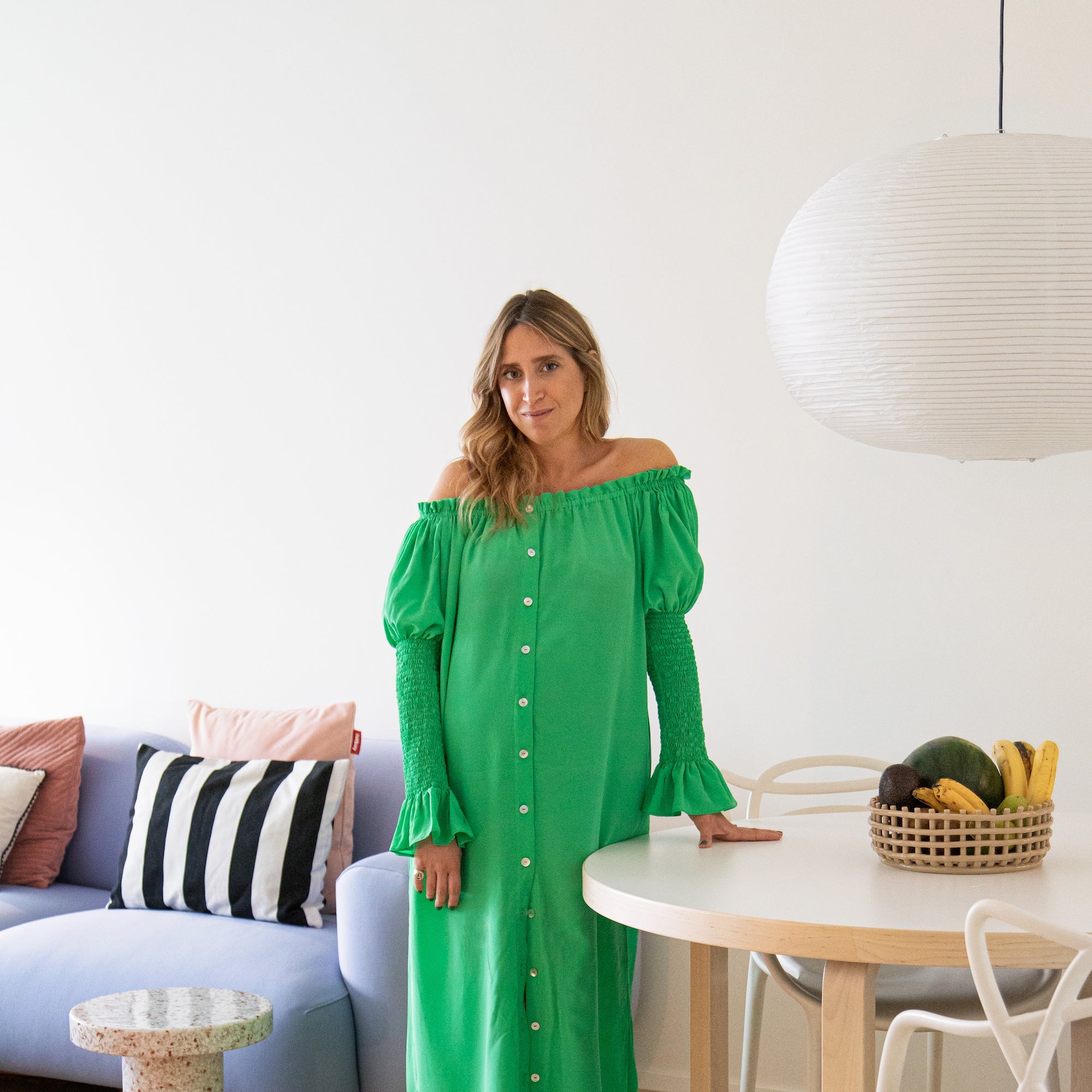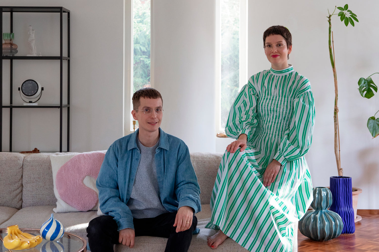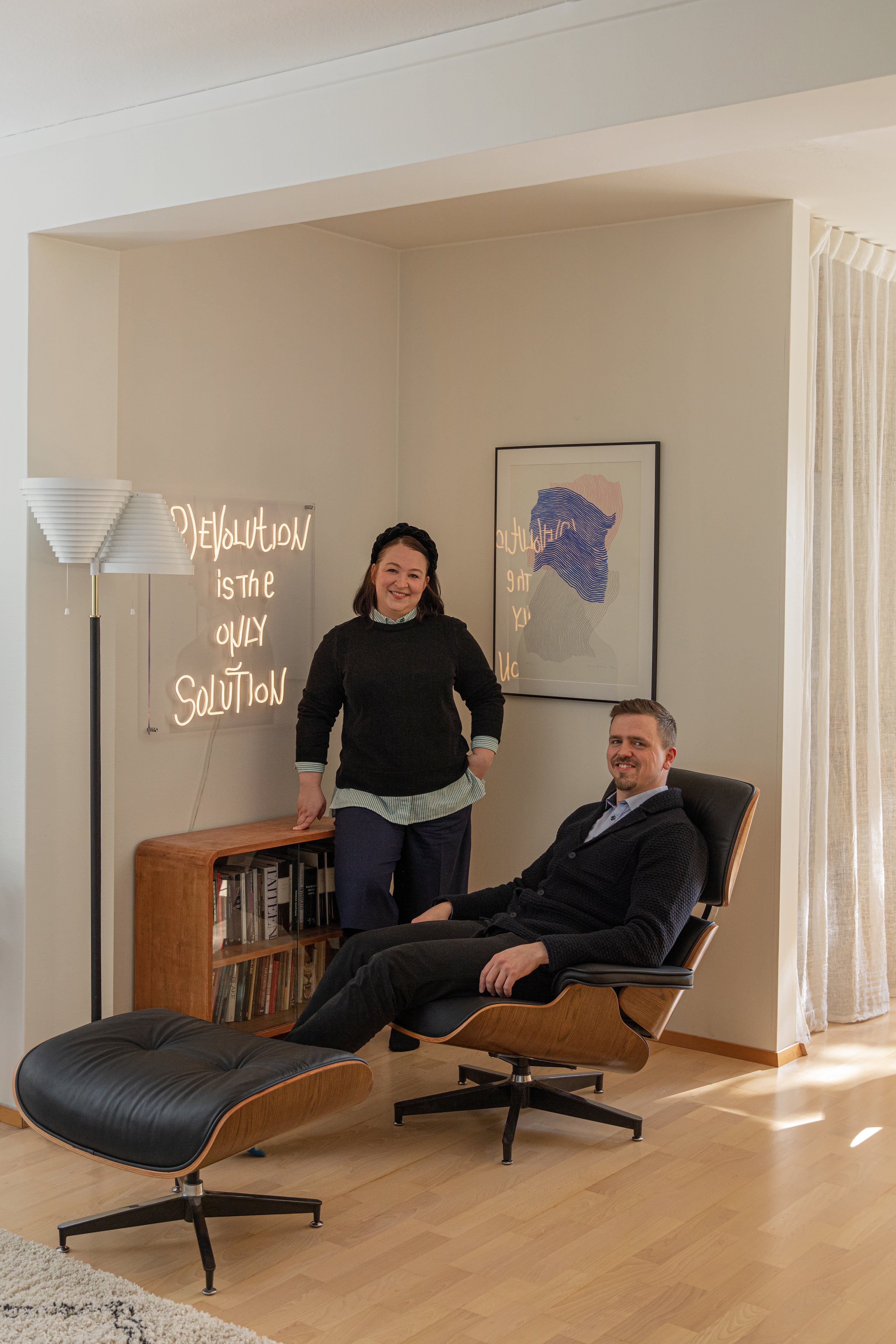
Designed by an architect with a functionalist bent, with its latticed lintel and ship cabin windows, Jenni and Tommi’s family home is striking from the outside. The all-white interior had a lot to live up to, so the design-minded couple engaged a colorful mix of new and old to make the place their own.

Jenni and Tommi weren’t planning to move out of their three-bedroom house in urban Töölö. Especially not to the suburbs. Tommi, who grew up in Espoo, had vowed never to return to his home region. But they saw potential in this bright and charming three-storey detached house. Jenni, Cover Story's marketing manager, and Tommi, who works in digital design, embraced the nautical feel of the building and designed the interior in a way that makes the most of the light streaming through the dozens of windows in their home.
The house contains many elements that reference the sea and ships – bow windows, visible screws, a sloping, cabin-windowed interior, and the couple fell in love with it in an instant. All the quirks and details felt like something they could make their own. Also, the all-white interior was also a great starting point for designing their own color palette. “We fell in love with this in a flash,” says Jenni. “Our home was built in 1992, when architects still drew their plans by hand without computer software. When you draw by hand, the lines can easily become overlong," says Jenni. "It’s fun to see – for example the lintel at the entrance is just like that, overly long and wondrous."
In the six months they've been there, the house has charmed its residents with its space and light. The five-metre ceilings and different sized windows with their various outlooks allow light to move through the spacious living room. Morning sunlight rises behind the bay window and goes down in front of the bedroom windows and, with the arrival of autumn, Tommi has moved from the east-facing patio terrace to inside the bay window to drink his morning coffee. It's his happy place.
 One of the reasons the couple moved here from Töölö was to counterbalance work and social life. “I long for space around me, to not be surrounded by people with all their expectations. Although there are at most four of us here, we can all be alone if we want to be. The house is full of nooks and crannies, and. it's such a luxury to be able to walk out the door and into your own backyard." Jenni explains.
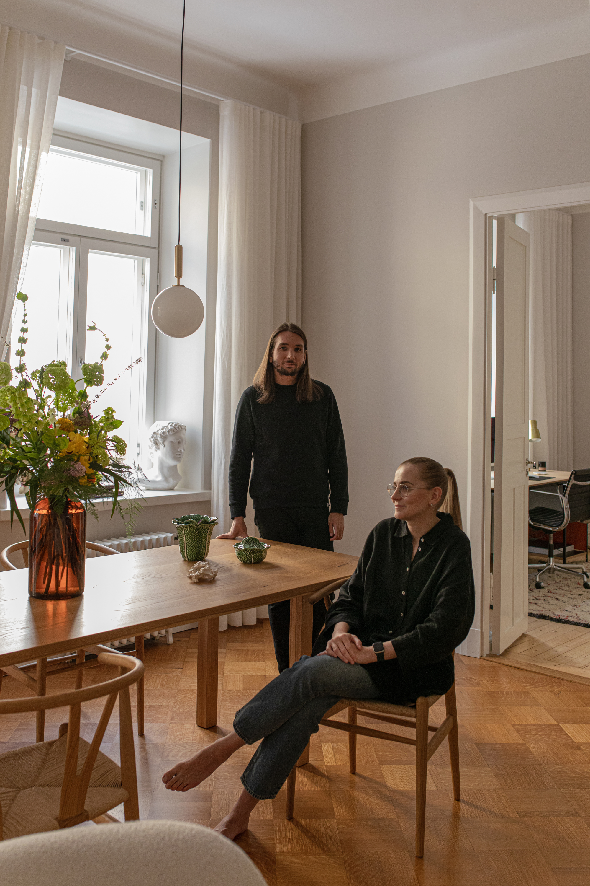
The furniture, plants and objects from their old home have found a place in the new home. Despite more than doubling the size of their family dwelling, the old furniture has been enough to create a homely interior. Only the bay window was given a new chair to sit pride of place.

 "Of course, this dwelling itself gives inspiration and has its own demands in terms of decoration. But in different apartments, the same furniture creates a completely different interior," says Jenni. "My aunt Kyllikki is a great lover of culture and when she was visiting, she would sigh out loud, 'This home is like a gallery'. Sometimes it's an art gallery, at other times it's just the standard family circus going on!"
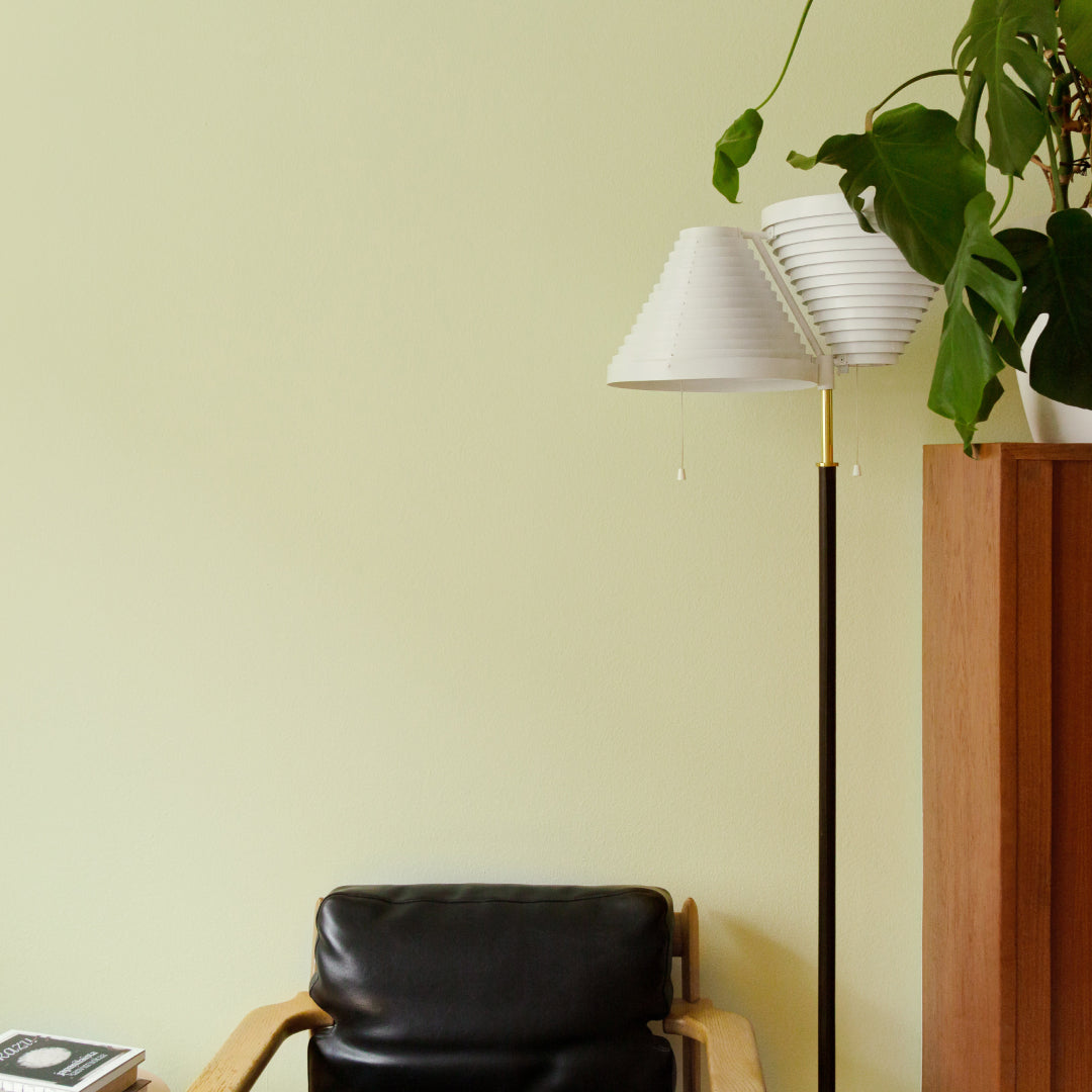
The home's spacious and bright interior combines 90s architecture with playful details and color with bright objects bringing the white space to life. Characteristic of the architecture of the 1990s, shades of mint green and blue elements are still present; the balustrades, the external roof and the lower parts of the staircase have been kept in their original colors. While painting the bay window, the couple replaced the silicone windows and discovered that the white wall used to be mint green.
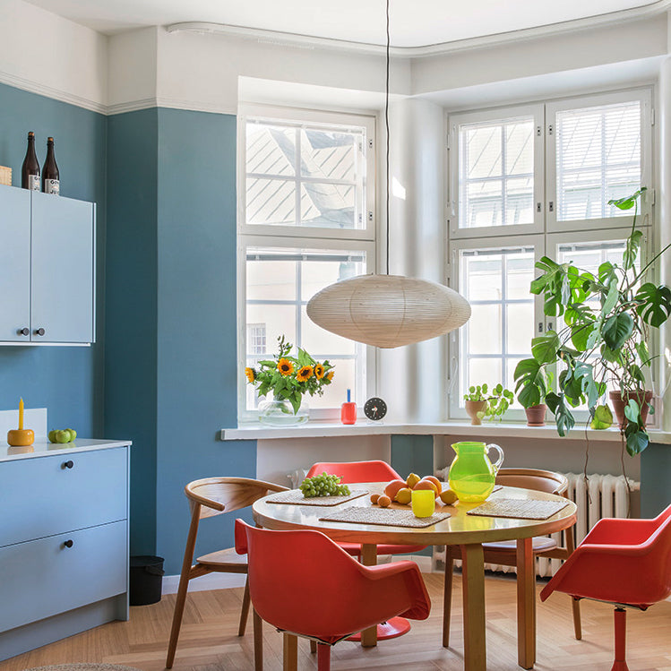
"We wanted to honour the spirit and time of this house in our color choices, so we painted the lower part of the downstairs wall a light blue – it's like walking down the stairs and landing in the water. Meanwhile, our bedroom is painted a greyish blue-green. The room is like the Titanic. We're submerged on the staircase, paddling downstairs," says Tommi. 

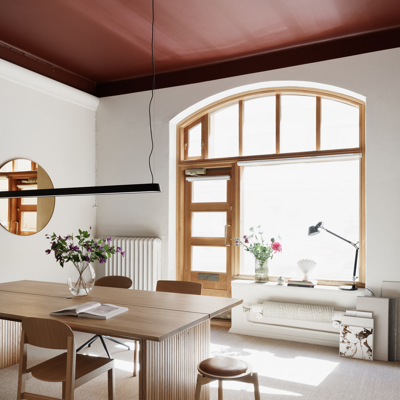
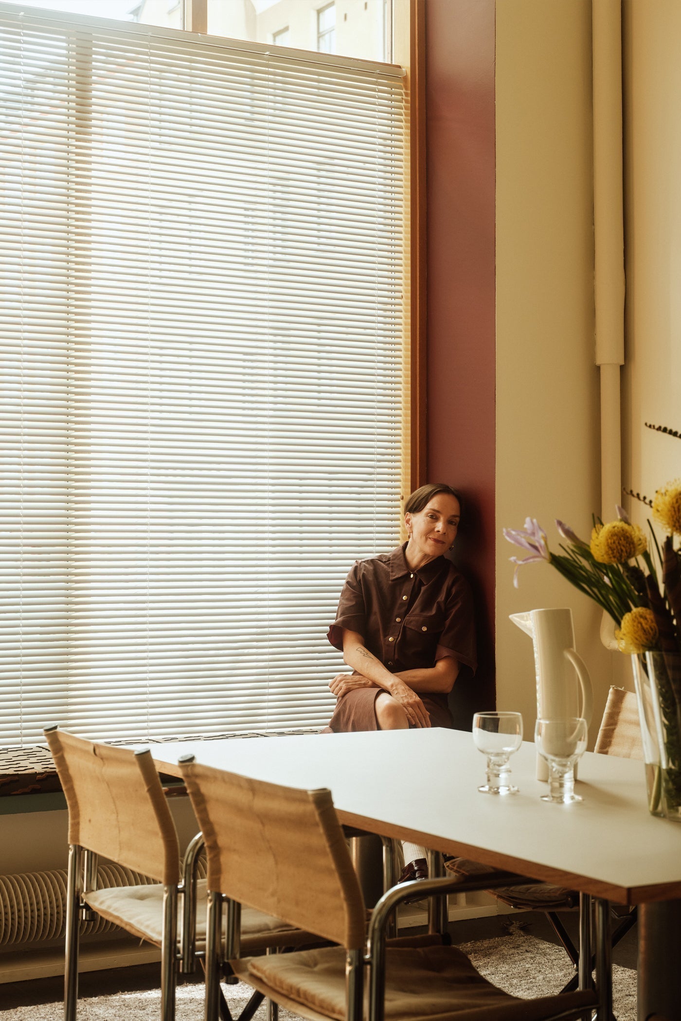
Although blue would have been a natural choice for the color scheme of the time and the house's nautical theme, the couple chose otherwise for the living room – a splash of classic dark burgundy.
"Perhaps a little surprisingly, burgundy feels refreshing when our living room is otherwise so spacious and light. The dark burgundy bay window now feels like its own, separate space with its greenery and outlook onto nature. We used the color to highlight the shape of the bay window," says Jenni.
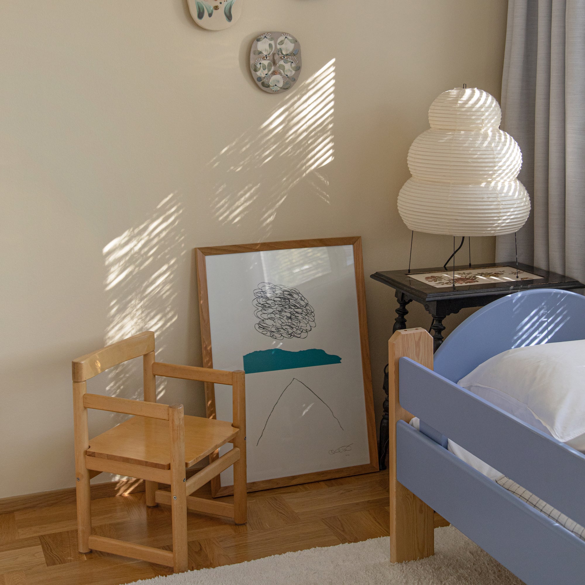
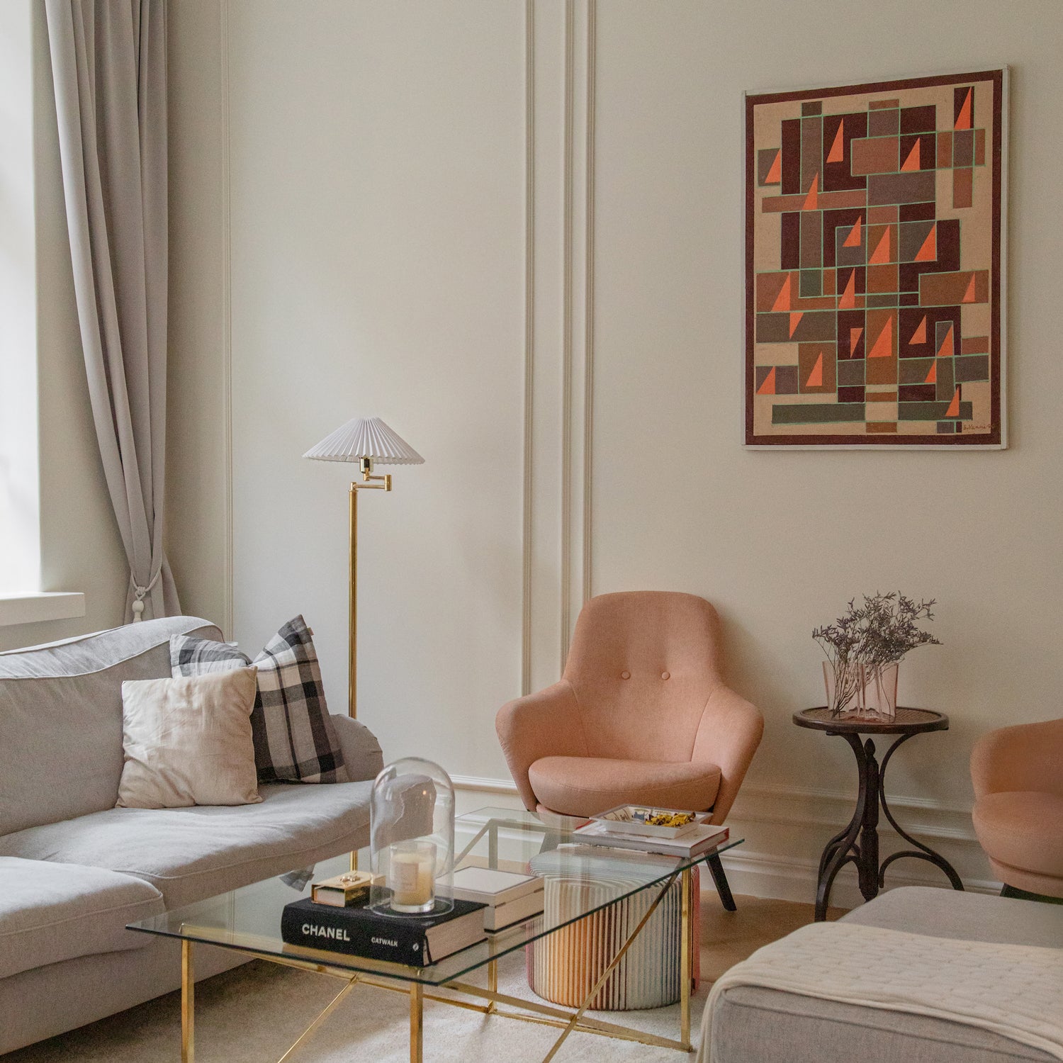
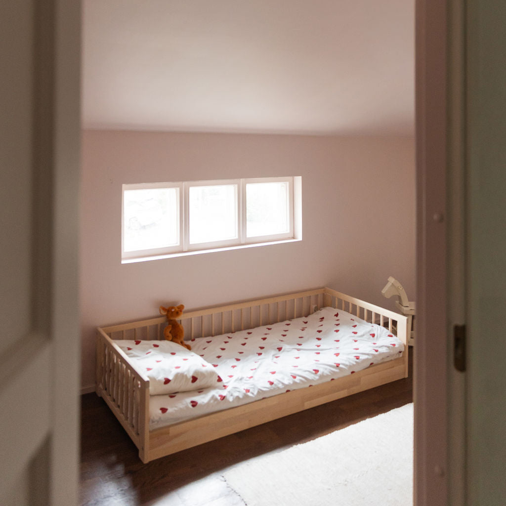
Because a house should feel like a home, the color choices also reflect the personalities and preferences of the residents. "One of my daughters is a total pink person, so it’s no surprise she chose FRANCIS for her room without a second’s hesitation," says Tommi.
"Personally, I’m still wondering which wall or ceiling I could paint bright green,” adds Jenni. “I love green, but Tommi’s not on board yet,” she laughs.


