
Textile designer and editor-in-chief of Asun magazine, Ulla Koskinen, designed two new colors for Cover Story’s Basics Collection. The shades transport us to a world of Italian design and historic palaces.
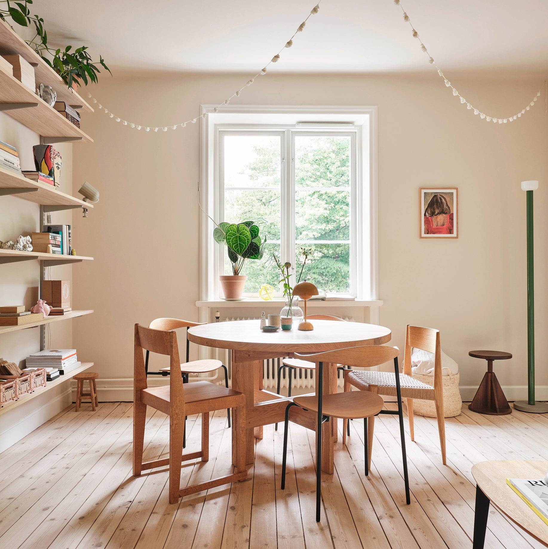
One might ask why, of all the colors in the world, pick these two shades? I think these hues encapsulate the power and character of color. They are quiet, even insignificant, and yet infinitely powerful. I sought a mood that is missing from the color charts of the North; a very dark, gray-brown that does not fold into violet yet, on the other hand, does not look too flat and black on a surface. To balance the subtle, dark tone, I wanted a soft, warm gray that would work perfectly in a space as a neutral.

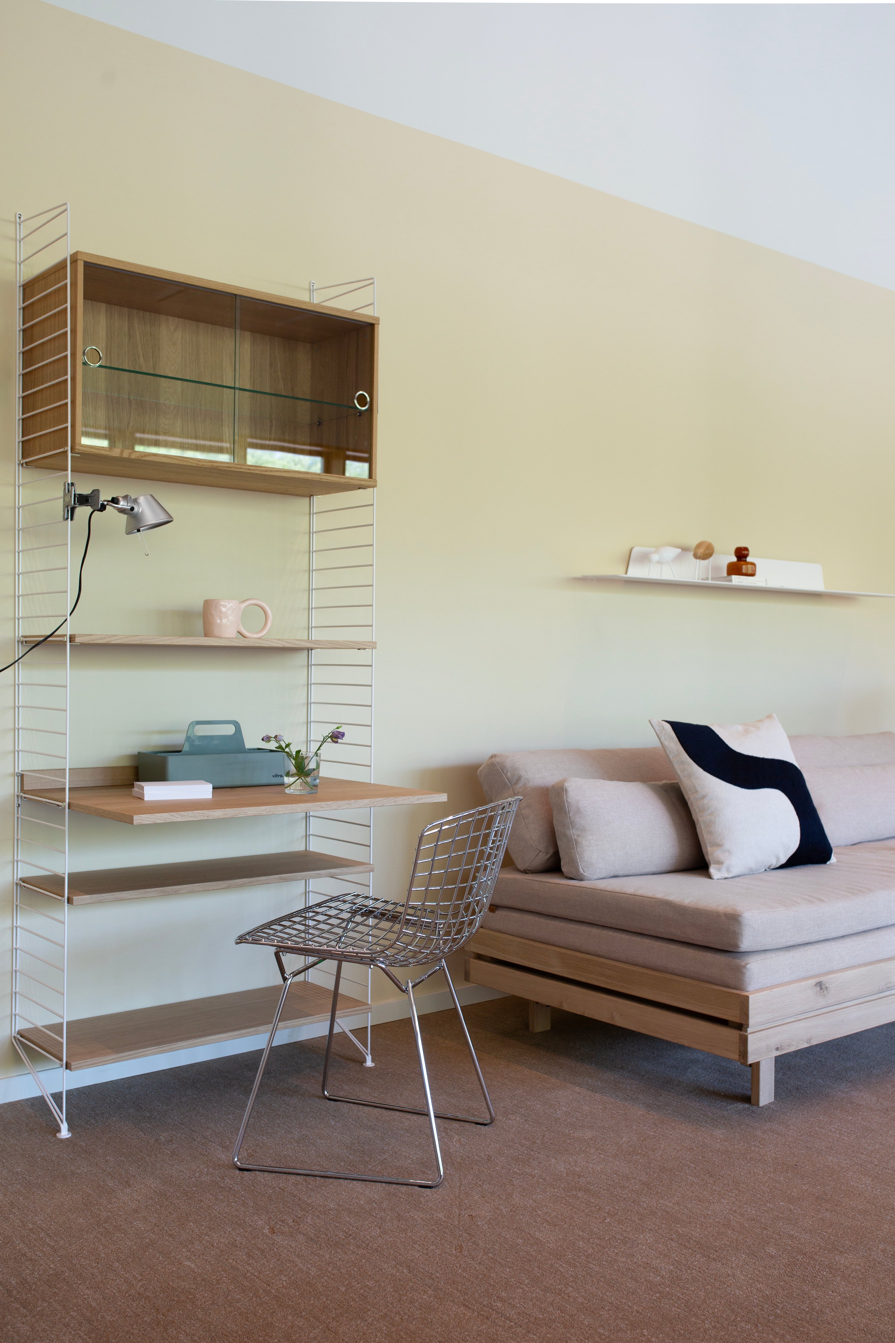
The shades I chose are easy to overlook when it comes to color. But they're not just any black and white, even if at first glance there's nothing extraordinary about them. Spatially, the neutral shades you choose are particularly important. For me, these are the basic colors on which I build the interior design with different surfaces and materials. Both the dark brown and light shades only become remarkable when part of the whole. Each shade has a quality that makes the space feel more intimate, cozy and soft. On the walls and ceilings, their subtle touches create a calming atmosphere. These shades are also linked by their mood. The combination of light and dark is strong, timeless and captivating. Balanced background tones are eternal.


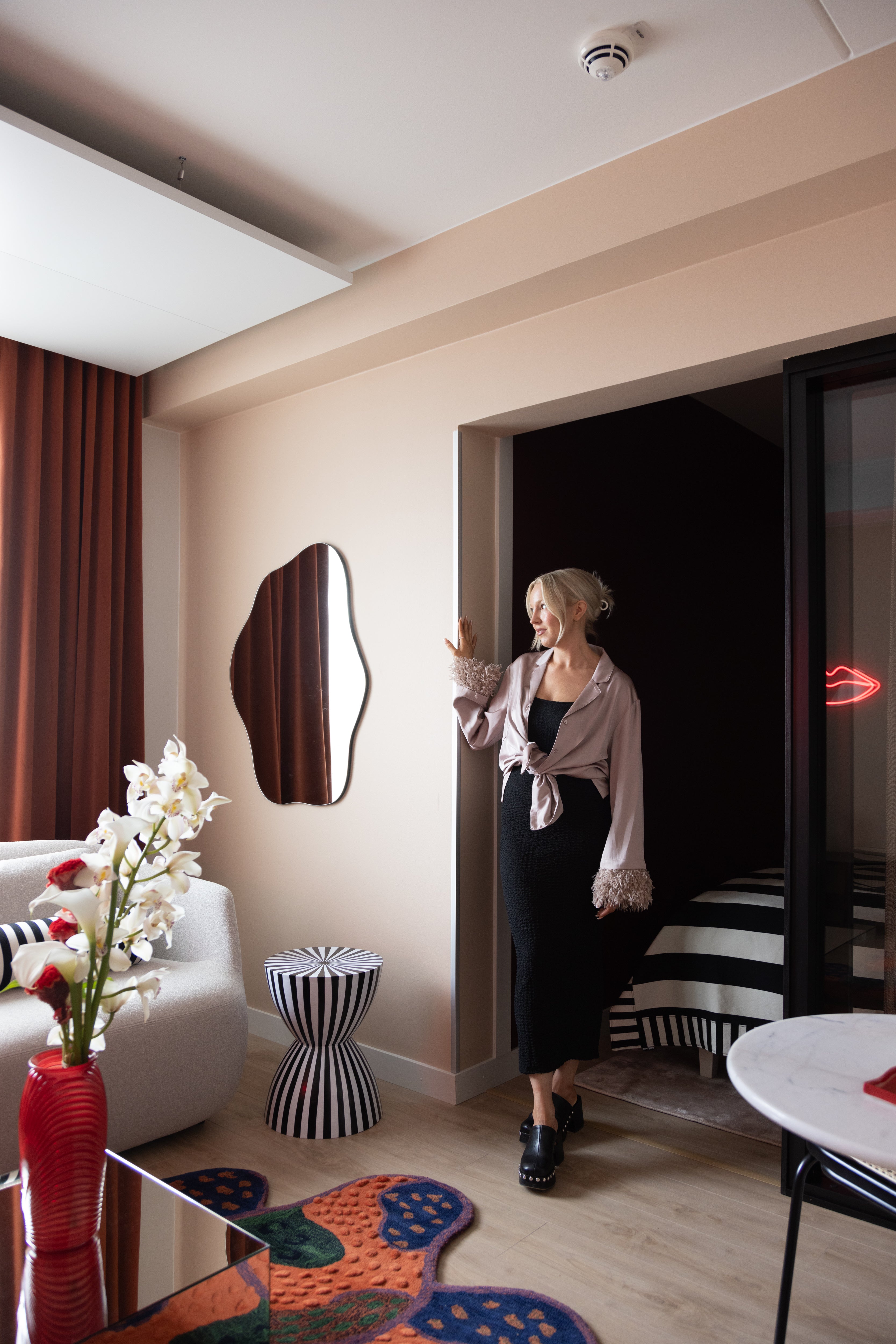
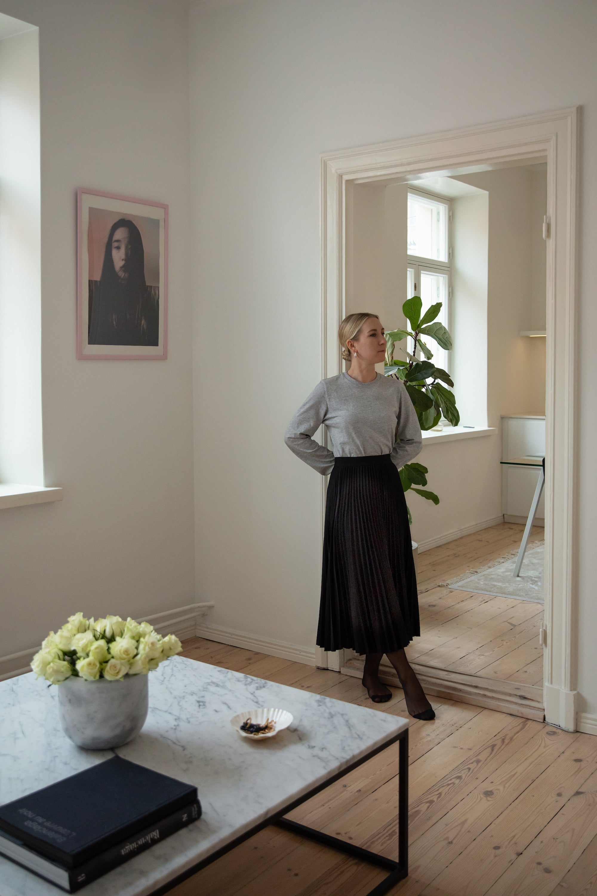
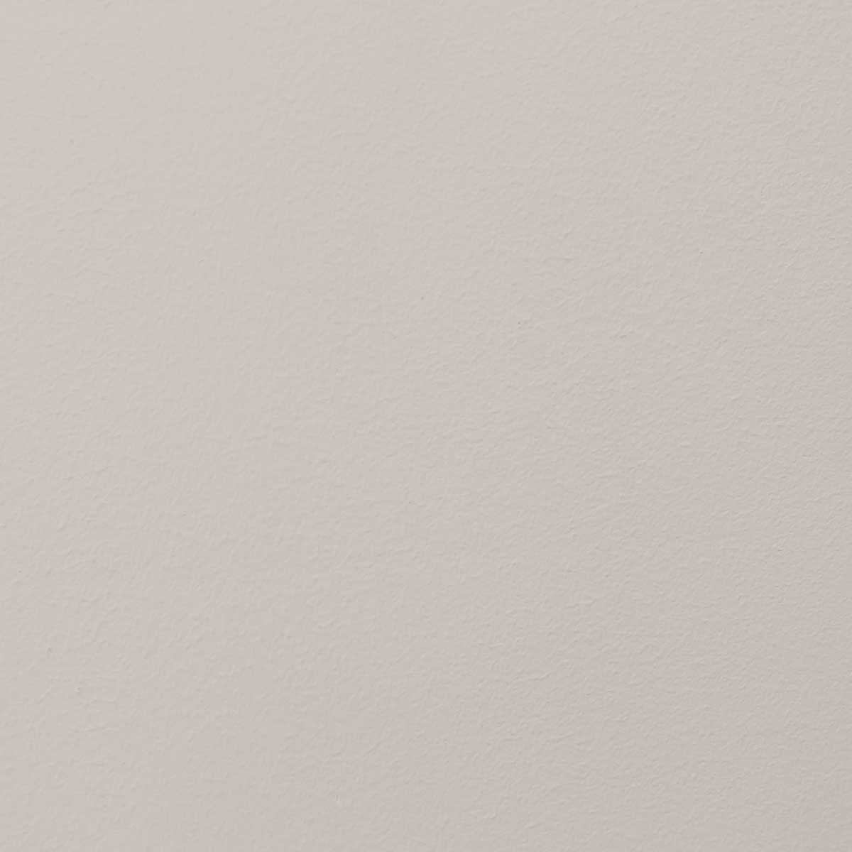
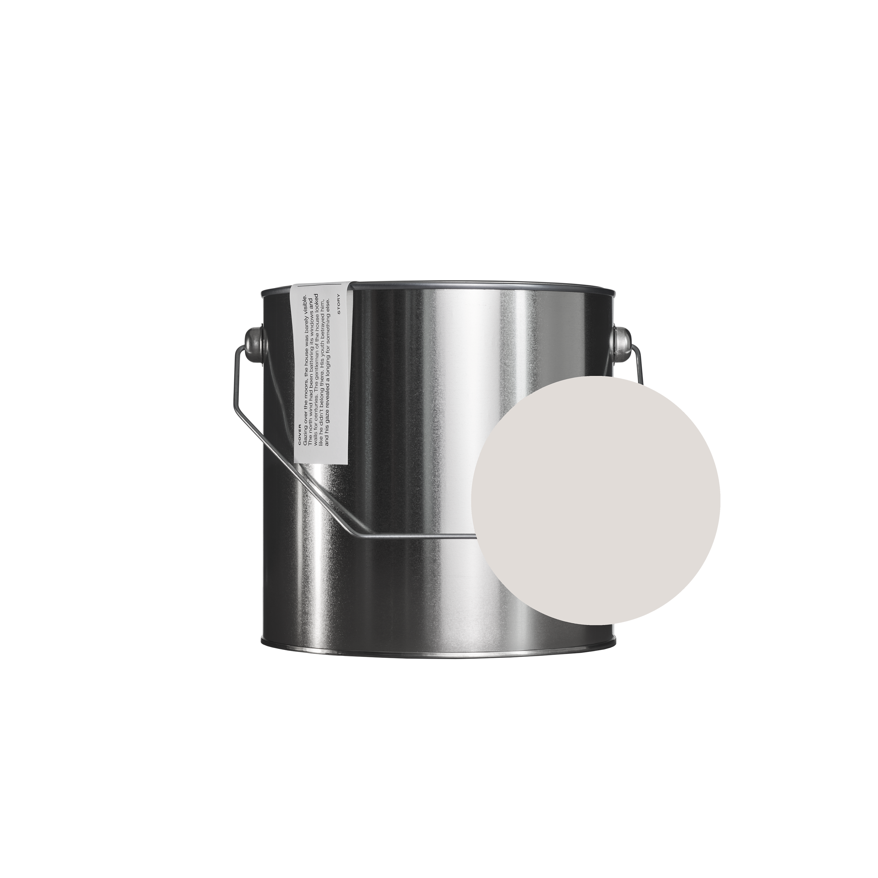
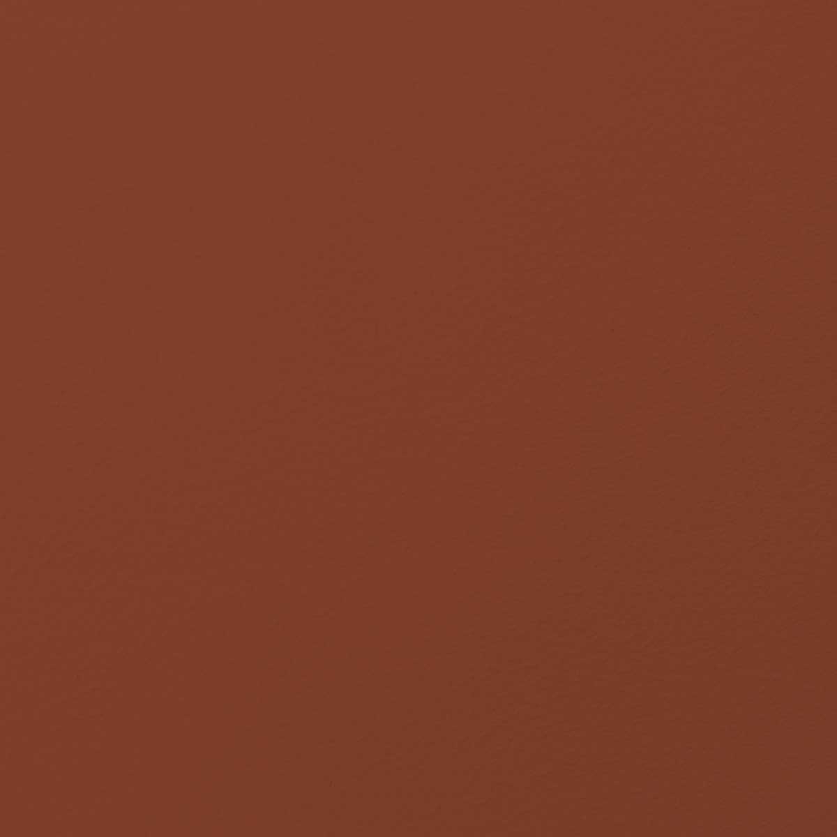
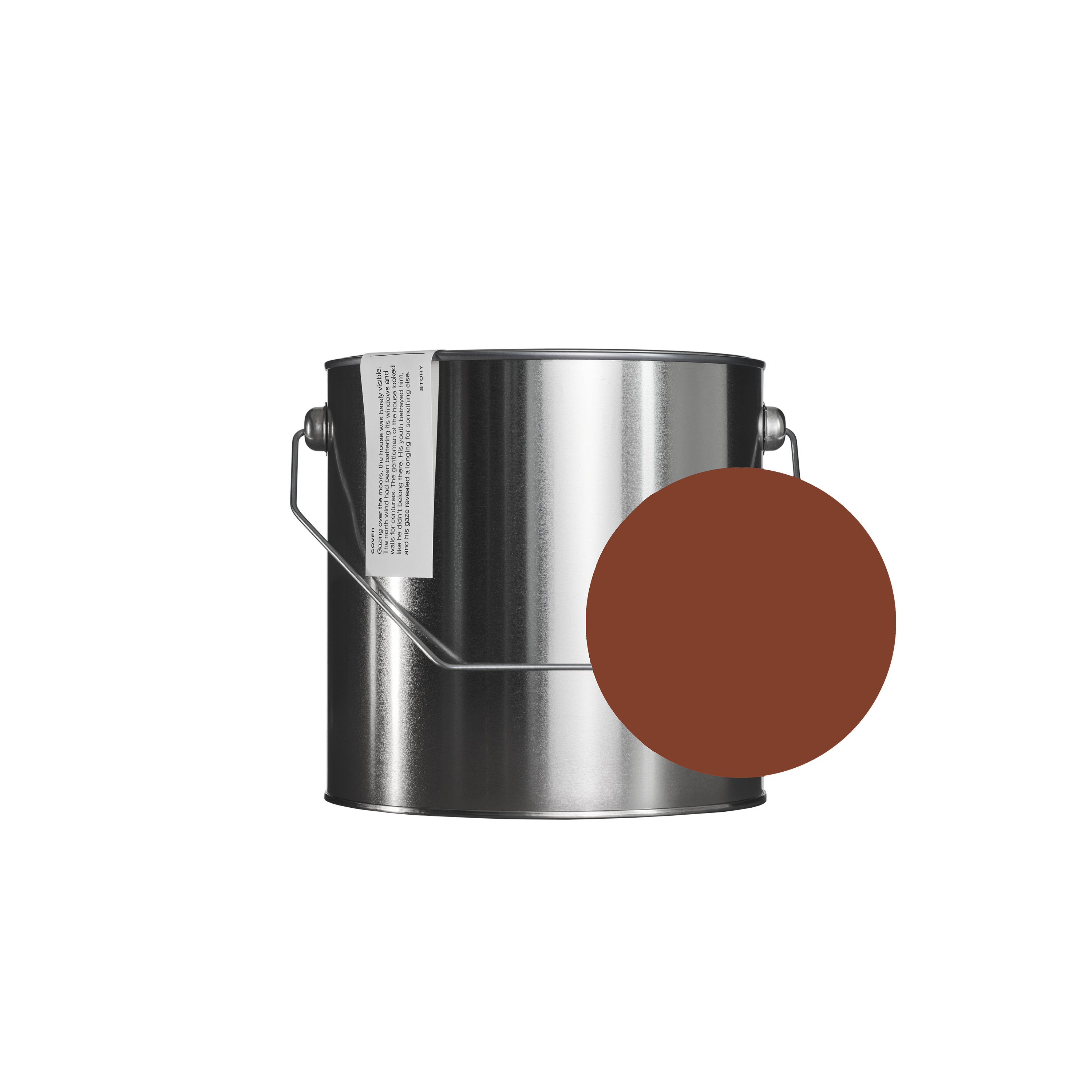
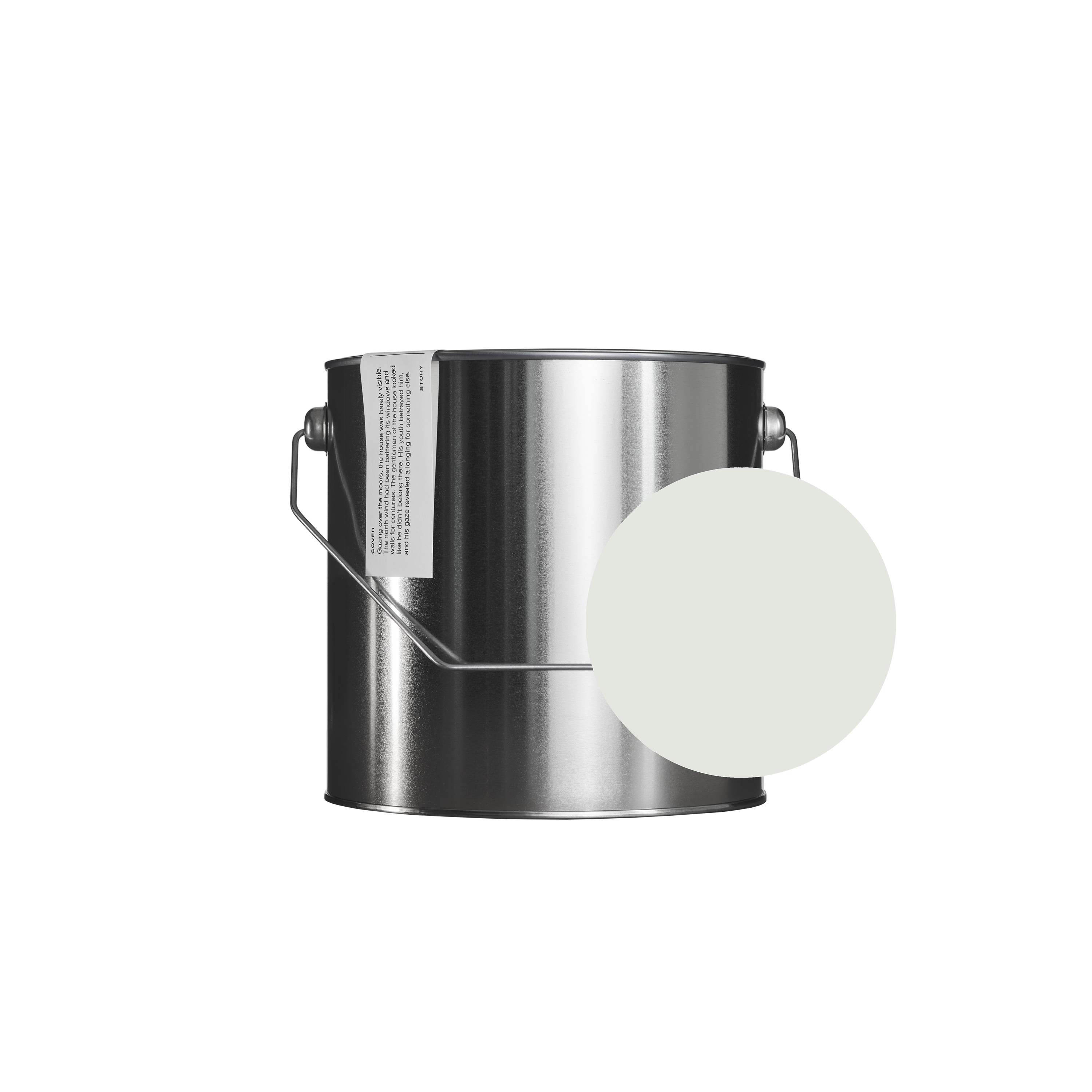
My design, 035 UMBERTO, is inspired by the dark, evocative color palettes of Italian palaces, their deep browns and grays. In paintings, black does not come from a tube, but is usually made by the painters themselves from several shades. Depth is created by mixing, and the color black always folds into something. The same with white shades; the artists add their own subtlety to the shade. I wanted to create a warm, light gray, 034 ELENA, which is not too yellow, but softens the home atmosphere and can be used as an overall white shade in different ensembles.
What fascinates me about 035 UMBERTO is the way it behaves in spaces – as if the corners and edges disappear and the shade envelops you comfortably. Dark colors are often unnecessarily avoided for fear of their darkness. The more trustworthy neutral shades are very safe, you feel like you're in a big, warm embrace. Also, the dark shades of northern color charts tend to fold into cool blue-grays. However, I wanted a shade that would create a warmer background.


I associate my colors with modern Italian design and interiors such as the stunning showrooms of Boffi, Salvatori and Dimore. Such shades also come alive on building facades, plaster and tiles. I admire the rich tiling patterns of old Italian buildings and the old palaces where this color pairing appears. Umberto and Elena also come alive in classical paintings, and can too be found in the soft black and white of modern art.
People often have their own favorite colors, and over the years they form a palette of colors that they love and feel comfortable with. I wanted to share these two favorites of mine – both quiet, yet strong, background shades.

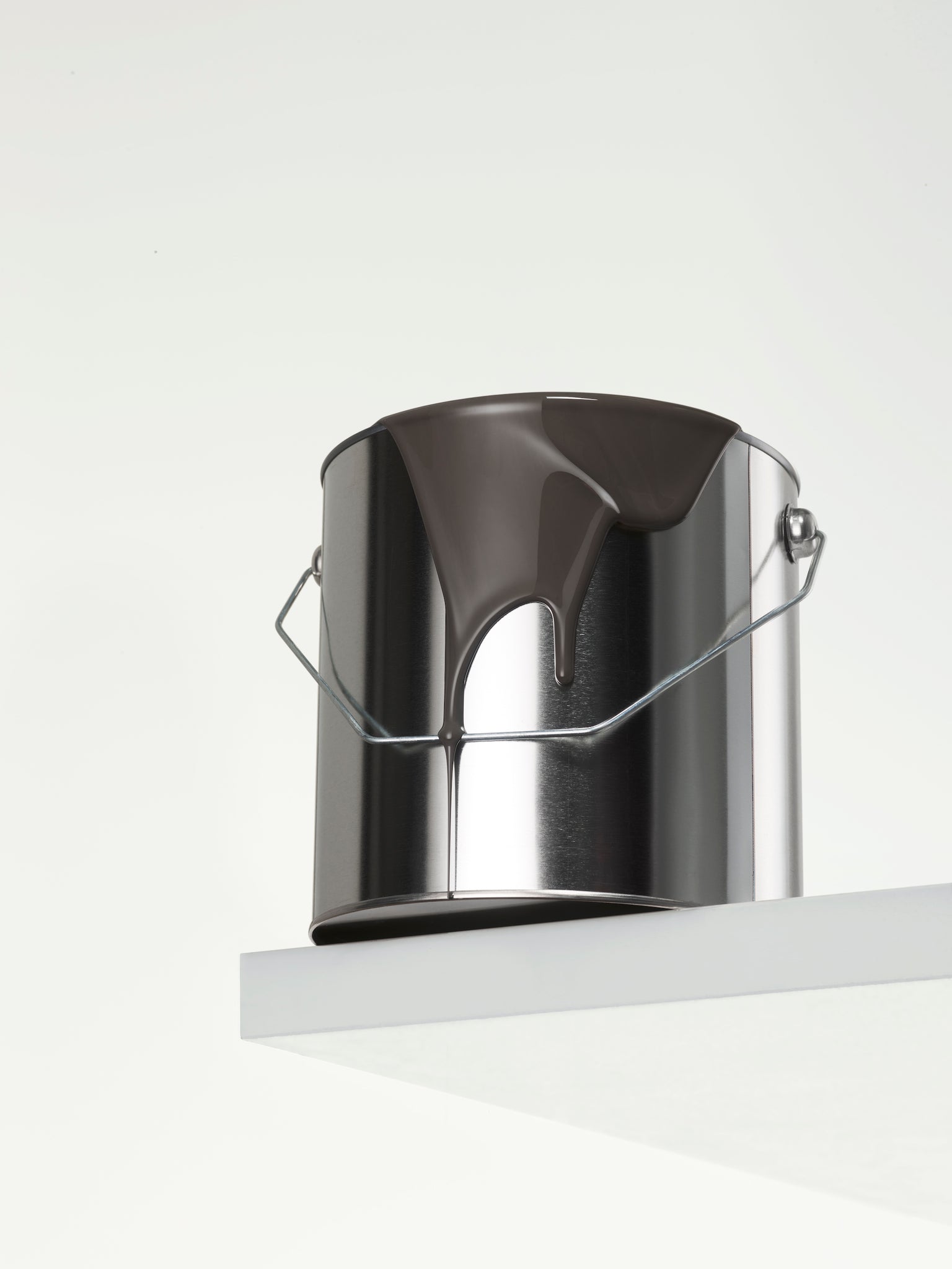
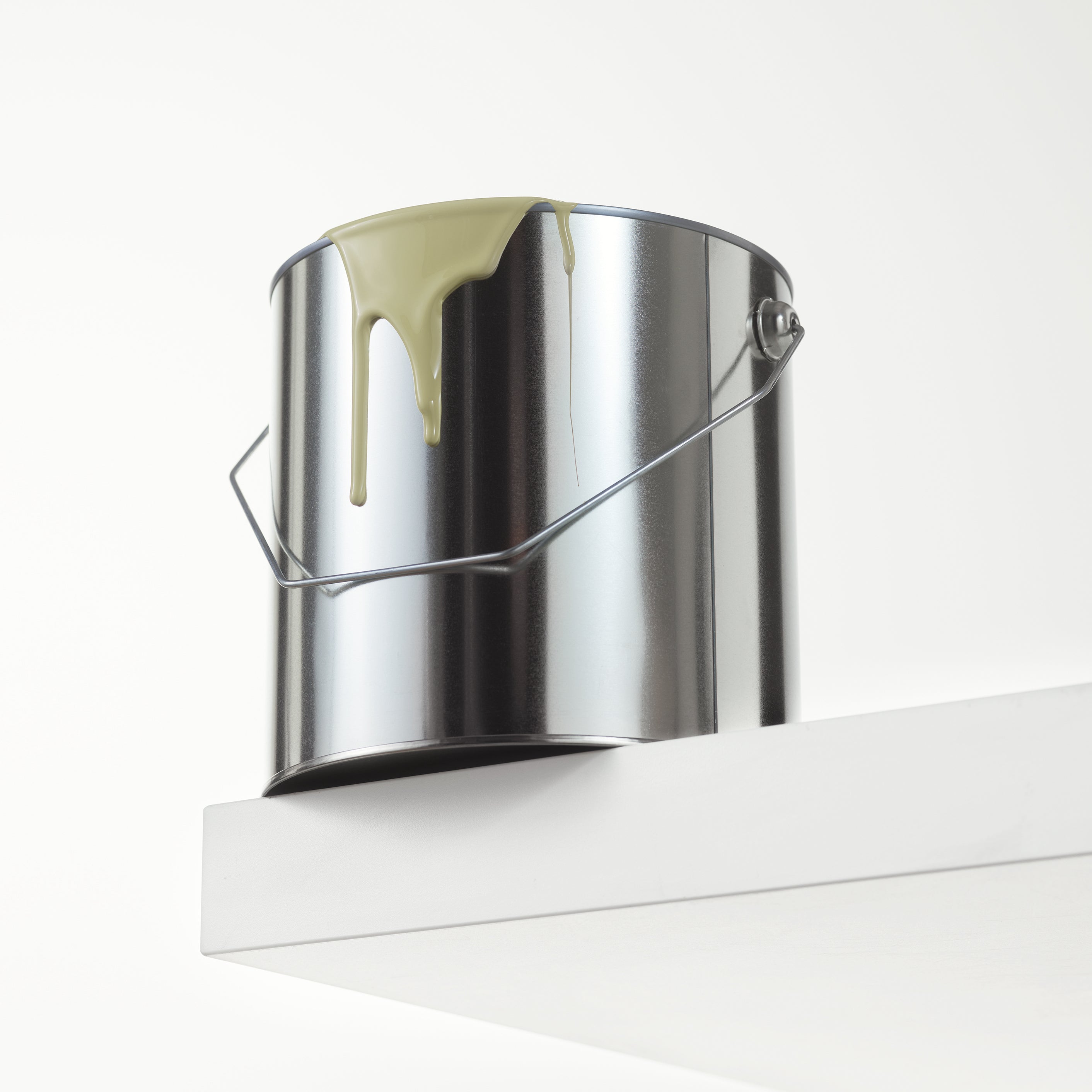
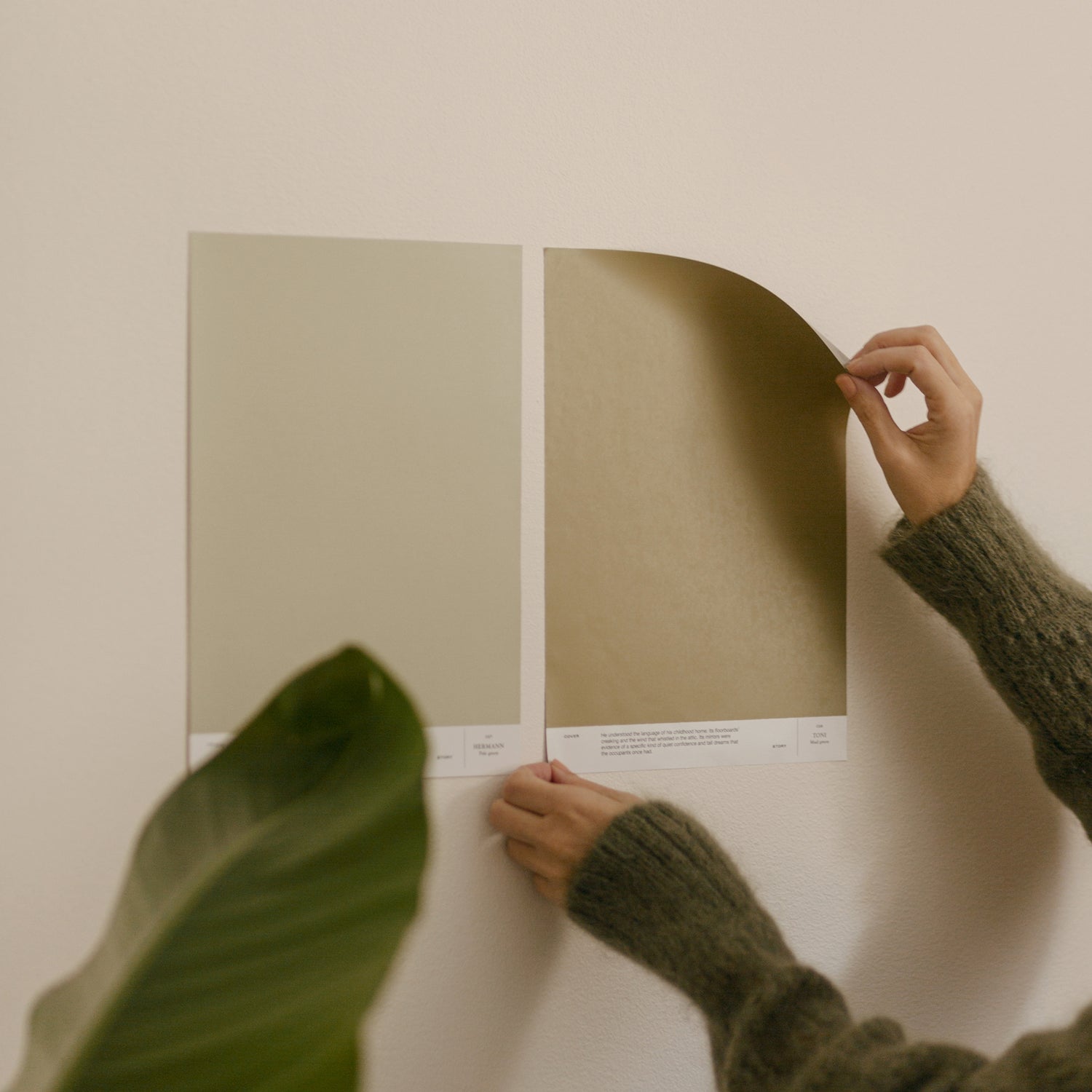
033 ELENA & 034 UMBERTO

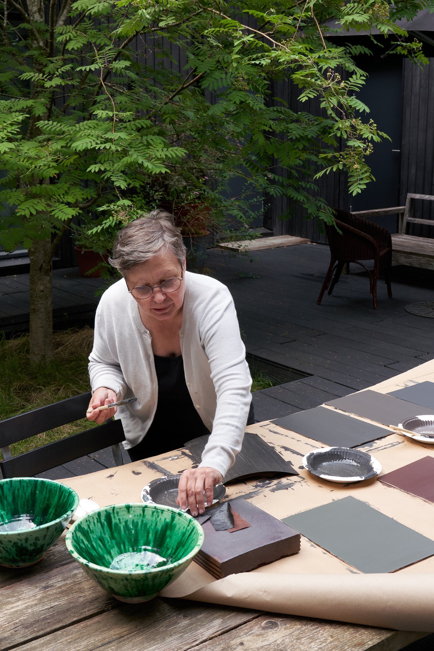
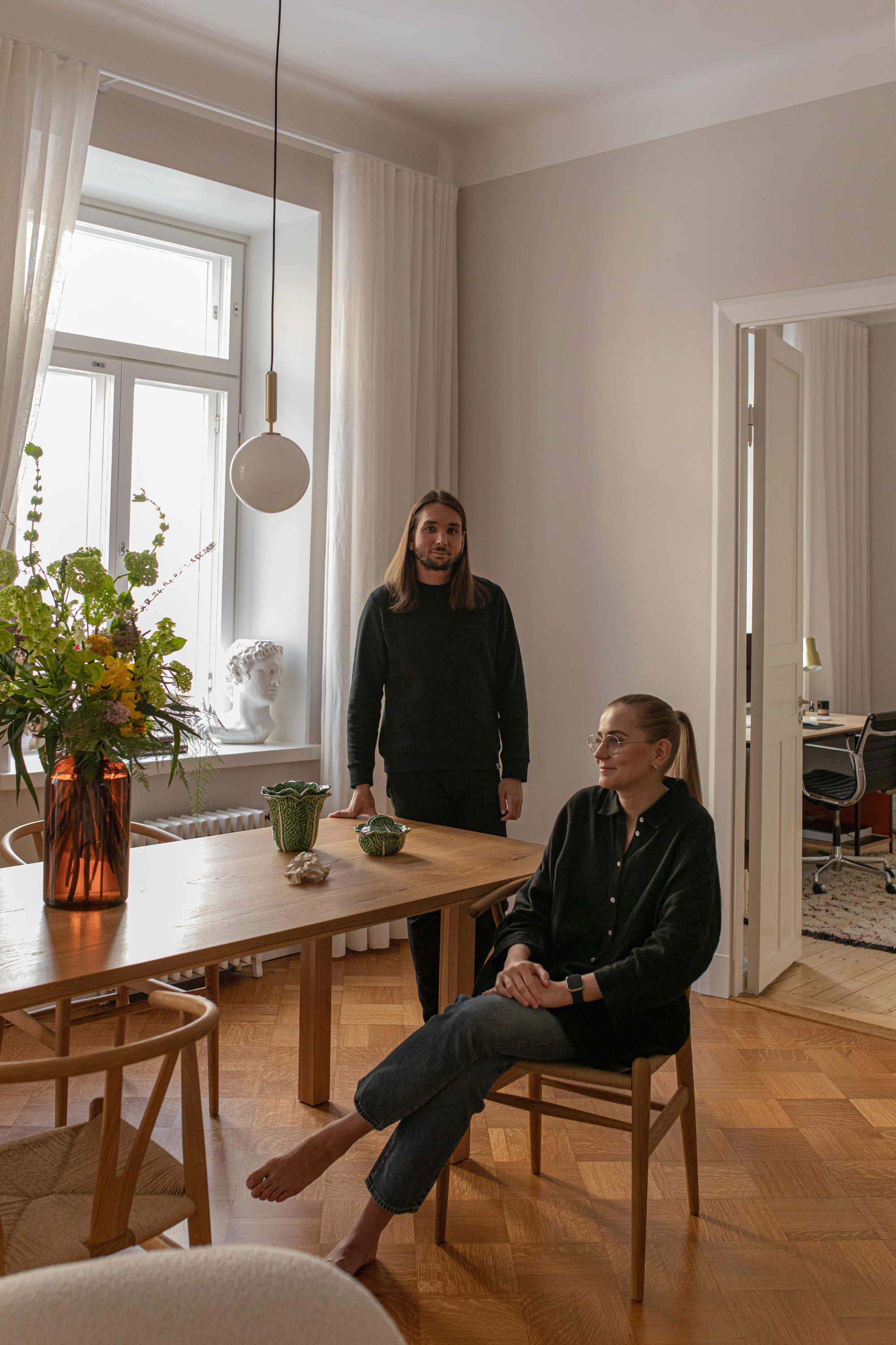
Ulla Koskinen is a textile designer for whom spatial perception and interior design have always been part of life. In her work, Koskinen moves fluidly from one space and scale to another, building interiors in which colors and materials are in dialogue with each other. In 2015, Koskinen founded interior and design magazine Asun which focuses on lifestyle, design, architecture and art with an inspiring soul.

